The Federal Reserve’s distributional accounts are a combined product of two Fed projects, the quarterly financial accounts, which we review soon after their publication, and the triennial Survey of Consumer Finances, a detailed look at household income and balance sheets. Often when we do our quarterly reviews of the financial accounts, we lament that the aggregates (which behave pretty much like means) don’t tell us anything about distribution. Middle-class wealth, such as it is, is largely in housing, while high-end wealth is largely in financial assets. The movements in those assets are proxies for a distributional analysis, and now we have the real thing.
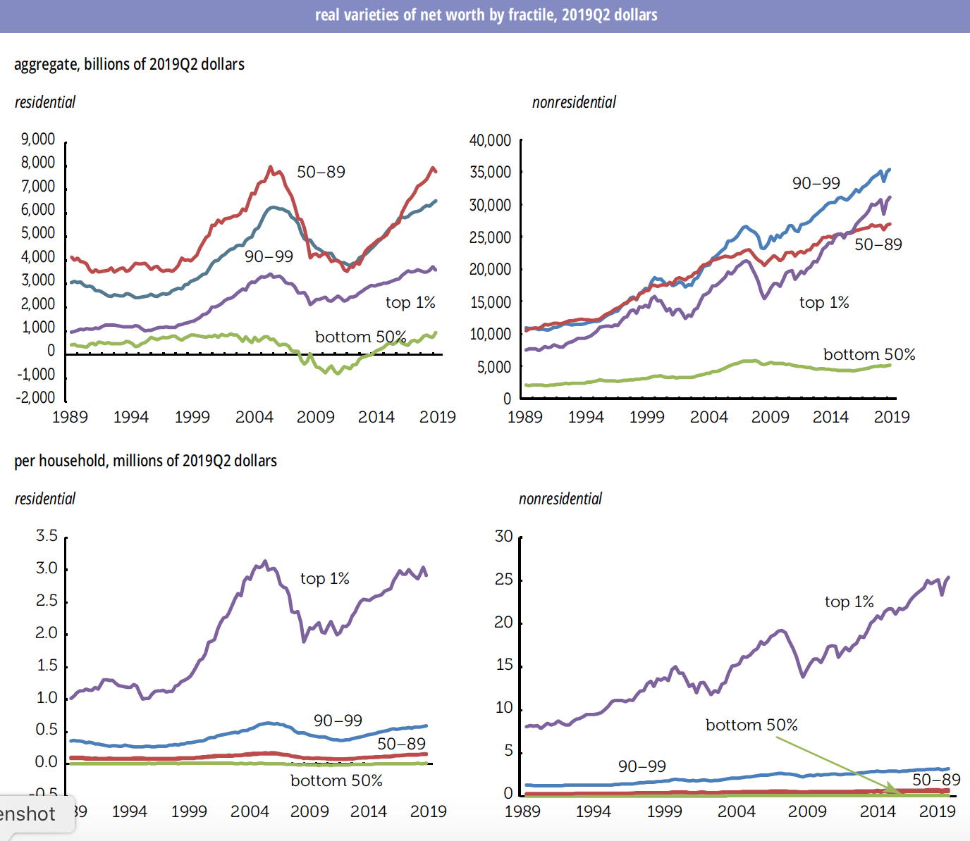
We graphed dollar levels, not shares, but a few words about them first. In 2019Q2, the top 1% of the distribution owned 29.0% of all assets, up from 21.2% in 1989; the bottom 50% went from 7.3% to 6.1%. Percentiles 90-99 saw little change in their share, but the next 40% lost 7 points of share, 37.2% to 30.1%. Holdings of stocks and mutual funds also become more concentrated, with the top 1% going from holding 47.8% in 1989Q3 to 52.0% in 2019Q2. The bottom 1% saw their share rise from 1.0% to 2.2%. Between the extremes, the most interesting development was how those between percentiles 50 and 90 rode the 1990s stock boom, going from owning 14% of stock in 1989 to a peak of 19.1% in 2001; they now account for just 11.4%. The top 1% went from holding 23.9% of net worth in 1989 to 32.4% this year; the next 9% were unchanged at 37.0%; the next 40% went from 35.4% to 28.7%; and the bottom half from 3.7% to 1.9%. In 1989, the top 1% had 6.5 times the share of the bottom half; in 2019Q2 it was 17.1 times—though that is down from a 2011 peak of 150 times, when the bottom half, hammered by the housing bust, was barely above water.
On to the graphs, which show residential and nonresidential net worth by fractile (slice of the distribution), first in the aggregate and then by household. (We estimate the household numbers by dividing the aggregate by the fractile’s share of total households in the quarter.) “Nonresidential” subtracts the value of real estate from assets and adds back mortgages from assets. It also excludes consumer durables, which are illiquid and depreciate rapidly, which the Fed counts as a household asset. We also deflate by the PCE index; the Fed presents nominal figures.

Although the 1% gets all the press, when it comes to residential net worth they don’t hold as much as the next 9% or the next 50%, though of course those populations are far more numerous. So, movements in the balance sheets of the 90-99%, what in economic slang is oddly called the upper middle class (as it is in the new book by Saez and Gabriel Zucman) and the next 40%, the better off segments of the “middle class,” matter for consumption. The bottom 50% has close to nothing in the aggregate.
The picture changes when you take out the residential parts: there, the 1% have more than percentiles 50–89, and is within hailing distance of 90–99. The bottom 50% have a little more than nothing; they’re disproportionately renters (though they took a hit on residential wealth in the crash), and might have a small savings or retirement account, but not much else.
Looking at households, the bottom 50% meanders around the zero line; they had a net worth of $15,280 in 2019Q2. The 40% above them had a net worth of just under $160,000. You can’t see it on the graph, but that’s up 42% since 1989, though there was an intervening hit of -37% during the housing collapse. The top 1%, who don’t have most of their wealth in housing, still have a lot: $2.9 million, up 188% from 1989. But again, the 1% star in nonresidential wealth: $25.3 million in 2019Q2, up 214% from thirty years earlier. The next 9% were not begging: $3.2 million. The bottom 50% have a net of $84,189 to their name, up 90% from 30 years ago, well under half the gain clocked by the top 1%.
Again, people are living in very different universes.


Little Wonder the BQE is about to Fall Over
For another striking measure of shortfalls in public and private investment, check out the graph below. These are real dollar amounts, not percentages of GDP. In real dollar terms, net fixed investment of all kinds is 20% below where in was in 2005. Net private nonresidential investment is just 12% above where it was in 2007. Net residential investment is 63% below where it was at the peak of the housing bubble, 2006. And net public investment is 39% below. Again, real dollars. These are paltry numbers considering that real GDP is up 36% since the pre-recession peak in 2007.
So net private investment is limp, and net public investment is struggling to keep one nostril above water. This has a lot to do why it feels like things are falling apart, and not just in rural America. An important section of the Brooklyn–Queens Expressway is about to fall down, and there are many other similar cases across the country. Visitors from China routinely express shock about the state of the infrastructure in a country that is still far richer than theirs. And crises like the coronavirus really bring home the effects of inadequate public and private investment. Tending to long-lasting things has gotten highly unfashionable, but that approach has some pitfalls.