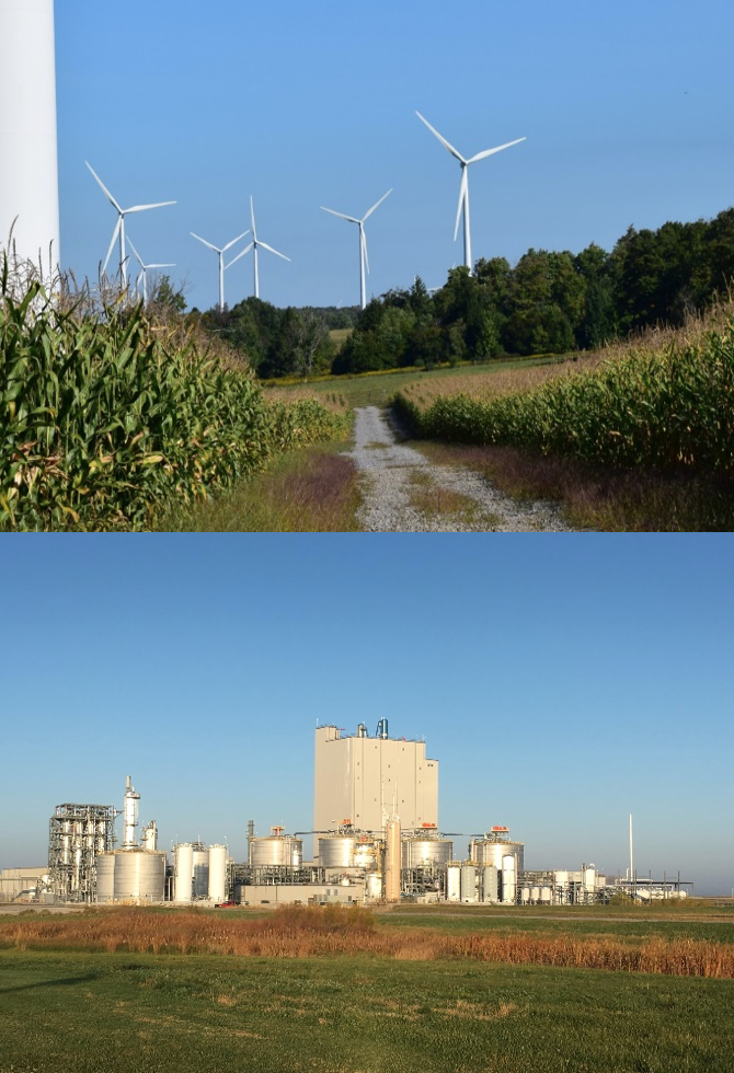
Many Midwestern states have become energy as well as food producers. North Dakota and Oklahoma produce lots of the non-renewable kind, but for the other Midwestern states, the energy comes primarily from ethanol and wind. The U.S. Energy Information Administration (EIA) reported that during 2018, 92% of the 383.1 million barrels of ethanol produced in the United States came from the Midwest, as did 47% of the total USA production, 275 TeraWatt-hours, of wind-generated electricity. In Iowa, wind turbines occupy about 7 thousand acres, which round up to 0.03% of the 23 million acres of cropland, and generate 42% of electricity produced in the state.
But first: Mike Lipsman is an economist, who is President and Chief Economist for the Strategic Economics Group (SEG). During both his years with state government and as a private consultant he has completed numerous agricultural and energy sector studies. We are happy to publish the meticulous work he did on this article, which presents high-level views of the gross and net energy yields from ethanol and wind technologies in the United States, and then uses Iowa as a case study to illustrate the tradeoffs between the two technologies.
The Energy Balance: The first contender
In the United States corn serves as the primary feedstock for the production in ethanol. In other countries, such as Brazil, ethanol is made from sugar cane or other crops. The average energy content of a gallon of ethanol equals 76,100 BTUs (British thermal units). About 2.8 gallons of ethanol can be produced from one bushel of corn.
But the important number is the energy balance or Energy Returned on Energy Invested (EROEI), the ratio of the amount of energy contained in a gallon of ethanol and the amount required to produce that gallon. Here there is room for disagreement: How carefully should inputs be analyzed, and which assumptions are most useful? Not for us to say, and we’ll stay out of those weeds.

In their January 2016 article, Bentsen, Felby, and Ipsen summarize energy balance findings from 27 prior studies, twelve of which pertain to corn-based ethanol produced in the United States. Looking at the US studies, energy balances are somewhat higher if credits for by-products, like distillers grain used for animal feed, are allowed, and range from 0.58 to 1.14 without such credits, and 0.69 to 1.9 with. Of course, the technology used to produce ethanol has itself become more energy efficient and, indeed, the lowest values come from studies produced in 1991, the highest from a 2005 study, so we’ll use 1.9. That energy balance means a gallon of ethanol yields net energy equal to 36,047 BTUs, and a bushel of corn used to produce ethanol produces net energy of 100,932 BTUs.
As an aside, commercial-scale ethanol production got underway during the oil embargoes of the 1970s, and as a replacement for lead used to lift octave levels. The less-than-1 ratios above mean that ethanol production was consuming more energy than it produced, but was achieving other objectives.
The Energy Balance: Enter the Turbine….
The National Renewable Energy Laboratory’s survey of 172 wind firms shows that including the concrete tower pad, power substations, and access roads, a utility-scale wind turbine with a nameplate capacity of about 2MW directly occupies about 1.5 acres. To minimize the effects of turbulence, the optimal density of wind turbines is about five per square mile, and most of the land in a wind farm remains available for crop production and pasture.
No matter what you often hear, it takes 0.27 years for a 2MW wind turbine to produce the amount of energy consumed to install it, and the average life-span of the turbine is 20 years. That means about 74.1 times more energy comes out than goes in. That compares to ethanol’s highest efficiency measure, just 1.9 times as much energy as was consumed in production. For those of you who like to think in gross margins, a wind turbine’s net yearly output is 98.7%.
Details: A 2MW wind turbine with an efficiency factor of 30%, meaning it’s producing energy about 30% of the time, will generate 17,933.5 billion BTUs of energy per year. Spread over its 20-year life, the annual amount of energy consumed in manufacturing and installing a 2MW wind turbine is 242.1 billion BTUs, and the net amount of energy produced by a 2MW wind turbine equals 17,691.4 billion BTUs/year.
How’s it going in Iowa?
During 2018, Iowa produced 2.5 billion bushels of corn, and Iowa’s ethanol plants produced 4.4 billion gallons of fuel ethanol, about 27% of total U.S. production. This implies that about 1.6 billion bushels of corn were used to produce ethanol, equating to a net energy yield of 156.8 trillion BTUs. Iowa’s wind turbines generated 21,685.1 GWh of electricity during 2018, or 73.0 trillion net BTUs. That means ethanol yielded about 2.15 times as much net energy as did wind turbines, but the amount of corn used to produce the ethanol spread over 7,800,000 acres, while the land occupied by the 4,859 utility-scale Iowa wind turbines was just a bit more than 7,000 acres. Problem number one.
But let’s look at net revenue. The past couple of years have not been particularly good financially for corn farmers in Iowa. According to Iowa State University Extension, the average cash price of corn in 2019 was $3.71 a bushel, while the fully allocated cost of growing that bushel ranged from $3.23 to $3.76, depending on whether the field was planted in soybeans or corn the prior year, if you must know. So, on a fully allocated cost basis the return for planting corn during 2019 was either a loss of 5-cents per bushel or a gain of 48-cents. On a per-acre basis, assuming a 200-bushels per acre yield, the return ranged between -$10 and $96. And even if only variable costs are taken into consideration the gross margin from planting corn averaged only between $350 and $420 per acre.
Property owners who lease their land for siting wind turbines generally receive annual payments of 2% to 4% of the gross revenue yielded by the wind turbine. Working with the nameplate capacity of Iowa’s utility-scale wind turbines, averaging 1.65MW with a 33% efficiency, or 4,813.2 MWh per turbine a year, and the retail price of electricity in the state, $89.2/MW, shows that the average return on a turbine is $429,377, or $286,224 per acre. At 3%, that’s a $8,600 payment to the landowner per acre, which compares to the highest margin on ethanol inputs of $420.00. ($8,600 is higher than that coming from the older turbines in place that have lower capacity.)
Wind farming can be a lucrative, reliable, and stable source of supplementary income for rural landowners. Iowa ranks second in terms of wind capacity and first in terms of share of electricity produced from wind in the nation, and has real potential to expand. The National Renewable Energy laboratory estimates that Iowa has a wind energy potential of 570,714 MW, so Iowa’s existing capacity of 10,190MW barely scratches the surface. It’s kind of “fun with statistics” to put that in percentage terms, but that’s an eye-popping growth rate of 5,600%. Consider the effects of that kind of sustainable growth around the country.
The Farm Bureau is not on board, and there’s a lot of pushback, often supported by claims that don’t hold up. And many complaints that have merit can be mitigated. But straight-up economics suggest that farming electrons is far more lucrative than farming ethanol, and would go a lot further toward bridging the rural divide.
Side note:
Birds, and don’t forget bats, do get killed flying into turbines, and about one third of those deaths are large, scarce raptors, including our beautiful arctic visitors who wing down every winter to course our fields. Sound conservation practices & wise siting can offset some of this, while providing local employment BTW, and slower blades are already lowering the counts.
Nevertheless, when we think about the raw numbers of bird deaths from different sources, we have to consider the status of each species involved, not easy to do. Estimates vary widely, and are changing as more solar and wind-generating facilities are built. There are also real concerns about differential detectability, as in, is it easier to find evidence of bird kills near urban buildings than by rural turbines? In any case, some of the highest current estimates for wind turbines are about 330,000 a year. Too many, yes, but dwarfed by annual deaths from building strikes, with current estimates ranging from hundreds of millions to a billion, fatalities from agricultural chemicals used in corn and soybean production, or feral and free-range cats, whose kills are in the billions.
Or take a page from Benjamin Sovacool who suggests we look at death rates in terms of energy produced. His preliminary findings
show wind farms responsible for 0.3 fatalities per GWh, with fossil-fuel powered stations responsible for 5.2 fatalities, a figure that, of course, includes the effects of climate change.
Not the last word, but a context. In the meantime, please keep your cats in, and support lights out programs to reduce building strikes.


