Opening Gambits
There seems to be a consensus that the high level of job openings—September’s reading of 6.5% of employment is off from March’s all-time high of 7.3%, but it’s still at the 95th percentile of all months since December 2000—has contributed to inflationary pressures. We’ve long been skeptical about what the openings component of the JOLTS program measures, wondering whether it’s boosted by employers who say, “sure would like an app programmer for $10 an hour but I can’t find anyone!” And a lot of us wouldn’t mind being 35 again either.
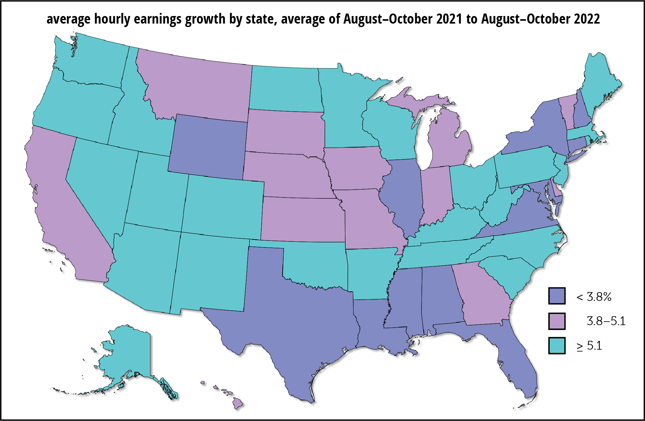
We thought a look at recent state openings data might be clarifying. (We used three-month averages to smooth some of the volatility, which is greater at the state level than nationally.) It was clarifying all right: openings bear no relationship to wages.
That point is made by the maps below. The states are shaded so that high, medium, and low openings and high, medium, and low wage growth are represented by the same colors. If openings and wage growth were tightly correlated, the maps would look a lot more similar than they do.

Another way of making the same argument is with the scattergram below. Here too, there’s no relationship at all. The eye doesn’t want to add a trendline because there is none.
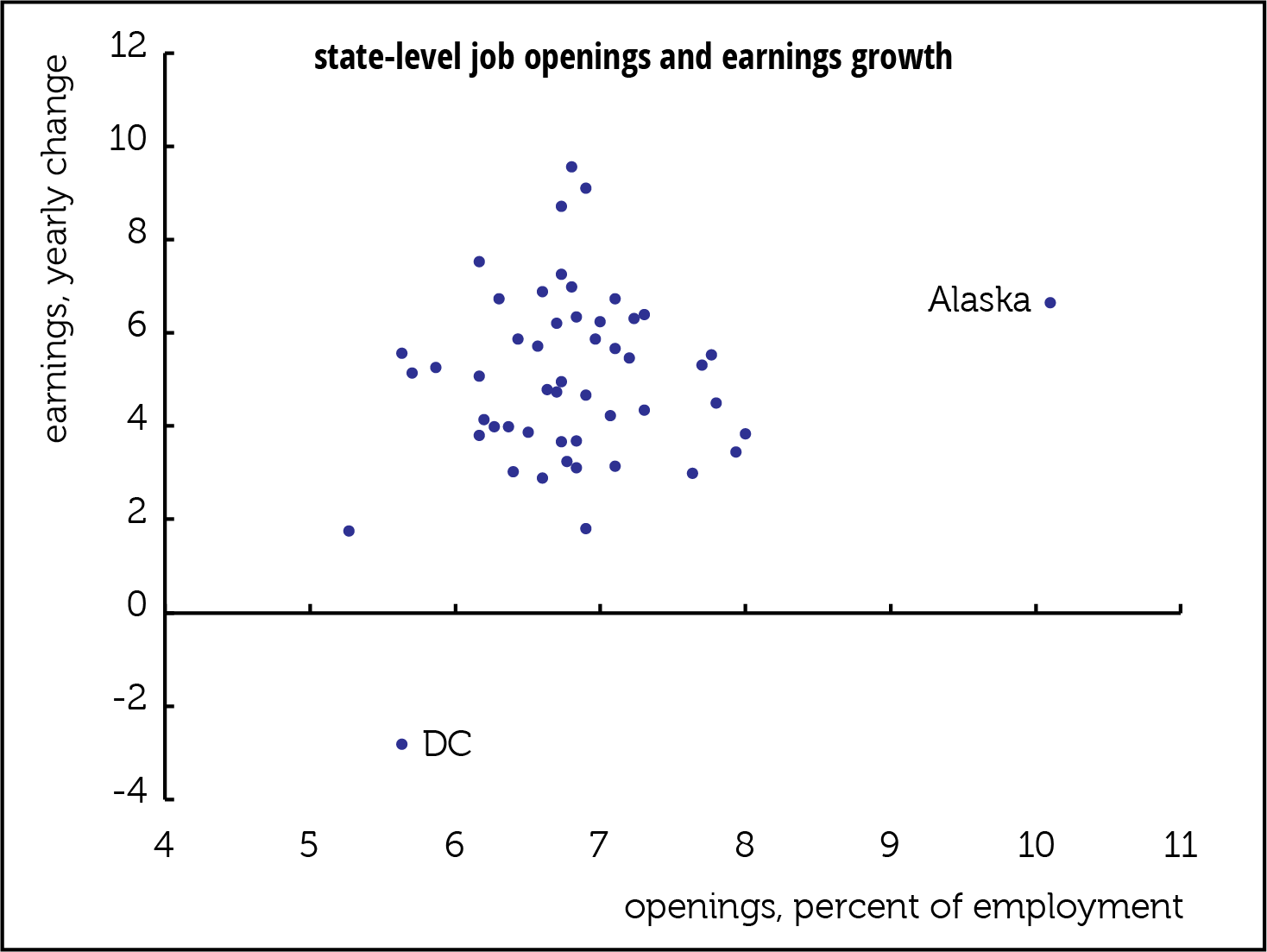
The lack-of-trendline point can also be made with a simple regression of average hourly earnings growth on openings. That yields an r2 of 0.02, meaning that the openings explain all of 2% of the variation in earnings growth. Worse, there’s a 15% chance that the relationship is entirely random. And the relationship is flattered by the two outliers (DC and Alaska, labeled in the scatter). Take them out and the r2 falls to 0.00 and the chance of randomness rises to 87%.
Aside from the fact that this has never looked like a wage-driven inflation, these opening stats explain nothing.

