We happened to come across some graphs from several years ago by Pavlina Tchernova of Bard College showing the growth in income by expansion for the top 10% and bottom 90% and wondered what an update would look like. We didn’t do exactly what she did, but we did want to give her credit for the general idea.
The striking graphs below tell the story by themselves, using numbers assembled by Thomas Piketty and Emmanuel Saez. In the expansions from the end of the World War II to 1973, the further up the income distribution you went, the lower the income gains. For the first five cycles, the bottom 90% saw an average of unweighted average of the growth for the bottom 90% first five cycles of 17%; for the second five cycles (the current one only through 2018), of 6%. For the top 1%, the figures are 7% and 52%. The first is less than half the bottom 90%’s performance; the second, almost eight times as much.
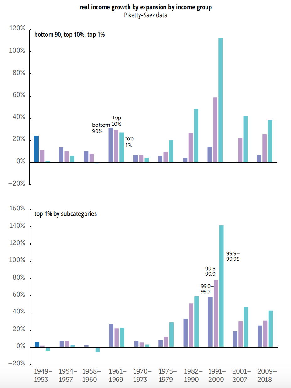
Within the top 1%, similar patterns prevail. For the 99.0–99.5% set, the gains were 10% and 29% for the two sets of cycles; for the 99.9–99.99% fellowship, the figures are 4% and 64%.
We live in very separate economic universes. Your opinion of that depends heavily on your percentile, but whether it’s sustainable is open to question.

