“Credit positive activities,” A Short-lived Phenomenon
According to a Moody’s analysis of 100 large companies, after an initial round of “credit positive activities,” notably debt reduction, following the corporate tax cuts in the 2017 overhaul, firms have shifted their attention to stock buybacks. The tax cuts increased corporate cash flow by almost $400 billion in 2018. Of that increment, 37% went to debt reduction in the first half; that fell to 14% in the second half. Just over a third, or 36% went to share repurchases in the first half; in the second half, that soared to 60%. Capital spending’s share went from 22% in H1 to 20% in H2.
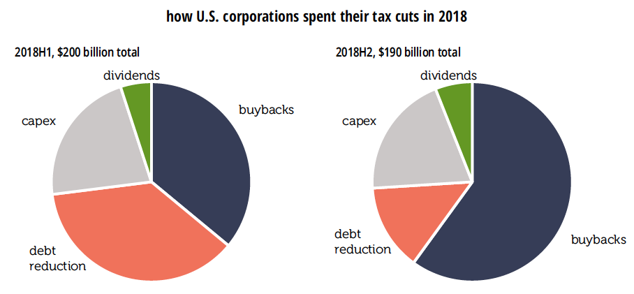
The first half’s gross debt paydown exceeded gross borrowing, making for a net reduction in debt outstanding. In the second half, however, firms returned to net borrowing (though at a rate considerably below 2016 and 2017).
Shifting the focus from the uses of the tax cut gusher alone, firms devoted 49% of their total cash outflow to capex in 2016–2017; that fell to 41% in 2018. But the share devoted to buybacks went from 25% to 31%.
Moody’s report pairs nicely with a new NBER working paper by Daniel Greenwald of MIT, Martin Lettau of Berkeley, and Sydney Ludvigson of NYU, “How the Wealth Was Won: Factors Shares as Market Fundamentals.” They find that between 1989 and 2017, $23 trillion in real equity wealth was created by the nonfinancial corporate sector. More than half, 54%, of that increase “was attributable to a reallocation of rents to shareholders in a decelerating economy.” (To be specific, those rents were reallocated away from labor.) Economic growth accounted for 24% of those gains, lower interest rates for 11%, and a lower risk premium, also for 11%. By contrast, between 1952 and 1988, less than half as much wealth was created, but almost all of it, 92%, can be attributed to economic growth. Conventional estimates of the equity risk premium are, by their work, overstated by 50%.
Unlike many models of stock returns, rather than imagining a single representative agent, Greenwald et al. divide the population into shareholders and workers—in line with a world where the top 5% of stock wealth distribution owns 76% of total stock market value. Shareholders earn relatively little of their income from labor, and workers earn almost all of theirs that way. In this model, shifts in income from labor to capital, which play no role in the traditional valuation literature, have a significant explanatory power over stock market returns. A reminder that two of the three authors of the paper are business school professors and not freelancing Bolsheviks.
What about the low interest rates of recent years? The authors find they explain little of the stock market’s rise since the financial crisis. While real rates are low by the standards of the 1984–2000 period, they’re not by the standards of the 1950s through the 1970s.
Greenwald et al. do not address buybacks specifically, but they certainly fit in with the distributional shift towards shareholders in their model.
Philippa Dunne & Doug Henwood