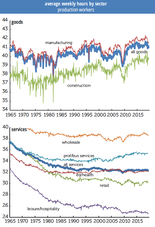
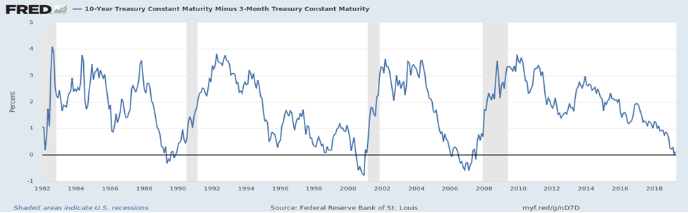
Articles by: admin

Farming Electrons

Many Midwestern states have become energy as well as food producers. North Dakota and Oklahoma produce lots of the non-renewable kind, but for the other Midwestern states, the energy comes primarily from ethanol and wind. The U.S. Energy Information Administration (EIA) reported that during 2018, 92% of the 383.1 million barrels of ethanol produced in the United States came from the Midwest, as did 47% of the total USA production, 275 TeraWatt-hours, of wind-generated electricity. In Iowa, wind turbines occupy about 7 thousand acres, which round up to 0.03% of the 23 million acres of cropland, and generate 42% of electricity produced in the state.

But first: Mike Lipsman is an economist, who is President and Chief Economist for the Strategic Economics Group (SEG). During both his years with state government and as a private consultant he has completed numerous agricultural and energy sector studies. We are happy to publish the meticulous work he did on this article, which presents high-level views of the gross and net energy yields from ethanol and wind technologies in the United States, and then uses Iowa as a case study to illustrate the tradeoffs between the two technologies.

The Energy Balance: The first contender

In the United States corn serves as the primary feedstock for the production in ethanol. In other countries, such as Brazil, ethanol is made from sugar cane or other crops. The average energy content of a gallon of ethanol equals 76,100 BTUs (British thermal units). About 2.8 gallons of ethanol can be produced from one bushel of corn.

But the important number is the energy balance or Energy Returned on Energy Invested (EROEI), the ratio of the amount of energy contained in a gallon of ethanol and the amount required to produce that gallon. Here there is room for disagreement: How carefully should inputs be analyzed, and which assumptions are most useful? Not for us to say, and we’ll stay out of those weeds.

In their January 2016 article, Bentsen, Felby, and Ipsen summarize energy balance findings from 27 prior studies, twelve of which pertain to corn-based ethanol produced in the United States. Looking at the US studies, energy balances are somewhat higher if credits for by-products, like distillers grain used for animal feed, are allowed, and range from 0.58 to 1.14 without such credits, and 0.69 to 1.9 with. Of course, the technology used to produce ethanol has itself become more energy efficient and, indeed, the lowest values come from studies produced in 1991, the highest from a 2005 study, so we’ll use 1.9. That energy balance means a gallon of ethanol yields net energy equal to 36,047 BTUs, and a bushel of corn used to produce ethanol produces net energy of 100,932 BTUs.

As an aside, commercial-scale ethanol production got underway during the oil embargoes of the 1970s, and as a replacement for lead used to lift octave levels. The less-than-1 ratios above mean that ethanol production was consuming more energy than it produced, but was achieving other objectives.

The Energy Balance: Enter the Turbine….

The National Renewable Energy Laboratory’s survey of 172 wind firms shows that including the concrete tower pad, power substations, and access roads, a utility-scale wind turbine with a nameplate capacity of about 2MW directly occupies about 1.5 acres. To minimize the effects of turbulence, the optimal density of wind turbines is about five per square mile, and most of the land in a wind farm remains available for crop production and pasture.

No matter what you often hear, it takes 0.27 years for a 2MW wind turbine to produce the amount of energy consumed to install it, and the average life-span of the turbine is 20 years. That means about 74.1 times more energy comes out than goes in. That compares to ethanol’s highest efficiency measure, just 1.9 times as much energy as was consumed in production. For those of you who like to think in gross margins, a wind turbine’s net yearly output is 98.7%.

Details: A 2MW wind turbine with an efficiency factor of 30%, meaning it’s producing energy about 30% of the time, will generate 17,933.5 billion BTUs of energy per year. Spread over its 20-year life, the annual amount of energy consumed in manufacturing and installing a 2MW wind turbine is 242.1 billion BTUs, and the net amount of energy produced by a 2MW wind turbine equals 17,691.4 billion BTUs/year.

How’s it going in Iowa?

During 2018, Iowa produced 2.5 billion bushels of corn, and Iowa’s ethanol plants produced 4.4 billion gallons of fuel ethanol, about 27% of total U.S. production. This implies that about 1.6 billion bushels of corn were used to produce ethanol, equating to a net energy yield of 156.8 trillion BTUs. Iowa’s wind turbines generated 21,685.1 GWh of electricity during 2018, or 73.0 trillion net BTUs. That means ethanol yielded about 2.15 times as much net energy as did wind turbines, but the amount of corn used to produce the ethanol spread over 7,800,000 acres, while the land occupied by the 4,859 utility-scale Iowa wind turbines was just a bit more than 7,000 acres. Problem number one.

But let’s look at net revenue. The past couple of years have not been particularly good financially for corn farmers in Iowa. According to Iowa State University Extension, the average cash price of corn in 2019 was $3.71 a bushel, while the fully allocated cost of growing that bushel ranged from $3.23 to $3.76, depending on whether the field was planted in soybeans or corn the prior year, if you must know. So, on a fully allocated cost basis the return for planting corn during 2019 was either a loss of 5-cents per bushel or a gain of 48-cents. On a per-acre basis, assuming a 200-bushels per acre yield, the return ranged between -$10 and $96. And even if only variable costs are taken into consideration the gross margin from planting corn averaged only between $350 and $420 per acre.

Property owners who lease their land for siting wind turbines generally receive annual payments of 2% to 4% of the gross revenue yielded by the wind turbine. Working with the nameplate capacity of Iowa’s utility-scale wind turbines, averaging 1.65MW with a 33% efficiency, or 4,813.2 MWh per turbine a year, and the retail price of electricity in the state, $89.2/MW, shows that the average return on a turbine is $429,377, or $286,224 per acre. At 3%, that’s a $8,600 payment to the landowner per acre, which compares to the highest margin on ethanol inputs of $420.00. ($8,600 is higher than that coming from the older turbines in place that have lower capacity.)

Wind farming can be a lucrative, reliable, and stable source of supplementary income for rural landowners. Iowa ranks second in terms of wind capacity and first in terms of share of electricity produced from wind in the nation, and has real potential to expand. The National Renewable Energy laboratory estimates that Iowa has a wind energy potential of 570,714 MW, so Iowa’s existing capacity of 10,190MW barely scratches the surface. It’s kind of “fun with statistics” to put that in percentage terms, but that’s an eye-popping growth rate of 5,600%. Consider the effects of that kind of sustainable growth around the country.

The Farm Bureau is not on board, and there’s a lot of pushback, often supported by claims that don’t hold up. And many complaints that have merit can be mitigated. But straight-up economics suggest that farming electrons is far more lucrative than farming ethanol, and would go a lot further toward bridging the rural divide.

Side note:
Birds, and don’t forget bats, do get killed flying into turbines, and about one third of those deaths are large, scarce raptors, including our beautiful arctic visitors who wing down every winter to course our fields. Sound conservation practices & wise siting can offset some of this, while providing local employment BTW, and slower blades are already lowering the counts.

Nevertheless, when we think about the raw numbers of bird deaths from different sources, we have to consider the status of each species involved, not easy to do. Estimates vary widely, and are changing as more solar and wind-generating facilities are built. There are also real concerns about differential detectability, as in, is it easier to find evidence of bird kills near urban buildings than by rural turbines? In any case, some of the highest current estimates for wind turbines are about 330,000 a year. Too many, yes, but dwarfed by annual deaths from building strikes, with current estimates ranging from hundreds of millions to a billion, fatalities from agricultural chemicals used in corn and soybean production, or feral and free-range cats, whose kills are in the billions.

Or take a page from Benjamin Sovacool who suggests we look at death rates in terms of energy produced. His preliminary findings
show wind farms responsible for 0.3 fatalities per GWh, with fossil-fuel powered stations responsible for 5.2 fatalities, a figure that, of course, includes the effects of climate change.

Not the last word, but a context. In the meantime, please keep your cats in, and support lights out programs to reduce building strikes.

“The boss told me, I’d get paid weekly…

…and that’s exactly how I’m paid.” Johnny Paycheck

If it’s so hard to find workers…

The Bureau of Labor Statistics announced in August that real hourly earnings were down 0.1% for all employers in July (+0.3% in earnings +0.3% increase in CPI for urban consumers, and rounding—more on that in a bit), and real weekly earnings were down 0.3%, adding in the 0.3% decrease in the average workweek.

Over the year, real hourly earnings were up 1.3%, but the workweek was down 0.3%, and average weekly earnings were up just 0.8%.

For production and non-supervisory workers, real hourly earnings were down 0.2% in July (+0.2% in earnings and +0.4% in the price index for Urban Wage Earners and Clerical Workers), and weekly earnings were down 0.5% in the month, adding in the decline in the workweek. Over the year, real earnings were up 1.6%, but a 0.9% decline in the workweek spiked that down to +0.7% in weekly wages.

It’s tough getting used to a falling workweek—it was so easy just to leave 34.5 hours circled on the forecast spreadsheet—but the declines seem to be real and persistent, and not just coming from the sectors one would expect, like retail, which has been falling for decades. The Bureau of Labor Statistics has, of course, added in specific sectoral detail to their releases over time and, as one would expect, the goods-producing sectors were the first to come online.

We started the graphs below in 1965 for consistency’s sake, though manufacturing goes back all the way back to 1941 (and some sectors don’t begin until 1972). World War II really shows up in the early years of the series, when the workweek exceeded 45 hours, but it fell back towards 40 with demobilization. It’s too bad we can see what other sectors looked like back then.


Please note the difference in hours worked in the graphs: the goods sector shows no long-term decline, leisure & hospitality is low and weakening, and the split between wholesale and retail trade widening, for obvious reasons.

The all-workers series starts in 2006, so we didn’t use it for graphing, but we did compare recent performance of the all workers and production work weeks. For private service-providing workers, the production side lost 0.3 hour in 2014 but all workers did not, meaning supervisory hours were up, but recently they have moved together, although production workers’ week is 6 minutes longer.

Production workers hours are more jagged in the logging and mining sector and have seen some declines that don’t show up in all hours. (Logging and mining isn’t graphed, because things were getting crowded.) Also, production workers’ hours, at 47.2, are below their 2014 peak of 47.9, while all workers’ weeks are longer than they have been since 2006. In manufacturing, production hours’ slide from 42.4 to 41.5 since April 2018 is a bit steeper than all worker’s decline, but in retail trade, oddly, production workers’ hours have risen 8/10s to 30.2 while all workers fell from 31.8 hours to 30.7.

In leisure & hospitality, all workers are half an hour above their prior trough while production workers are below, and in bars & restaurants production workers are now slipping in a modest jagged way, but still up about half an hour from the 2010 trough, while all workers are slightly down.

The two series travel together in construction, and in education & health, although, you guessed it, health care hours are stronger than education hours. One could make a “we don’t need no education” crack about that, but since there are a lot of people working for those “under federal investigation” for-profit outfits on that line, we’ll raise a glass instead.

Using a long line graph obscures recent movements, so we’ll note that over the year total all-worker private workweeks are down from 34.5 to 34.3 hours, and within that goods production is down 0.4 tenths of an hour, construction down 0.3 over the year and down 0.2 over the month, manufacturing down 0.6 over the year and 0.3 over the month. Retail was steady over the month, at 30.7 hours, which is down 0.4 from last year, and education and health are flat for the year and month, but down 0.1 from earlier in 2019. Leisure & hospitality is down 0.3 over the year, and transportation and warehousing down a full hour to 38.1 hours. Manufacturing overtime for both durable and non-durable goods continues to fall.

If it is so hard to find workers, and firms are holding on to their current employees, many of whom want to work longer hours, why are workweeks falling?

by admin· · 0 comments · Employment & Productivity

Benchmark Blues: BLS to Cut 0.3%, or 501,000 jobs, from 2019 levels

The extrapolation methods used by the Bureau of Labor Statistics in producing their monthly estimates (their word) of NonFarm Payroll (NFP) growth can obscure the magnitude of cycle turns, which is why it is important to pay attention to the annual benchmark, derived from the Unemployment Insurance filings mandated by federal law that cover 97% of the NFP universe.

The rule of thumb at the BLS is that if the benchmark falls between +/-0.2%, the average of the last 10 years, everything is copacetic, but if it exceeds that there is real information there. This morning the BLS released the preliminary benchmark for 2019 and, unfortunately, there is information there. The overall employment level is slated to be taken down by -0.3% or 501,000 jobs when it is made formal in January 2020, and in the private sector -0.4%, or -514,000 of the jobs previously estimated will be benchmarked away.

Largest losses are in logging & mining, -2.2%, or a scant -16,000 jobs, leisure & hospitality -1.1%, a not-so scant -175,000 jobs, retail trade -0.9%, or -146,400 jobs, professional/business services, -0.8%, or -163,000 jobs, and wholesale trade, -0.6%. Transportation & warehousing will be revised up 1.4%, or about 80,000 jobs, information 1.2% or 33,000 jobs, and government 0.1%, or 13,000 jobs. That’s it for the plus signs.

As you can see on the table, this is both out of trend, and the largest negative benchmark since the 2010 decline in the aftermath of the great recession.

Dwindling Labor Share

Here we revisit a familiar topic: the decline in the labor share of national income. We were prompted to revisit by a recent post to the St. Louis Fed’s website with the provocative title “Capital’s gain is lately labour’s loss” (Anglo spelling in original). It draws on the work of Loukas Karabarbounis and Brent Neiman (KN), which we’ve also discussed, though mostly in passing. KN’s data runs only through 2012; the St. Louis Fed post draws on their in-house FRED database to update it through 2017 for five major economies.

The declining labor share is interesting for several reasons. For decades, most economists assumed the share to be constant, which makes it far easier to develop economic models of production functions and economic dynamics. But the labor share is not constant. In their examination of 59 countries with at least 15 years of data between 1975 and 2012, BN found 42 with a declining labor share, measured against corporate value-added. A major reason is the declining cost of investment goods; the St Louis researchers present a series showing a near-relentless decline in the price of capital goods vs. consumer goods since 1948, with an acceleration in the 1980s. (The average decline from 1948 through 1979 was 1.6%; from 1980 to 2016, 2.6%.) That makes it easy to substitute capital for labor, to the detriment of labor’s share.

The extension of the data for the five years doesn’t change the fundamental story. The labor share in the five economies shown in the graph on the top of p. 7 was little changed between 2012 and 2017, despite sharp declines in the unemployment rates in most. You might think that a tightening labor market might boost labor’s share, but that hasn’t happened.

As the graphs above show, the declines happened to different degrees and over different intervals for the five countries shown. The declines range from 3 percentage points in the US to 8 in Canada; expressed as percentage (not point) declines, they range from 5% in the US to 11% in Canada (with the other four countries not far behind). Remember, it had been a well-established axiom in economics that this was not supposed to happen.

BN find that most of the decline in the labor share has happened within industries, so it can’t be explained by compositional changes such as the shift from manufacturing to services, which, among other things suggests things other than globalization are at work (given the varying exposure of different industries to international competition). And they also find a decline in the labor share within China, which makes it an unlikely culprit for the decline in the labor share in the richer countries.

They conclude that the decline in the price of investment goods accounts for about half the decline in labor’s share. An interesting question is what accounts for the other half. They don’t examine the effect of labor market deregulation and the declining power of unions, but those seem like worthy avenues of investigation, as they have been in other research pieces.

Inversion: What is the Yield Spread Telling Us Now?

A Little Background

On March 22nd the spread between the yields on 3-month and 10-year Treasury debt securities inverted. This reversal of the normal relation between yields for short- and long-maturity Treasuries typically signals an impending recession. Each of the past three recessions has been preceded by similar yield spread inversions.

The question often asked about this particular economic indicator is “Does it simply signal an impending recession, or does it somehow cause one to occur?” At least over the past thirty years inverted yield spreads have been followed by recessions. Depending on how long the inversion lasts and how large the reversal of yields is, the inversion can also be a major contributor to an economy’s decline into recession, something people tend to forget.

Particularly in more recent years, when banks have come to rely more on borrowed funds and less on savings deposits for the money they lend, a yield inversion has resulted in banks tightening their lending standards as the profitability of loans declines. This in turn can result in less business investment and slower economic growth.

In their 4th-quarter survey of senior bank loan officers, the Federal Reserve found a tightening of loan standards for commercial real estate, while standards for other commercial and industrial loans remained unchanged from the prior quarter. Combined with the finding that demand for all types of loans to households weakened, the results imply the nation is moving into a period of slower economic growth.

Here’s a review of some of the characteristics of the inverted yield spreads that preceded the past three recessions.

Yield Curve vs Yield Spread

The yield curve shows the relationship among the yields across all Treasury debt maturities. A single yield curve shows the relationship among the yields for different maturity Treasury debt securities at a single point in time. Graphing multiple yield curves on the same axes reveals changes in the location and slope of the curve over time.

The following chart presents yield curves based on average monthly yields for each of the past five Januaries and for March 2019. For January 2015, 2016 and 2017 the curves are generally parallel but move up by about 0.5pps between 2015 & 2017. In 2018 the curve begins to rotate and flatten with the yield for the 3-month Treasury bill rising by 0.91% from January 2017 to January 2018, while for 30-year Treasury bonds the yield declined by 0.14%.

By January 2019, the yield for the 3-month Treasury bill moved up to 2.42%, 0.99% above the average yield in January 2018. The yield of the 30-year Treasury bond averaged 3.04%, just 0.16% above the prior January, meaning that at the beginning of this year the spread was just 0.62%. During March 2019, the 3-month yield held at about 2.41%, and the 30-year bond yield fell to 2.80%, which reduced the spread from the bottom to the top of the curve to just 0.39%. Of greatest interest: In March, the yields for the 5-year and 7-year notes fell below the yield for 3-month Treasury bills.

The yields for any two debt securities may be used to compute a yield spread. As the result of past studies, attention has focused on the spread between the 3-month Treasury bill and the 10-year Treasury note yields because this particular spread has proven to be a particularly good predictor of coming recessions about one year into the future. The following chart from the St. Louis Federal Reserve Bank economic data site shows this relationship.

As the chart shows, inversions do not occur suddenly, but after a long period of decline in the spread between the yields of these two Treasury debt maturities. For example, the decline in the 3-month to 10-year yield spread began in April 5, 2010. Nevertheless, given the current apparent strength of the U.S. economy, and the long period of law rates, some skeptics believe this time is different, and that the U.S.economy will not slip into recession over the next year.

So let’s take a look at the conditions that led up to the last three recessions to see if such skepticism is justified, including the date the spread first inverted, the length of the inversion, the maximum value of the inversion, the changes in the 3-month and 10-year yields that caused the inversion, changes in Fed policy an inflation, and the lag between the end of the inversion and the beginning of the recession.

Note bene: For all three cycles, the yield spread peaked between 3.76% and 3.85%.

Cycle 1: October 28, 1987 through November 6, 1992

At the beginning of this cycle the yields for the 3-month and 10-year Treasuries were 5.25% and 9.01%, resulting in a spread of 3.76% and the Fed’s federal funds rate target was 7.31%, while the year-over-year rate of change in the consumer price index (CPI) was 4.36%, the good old days.

During this cycle 17 months elapsed between the maximum value and the inversion. Over that period the yield on the 3-month Treasury bill rose by 4.20%, from 5.25% to 9.45%, and federal funds target rate increased by only 2.4% from 7.3% to 9.8%. The yield on the 10-year Treasury note increased only slightly from 9.01% to 9.44%, and the rate of inflation ticked up by 0.53% from 4.36% to 4.89%. That means most of the decline in the spread occurred due to an increase in the 3-month Treasury bill yield. The increase in the 3-month yield may have been partially due to the increase in the federal funds target rate, but other factors must have played a role since the 3-month yield increased by much more than the target rate.

And the expectation of continued relatively high inflation, running at 5% when the inversion occurred, surely influenced both the 3-month and 10-year yields.

The spread initially inverted on March 27, 1989, and almost two months the cycle’s extended inversion period began, running from May 22, 1989 until December 28, 1989. The maximum inversion occurred on June 9, 1989, -0.35%, and the spread was negative for 98 (44.5%) of the 220 days of inversion.

This economic cycle’s recession began during July 1990, 15 months after the 3-month to 10-year yield spread initially inverted, and run for eight months into March 1991. Unemployment peaked at 7.8%, GDP dropped by 1.4%, and at the end of the recession inflation remained at a relatively high 4.82%, little changed from the beginning, and the federal funds target rate was 6.0%.

Cycle 2: November 6, 1992 through May 13, 2004

At the start of this cycle the yield for the 3-month Treasury bill was 3.13% and the yield for the 10-year Treasury note, 6.97%, giving a 3.84% spread. The federal fund target rate was 3.00% and the year-over-year growth rate of the CPI equaled 3.12%.

This is a different picture, and the close correspondence of the 3-month yield, the federal funds target rate, and the CPI growth rate is noteworthy. During this cycle the 3-month and 10-year Treasury yields initially inverted on September 10, 1998, with the 3-month yield at 4.78%, the 10-year yield at 4.76%, and the federal funds target at 5.50%, while the CPI measure of inflation stood at only 1.43%.

Following the initial inversion 22 months elapsed before an extended inversion period began, extending from July 7, 2000 until February 9, 2001. During this 217 day period, the yield spread was negative for 61.3% of the period, or 133 days. The deepest inversion occurred on January 2, 2001, when the 3-month Treasury bill yield was 5.87% and the 10-year Treasury note yield was 4.92%, and the spread was -0.95%. The federal funds target rate and the CPI inflation rate stood at 6.50% and 3.72%.

A recession followed 30 months after the initial inversion, and 8 months after the extended inversion began, running from March 2001 and until November 2001. This was a relatively mild recession with peak unemployment reaching only 6.3% and GDP declining by only 0.3%. At the end of the recession the 3-month yield was 1.92% the 10-year yield, 4.79%, the spread 2.87%. The federal funds target rate equaled 2.00%, 4.00% below the level at the end of the last recession, and over the cycle CPI inflation rate dropped from 4.82% to 1.89%.

Cycle 3: May 13, 2004 through April 5, 2010

At the start of this period the yields for the 3-month and 10-year Treasuries was 1.00% and 4.85% resulting in a spread of 3.85%. The federal funds target rate was 1.00% and the CPI measure of inflation was 2.90%. By the mid-2000s inflation had largely been tamed, and except for a short uptick during the last recession it has remained low, which has complicated matters for monetary authorities.

On January 17, 2006, a relatively short 20 months later, a shallow and brief inversion occurred: the 3-month yield rose to 4.38% and the 10-year yield fell to 4.34%. There were 3 inversion days during January and 6 more in February. The extended period began on July 17, 2006, and by August 27, 2007 there had been 233 inversion days, or 57.4% of the period. The deepest inversion, on February 27, 2007, was -0.64%.

During those 13 months, the CPI fell from 4.1% to 1.9%, and the Fed left its target rate unchanged at 5.25%.

The recession that followed began in December 2007, 23 months after the initial inversion and 18 months after the beginning of the sustained period. As we all know, the Great Recession that extended until June 2009 was our worst economic downturn since the Great Depression: unemployment rose to 10.0% GDP shrank by 5.1%, and the misery indexes soared.

The Current Cycle: April 5, 2010 to Whenever

At the beginning of this period yields on the 3-month and 10-year Treasuries were 0.16% and 3.57%, and the spread, 3.41%. The first inversion took place on March 22, 2019, with 3-month Treasury bills at 2.46% and 10-years at 2.44%.

Over the 9 years & 11 months since the beginning of this cycle the upper range of the federal funds rate target rose from 0.25% to 2.50%, suggesting that the 3-month Treasury bill appears to have been pushed higher by Fed policy actions. Over the same period the yield on the 10-year Treasury note declined by 1.13%, and the CPI measure of inflation declined by 0.35% from 2.21% to 1.86%. Over this period the spread between the 10-year Treasury note and the 10-year TIPS (Treasury Inflation-Protected Security) declined from 2.35% to 1.91%, showing inflation expectations to be in check.

Summing Up

The following table provides a summary of key dates, yields, federal funds targets, and inflation rates for the past three economic cycles and for the beginning of the current cycle.

As the past three cycles have shown, a considerable amount of time may pass between the first inversion and the longer, sustained period. On May 1, the spread between the 3-month and 10-year Treasury yields was 0.10%.

Here are the take-aways:

• The peak values of the 3-month to 10-year Treasuries yield spread were tightly clustered between 3.76% and 3.85% at the start of the prior three yield spread cycles, but at the beginning of the current cycle the spread is somewhat lower at 3.41%.

• Federal Reserve Board increasing the federal funds target rate contributed to the shrinking of the yield spread during all three prior cycles, but this does not entirely explain the changes in 3-month Treasury bill yields. From the beginning of Cycle 1 until the first inversion the Fed funds rate target was up 2.44%, but the 3-month Treasury bill yield was up 4.20%. From the beginning of Cycle 2 until the first inversion, the Fed funds rate target rose by 2.50%, but the 3-month Treasury bill yield increased by only 1.65%. From the beginning of Cycle 3 until the first inversion the Fed funds target increased by 3.25% and the 3-month Treasury bill yield increased by 3.38%. For the current cycle the federal funds rate target increased by 2.25% and the 3-month Treasury bill yield increased by 2.30% from the cycle’s start until the initial inversion date.

• The nature of changes in the yields for the 10-year Treasury notes are mixed. From the time of peak yield spread until the first inversion the 10-year Treasury yield increased by 0.43% during Cycle 1, decreased by 2.21% during Cycle 2, decreased by 0.51% during Cycle 3, and decreased by 1.13% during the current cycle. For Cycles 1 and 3 and for the current cycle increases in the 3-month Treasury bill yield explain the majority of the collapse of the yield spread. But for Cycle 2, during the late 1990s and early 2000s, the decline of the 10-year Treasury note yield had the greater impact on the inversion of the yield spread.

• In addition, changes in the rate of inflation distinguish Cycles 1 and 3 from Cycle 2. During Cycle 1 the rate of inflation increased from 4.36% to 4.89% before the first inversion. For Cycle 3 the inflation rate rose 2.90% to 4.02% in the comparable period, but for Cycle 2 the rate of inflation decreased from 3.12% to 1.43%, a likely explanation for the drop in the 10-year Treasury note yield at the beginning of Cycle 2. During the current cycle inflation has also fallen, from 2.21% to 1.86%.

• For the prior three cycles the lapse between the initial inversion and the sustained inversion were 2 months, 21 months, and 6 months, and the lapse between the beginning of periods of sustained inversion and the start of the recessions were 13 months, 8 months, and 16 months.

Based on the analysis of the last three yield spread cycles, I would argue that long-term shrinkage of the 3-month to 10-year Treasuries yield spread indicates that the United States economy is headed for recession, with the obvious question, but when?, since lapses between initial inversions and the start of recessions has ranged from 15 to 30 months. And we are in uncharted territory.

I think Cycle 2, which extended from the mid-1990s to the early 2000s, is the most like the current one. That was a period of strong economic growth, low unemployment, and low and declining inflation. The bursting of the dot.com bubble put a major dent in that expansion, and although the 9/11 terrorist attacks were followed by declines in payroll employment, there was evidence at the beginning of September that such losses were coming.

Now there is considerable economic froth generated by the federal tax cuts & the resulting explosion of the federal deficit: inflated equity prices as tax savings flow into stock buy backs and increased dividends; and a rush of new tech initial public offerings that is goosing stock markets exuberance, which is curious since many of the companies issuing stock have no profits. And we have a long list of political unknowns that could disrupt the economy: domestic political turmoil, a Brexit related economic slowdown in Europe, a possible revolution and proxy war in Venezuela, and deepening trade disputes. Maybe I’ll stop there.

To me a reasonable guess is that we have another year to 18 months before recession provided no major political shocks occur. If the Federal Reserve continues in a holding pattern there will be little pressure from below to push up the 3-month Treasury yield. This time there may actually be a higher probability of downward pressure on the yield spread with inflation in check and a variety of factors pushing prices lower. These include a stronger dollar due to weakening foreign economies, government budget tightening, and continued growth of domestic oil and natural gas production.

The best advice for now is to just be watchful. Keep an eye on the 3-month to 10-year Treasuries yield spread. When it falls into a period of sustained inversion there will still be many months until a recession sets in. This should provide alert businesses and households with adequate time to plan for and adjust to the coming economic slowdown.

Mike Lipsman

by admin· · 0 comments · Sightlines Bulletin