Measuring the Platform
The “platform economy”—Uber etc.—is a lot smaller than people think it is. And workers would pay good money for better working conditions.
A lot of myths circulate about the contemporary labor market. One of the more durable is that we’re all day laborers now, working two temp jobs and driving an Uber on the side. As we showed back in June, BLS stats show that between 1.3% and 3.8% of all workers are contingent, depending on which definition you use, which are smaller shares than what prevailed in 1995 and 2005. In other words, hardly representative.
But what about what the BLS calls “electronically mediated employment,” platforms like Uber and TaskRabbit? Internet and barstool chatter would have you believe they’re ubiquitous—not as a way of hailing a ride but as a major form of employment. Data released by the BLS at the end of September challenges this story. In fact, such platforms account for just 1% of total employment. And over a fifth, or 22%, of such workers are in the transportation sector, more than four times that sector’s share of total employment. Take those away, and the electronically mediated account for just 0.8% of employment.
There were technical challenges
to evaluating the numbers, which were gathered as part of a supplement to the monthly Current Population Survey (CPS, the source of the household employment stats) for May 2017. Many respondents were apparently confused by this question into thinking they should answer “yes” if they drove to work or used a computer on the job:
Some people find short, IN-PERSON tasks or jobs through companies that connect them directly with customers using a website or mobile app. These companies also coordinate payment for the service through the app or website.
For example, using your own car to drive people from one place to another, delivering something, or doing someone’s household tasks or errands.
Does this describe ANY work (you/NAME) did LAST WEEK?
Since the BLS could compare responses to this question with respondents’ full answers to the CPS, they were able to discover a large number of false positives. For example, a banker, a cop, a professor, a motel desk clerk, a hairdresser, and a surgeon all answered “yes,” even though they shouldn’t have. The raw “yes” responses came to 3.3% of employment. But when the BLS recoded the answers to be consistent with the regular CPS questions, the share fell to 1.0%. For transparency’s sake, they report both sets of results. But given the rich comparative data provided by the standard CPS questions, the recodings look well-founded.
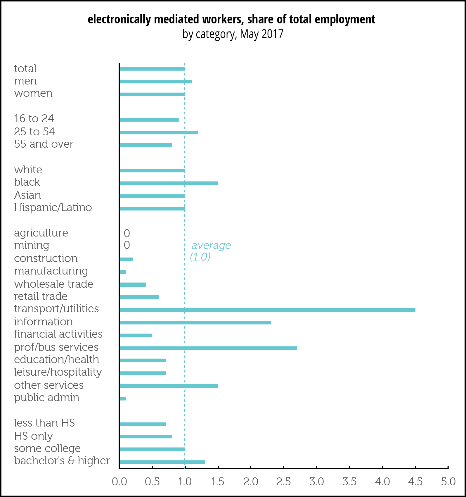
As the graph above shows, there were some variations by demographics and especially sector in the prevalence of platform employment. There was little gender difference. Blacks were somewhat more likely than others to be so employed. The share rose with education (and, although the graph doesn’t show these results, those with advanced degrees were more likely than those with bachelor’s only to do electronically mediated work). The biggest variations are by industrial sector, with almost no one in the goods-producing sectors or government working for an app. But 4.5% of workers in transportation and warehousing, 2.7% of those in professional and business services, and 2.3% of those in information were.
These are not large numbers, even in transportation.
They’re consistent with a new study from the JP Morgan Chase Institute, which is based on deposits into 39 million Chase checking accounts. It found 1.6% of the sample earning platform income in 2018Q1, up from 0.3% five years earlier. (If you’re the sensationalizing sort, you could say the share has quintupled, but it’s still quite small.) Two-thirds of that came from transportation. Over the course of a year, 4.5% of accounts showed some platform income, but most were for just a few months.
Strikingly, despite the growth in platform work in transportation, from close to 0 in 2013 to 1.0% of the sample in 2018Q1, average monthly earnings in transportation were down by more than half, “even among the highest earning and the most regularly engaged drivers.” Earnings from selling (presumably names like Etsy and eBay, though neither the BLS nor Chase names names) and space rental (presumably Airbnb and the like) were quite small, with under 0.5% of accounts showing such income in a recent month. In months when families participate in the platform economy, such earnings account for just over half the month’s income—but other sources of income are clearly necessary.
So, it looks like the platform economy can provide some income, but not enough to live on. And the steady influx of drivers into the likes of Uber and Lyft is driving down pay.


Startups Only Stable. We’re Waiting….
We keep looking for evidence that policy changes coming out of Washington—namely tax cuts and deregulation—are stimulating entrepreneurship and so far we’re coming up empty.
The latest evidence comes for the BLS’s Business Employment Dynamics (BED) series.
The BED series isn’t the timeliest around—we just got the data for the first quarter. But we shouldn’t get too hung up on novelty; these things have long-term effects.
Establishment births, expressed as a percentage of total establishments, were unchanged between 2017Q4 and 2018Q1, at 3.1%. (Establishment deaths, which are available with an additional three quarter lag—you want to make sure they’re really dead and not just unresponsive—rose between 2017Q1 and 2017Q2.) That 3.1% birth rate is below earlier peaks in 2005, 2012, and 2015 (each of which was lower than the previous).
Maybe things will pick up, but they haven’t yet.