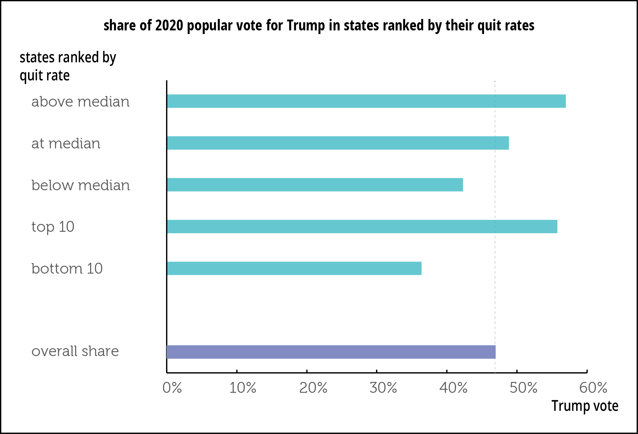
When mulling through state quit rates we found a striking pattern: states with high quit rates tended to vote red, and those with low rates, blue. So we decided to take a closer look. And that closer look confirmed the intuition.
Here’s a graph to make the point. In 2020, Donald Trump’s share of the popular vote in states with an above-median quit rate was 57.0%; in states with below-median quit rates, it was 42.3%. That’s a gap of 14.7 points. In those at the median (3.0%, by the way), Trump’s share was 48.8%, only slightly above his national 46.9% popular vote share. The relationship holds if you look only at the top and bottom ten states as well. The correlation coefficient between the two measures is a not-unimpressive 0.52. The relationship is considerably weaker if you look at job openings (sorry, no graph of these): the gap between the above-median and below-median states shrinks to under 5 points (with openings higher in the Trump-voting states).
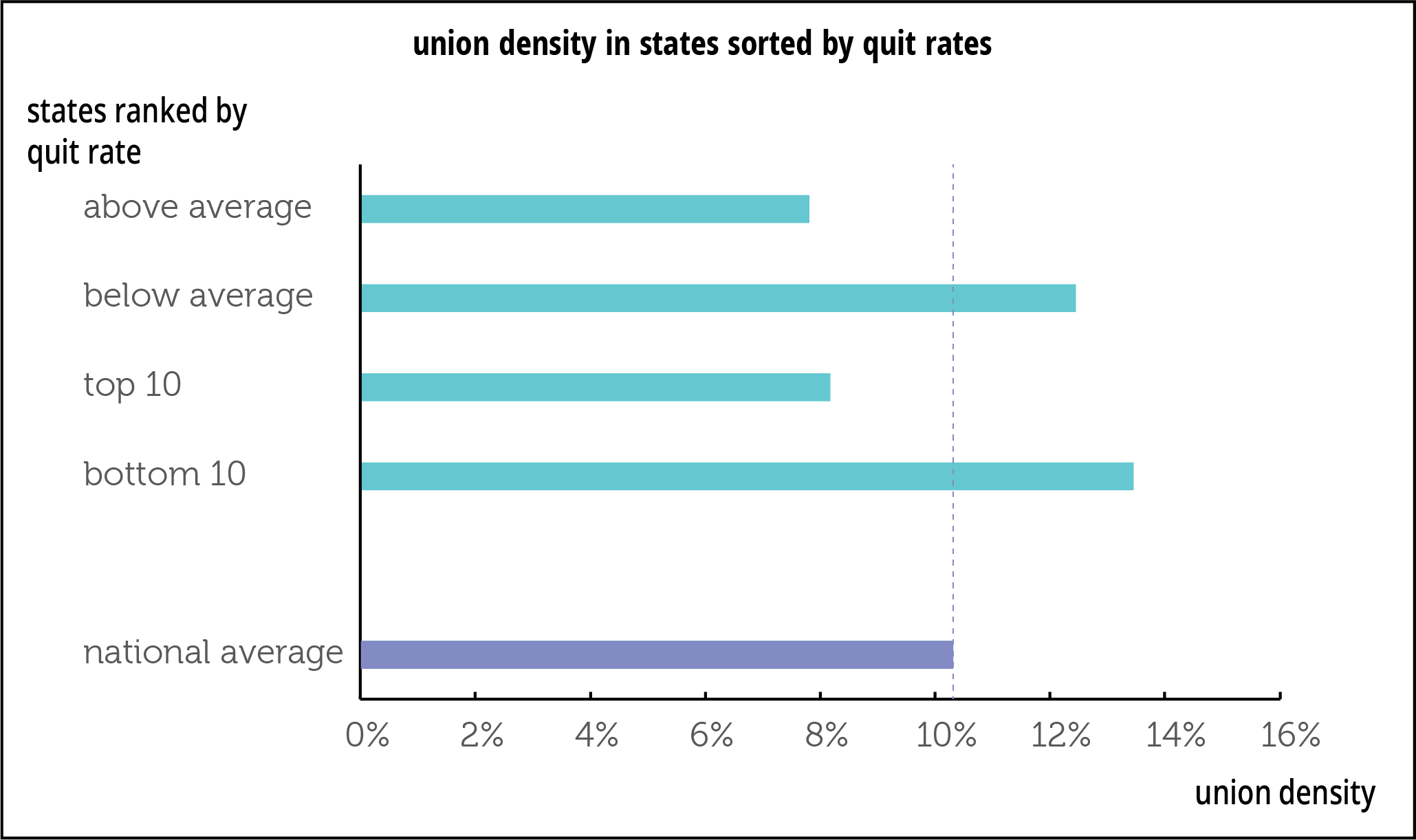
And here’s another curious correlation: quit rates are lower in states with above-average unionization rates, and higher in those with below-average union density—7.8% in the high-quit states, and 12.5% in the low-quit states, for a gap of 4.6 points (graph below). The relationship almost disappears if you look at openings rather than quits: the gap shrinks to 0.7 point, though still in favor of the low-quit states. Next on our agenda: figuring out what this all means. One possible explanation is that conservative, low-union-density states have more dynamic labor markets, but the small difference in openings counters that explanation