Search Results for: "recent work on"

Manufacturing, Women & Labor Pain

It was encouraging to see solid gains in manufacturing & construction in the most recent payroll numbers, occupations listed as more stable, and therefore safer. Back in spring the idea was to get such work rolling again, while skipping the stop at a bar on the way home. We’re hitting the reset button on that.

That may help get the pandemic under control, but it is going to hurt minority workers, as shown in Friday’s jobs report. The Household survey is jumpy, but the number of employed men rose, while the number of employed women fell. Within that both White and Black men gained jobs, as did White women, but Black women lost jobs, as did both sets of Latinx workers, and Asians, not broken out by sex. Gains were large enough to lift employment-population ratios for White women and Black men, while losses were enough to cause declines for Black women, Asians, and for Latinx men and women.

In 2019 women held 29% of manufacturing jobs and, within that, 39% of medical manufacturing and animal processing, 46% of sporting goods & toy manufacturing, and a little over half of textile manufacturing. Asian workers had a 7% share, but 29% of computer equipment; Blacks, 10%, and close to 20% of auto and pulp manufacturing; and Latinx, 17%, including 40% of fruit and vegetable preservation. Both Black and Latinx workers have close to 20% share in tire manufacturing, and 22% and 35% shares in animal processing plants.

Manufacturing employment is still down 4% over the year, less than overall employment’s -6%. We sometimes include a graph of the three-month average of manufacturing withholding in a classic Midwestern state. Here’s what that looks like these days:

by admin· · 0 comments · Comments & Context

“The boss told me, I’d get paid weekly…

…and that’s exactly how I’m paid.” Johnny Paycheck

If it’s so hard to find workers…

The Bureau of Labor Statistics announced in August that real hourly earnings were down 0.1% for all employers in July (+0.3% in earnings +0.3% increase in CPI for urban consumers, and rounding—more on that in a bit), and real weekly earnings were down 0.3%, adding in the 0.3% decrease in the average workweek.

Over the year, real hourly earnings were up 1.3%, but the workweek was down 0.3%, and average weekly earnings were up just 0.8%.

For production and non-supervisory workers, real hourly earnings were down 0.2% in July (+0.2% in earnings and +0.4% in the price index for Urban Wage Earners and Clerical Workers), and weekly earnings were down 0.5% in the month, adding in the decline in the workweek. Over the year, real earnings were up 1.6%, but a 0.9% decline in the workweek spiked that down to +0.7% in weekly wages.

It’s tough getting used to a falling workweek—it was so easy just to leave 34.5 hours circled on the forecast spreadsheet—but the declines seem to be real and persistent, and not just coming from the sectors one would expect, like retail, which has been falling for decades. The Bureau of Labor Statistics has, of course, added in specific sectoral detail to their releases over time and, as one would expect, the goods-producing sectors were the first to come online.

We started the graphs below in 1965 for consistency’s sake, though manufacturing goes back all the way back to 1941 (and some sectors don’t begin until 1972). World War II really shows up in the early years of the series, when the workweek exceeded 45 hours, but it fell back towards 40 with demobilization. It’s too bad we can see what other sectors looked like back then.


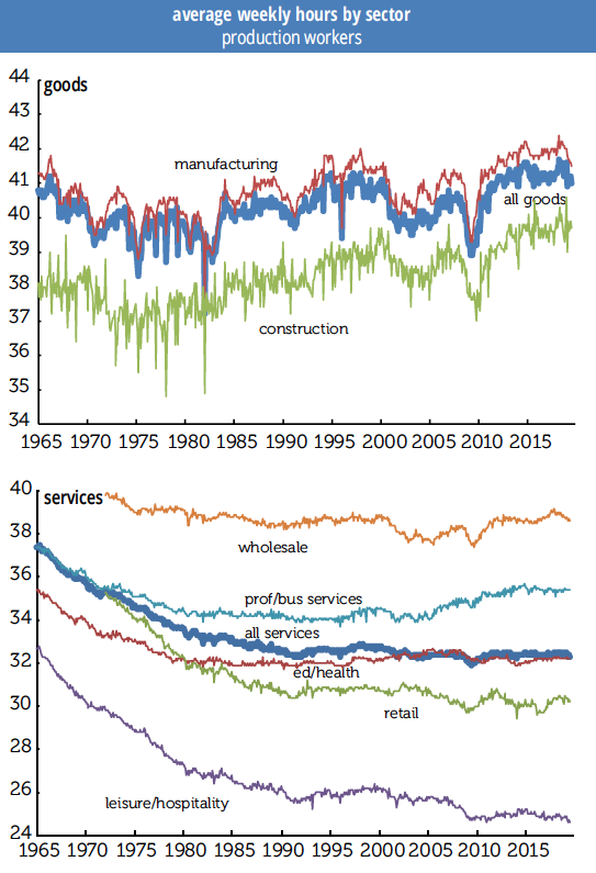
Please note the difference in hours worked in the graphs: the goods sector shows no long-term decline, leisure & hospitality is low and weakening, and the split between wholesale and retail trade widening, for obvious reasons.

The all-workers series starts in 2006, so we didn’t use it for graphing, but we did compare recent performance of the all workers and production work weeks. For private service-providing workers, the production side lost 0.3 hour in 2014 but all workers did not, meaning supervisory hours were up, but recently they have moved together, although production workers’ week is 6 minutes longer.

Production workers hours are more jagged in the logging and mining sector and have seen some declines that don’t show up in all hours. (Logging and mining isn’t graphed, because things were getting crowded.) Also, production workers’ hours, at 47.2, are below their 2014 peak of 47.9, while all workers’ weeks are longer than they have been since 2006. In manufacturing, production hours’ slide from 42.4 to 41.5 since April 2018 is a bit steeper than all worker’s decline, but in retail trade, oddly, production workers’ hours have risen 8/10s to 30.2 while all workers fell from 31.8 hours to 30.7.

In leisure & hospitality, all workers are half an hour above their prior trough while production workers are below, and in bars & restaurants production workers are now slipping in a modest jagged way, but still up about half an hour from the 2010 trough, while all workers are slightly down.

The two series travel together in construction, and in education & health, although, you guessed it, health care hours are stronger than education hours. One could make a “we don’t need no education” crack about that, but since there are a lot of people working for those “under federal investigation” for-profit outfits on that line, we’ll raise a glass instead.

Using a long line graph obscures recent movements, so we’ll note that over the year total all-worker private workweeks are down from 34.5 to 34.3 hours, and within that goods production is down 0.4 tenths of an hour, construction down 0.3 over the year and down 0.2 over the month, manufacturing down 0.6 over the year and 0.3 over the month. Retail was steady over the month, at 30.7 hours, which is down 0.4 from last year, and education and health are flat for the year and month, but down 0.1 from earlier in 2019. Leisure & hospitality is down 0.3 over the year, and transportation and warehousing down a full hour to 38.1 hours. Manufacturing overtime for both durable and non-durable goods continues to fall.

If it is so hard to find workers, and firms are holding on to their current employees, many of whom want to work longer hours, why are workweeks falling?

by admin· · 0 comments · Employment & Productivity

Dwindling Labor Share

Here we revisit a familiar topic: the decline in the labor share of national income. We were prompted to revisit by a recent post to the St. Louis Fed’s website with the provocative title “Capital’s gain is lately labour’s loss” (Anglo spelling in original). It draws on the work of Loukas Karabarbounis and Brent Neiman (KN), which we’ve also discussed, though mostly in passing. KN’s data runs only through 2012; the St. Louis Fed post draws on their in-house FRED database to update it through 2017 for five major economies.

The declining labor share is interesting for several reasons. For decades, most economists assumed the share to be constant, which makes it far easier to develop economic models of production functions and economic dynamics. But the labor share is not constant. In their examination of 59 countries with at least 15 years of data between 1975 and 2012, BN found 42 with a declining labor share, measured against corporate value-added. A major reason is the declining cost of investment goods; the St Louis researchers present a series showing a near-relentless decline in the price of capital goods vs. consumer goods since 1948, with an acceleration in the 1980s. (The average decline from 1948 through 1979 was 1.6%; from 1980 to 2016, 2.6%.) That makes it easy to substitute capital for labor, to the detriment of labor’s share.

The extension of the data for the five years doesn’t change the fundamental story. The labor share in the five economies shown in the graph on the top of p. 7 was little changed between 2012 and 2017, despite sharp declines in the unemployment rates in most. You might think that a tightening labor market might boost labor’s share, but that hasn’t happened.

As the graphs above show, the declines happened to different degrees and over different intervals for the five countries shown. The declines range from 3 percentage points in the US to 8 in Canada; expressed as percentage (not point) declines, they range from 5% in the US to 11% in Canada (with the other four countries not far behind). Remember, it had been a well-established axiom in economics that this was not supposed to happen.

BN find that most of the decline in the labor share has happened within industries, so it can’t be explained by compositional changes such as the shift from manufacturing to services, which, among other things suggests things other than globalization are at work (given the varying exposure of different industries to international competition). And they also find a decline in the labor share within China, which makes it an unlikely culprit for the decline in the labor share in the richer countries.

They conclude that the decline in the price of investment goods accounts for about half the decline in labor’s share. An interesting question is what accounts for the other half. They don’t examine the effect of labor market deregulation and the declining power of unions, but those seem like worthy avenues of investigation, as they have been in other research pieces.

“Credit positive activities,” A Short-lived Phenomenon

According to a Moody’s analysis of 100 large companies, after an initial round of “credit positive activities,” notably debt reduction, following the corporate tax cuts in the 2017 overhaul, firms have shifted their attention to stock buybacks. The tax cuts increased corporate cash flow by almost $400 billion in 2018. Of that increment, 37% went to debt reduction in the first half; that fell to 14% in the second half. Just over a third, or 36% went to share repurchases in the first half; in the second half, that soared to 60%. Capital spending’s share went from 22% in H1 to 20% in H2.

The first half’s gross debt paydown exceeded gross borrowing, making for a net reduction in debt outstanding. In the second half, however, firms returned to net borrowing (though at a rate considerably below 2016 and 2017).

Shifting the focus from the uses of the tax cut gusher alone, firms devoted 49% of their total cash outflow to capex in 2016–2017; that fell to 41% in 2018. But the share devoted to buybacks went from 25% to 31%.

Moody’s report pairs nicely with a new NBER working paper by Daniel Greenwald of MIT, Martin Lettau of Berkeley, and Sydney Ludvigson of NYU, “How the Wealth Was Won: Factors Shares as Market Fundamentals.” They find that between 1989 and 2017, $23 trillion in real equity wealth was created by the nonfinancial corporate sector. More than half, 54%, of that increase “was attributable to a reallocation of rents to shareholders in a decelerating economy.” (To be specific, those rents were reallocated away from labor.) Economic growth accounted for 24% of those gains, lower interest rates for 11%, and a lower risk premium, also for 11%. By contrast, between 1952 and 1988, less than half as much wealth was created, but almost all of it, 92%, can be attributed to economic growth. Conventional estimates of the equity risk premium are, by their work, overstated by 50%.

Unlike many models of stock returns, rather than imagining a single representative agent, Greenwald et al. divide the population into shareholders and workers—in line with a world where the top 5% of stock wealth distribution owns 76% of total stock market value. Shareholders earn relatively little of their income from labor, and workers earn almost all of theirs that way. In this model, shifts in income from labor to capital, which play no role in the traditional valuation literature, have a significant explanatory power over stock market returns. A reminder that two of the three authors of the paper are business school professors and not freelancing Bolsheviks.

What about the low interest rates of recent years? The authors find they explain little of the stock market’s rise since the financial crisis. While real rates are low by the standards of the 1984–2000 period, they’re not by the standards of the 1950s through the 1970s.

Greenwald et al. do not address buybacks specifically, but they certainly fit in with the distributional shift towards shareholders in their model.

Philippa Dunne & Doug Henwood

by admin· · 0 comments · Red Flags

NIPA review

There were some huzzahs over the first quarter GDP number. The 3.2% quarterly rate, while still below two of 2018’s quarters, was at the upper end of its recent range. And the yearly rate, also 3.2%, was the best in almost five years. But the quarter’s numbers do nothing to close the gap with the long-term trend, and the composition of growth was unimpressive.

As the graph below shows, actual GDP remains well below its 1970–2007 trendline, which is based on an average of 3.2% growth. Since 2019Q1 just matched that average, the trendline remained just as distant. GDP is now almost 17% lower than it would be had the 3.2% average prevailed after the Great Recession. That gap works out to a deficiency of almost $5,000 in per capita terms, which, given long-term relationships, works out to about $3,800 in after-tax personal income. Consumption is 16% below trend; nonresidential fixed investment, 15% below; residential investment, 40% below; and government, 20% below.

And important components of GDP sagged badly in the quarter.

Consumption contributed just 0.8 point to real GDP, less than half what it did the previous quarter, and well below the average for both this expansion and the average of all expansions between 1949 and 2007. The contribution of goods consumption was negative. Nonresidential investment was weak, with both equipment and structures contributing nothing, and only intellectual property making any contribution. Residential investment was a drag on growth. Imports were weak, which is actually a positive contribution to growth, since they’re counted as a subtraction from GDP, but it’s not a sign of strong domestic demand. Inventory investment—which was 0.6% of GDP in nominal terms, twice the average since 1980—contributed a hefty 0.7 point to the headline growth number.

But the headline number did look pretty decent.

by admin· · 0 comments · Employment & Productivity