Uncategorized

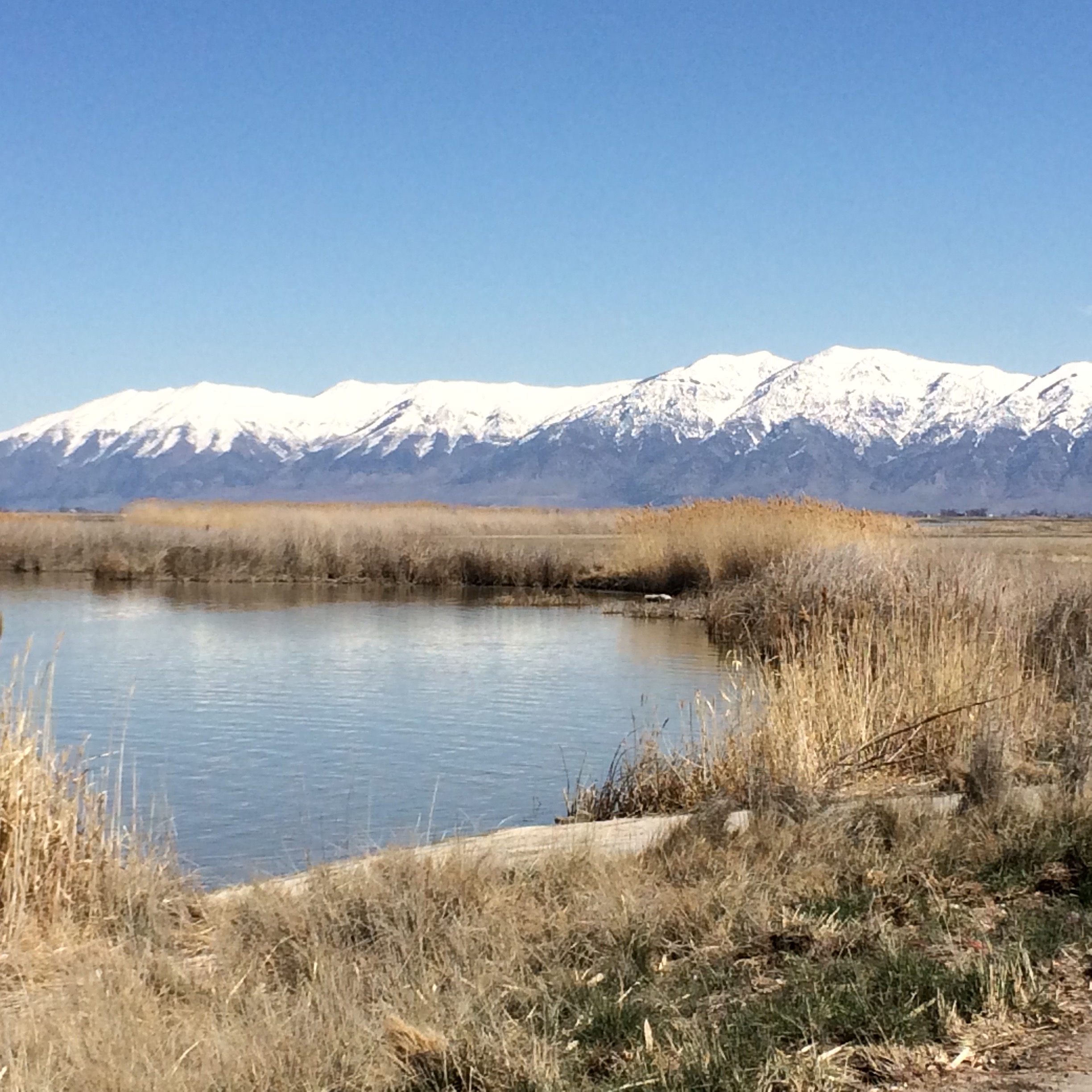
Coal Country, Shadblow, and Spring

We’ve written about the sophistication and inclusion of coal-mining communities in their early days, of land theft, empty promises, and hopes that were revised away. In a new NBER working paper, Canary in the Coal Decline, Josh Blonz, Brigitte Roth Tran, and Erin E. Troland—the first and last of the Federal Reserve, the second of the San Francisco Fed—report on the broad effects of the decline in coal mining on household finances in Appalachia. Removing coal from our energy mix is a top priority if we want to clean up our energy act; everything about it is enormously filthy, from mining it to burning it. But what are the human costs of the transition away from it?

To answer those questions, the authors use data from the New York Fed/Equifax panel, which is the same source as the New York Fed uses in its consumer credit series. They look at important measures of household economic well-being between 2011 and 2018—a period when total employment in the industry fell by 43% as total employment rose 11%—in counties with a heavy concentration of coal mining. Here’s a long-term look at coal employment:

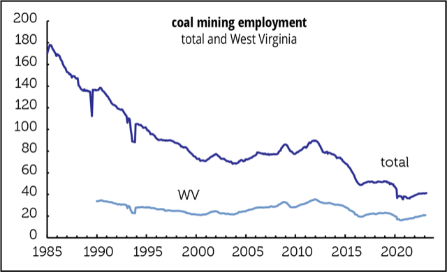
Coal-rich Appalachia has long been one of the poorest parts of the country, with relatively low educational attainment by national standards, a gap that has been widening. A good bit of the reason for this is that coal has been in decline for far longer than the last decade or two—it’s more like a century. Coal has become progressively less competitive economically compared to natural gas, as both plant construction and extraction costs have fallen (thanks to fracking, which won’t win any environmental awards either).

Even though coal accounted directly for only 2% of employment in what they define as active coal-mining counties, the economic impact of the decline was much broader and more severe than that small share would suggest. For example:

• Credit scores in coal-intensive regions were about 3 points lower than they would have been otherwise. That may not sound like much, but other researchers have found that even a 1-point decline can be economically meaningful. The effects went well beyond the 40,000 miners who lost jobs nationally over that seven-year period (three-quarter of them in this survey area). The effects were concentrated among those in the bottom half of the credit-score distribution. At the 40th percentile, roughly at the cutoff for subprime classification, the credit score hit was 7 points.

• Those credit score declines translated into a 50-basis point increase in mortgage interest rates.

• Declines in coal demand resulted in increases in the share of households ranked as subprime, more intensive use of credit cards, higher delinquencies and collection rates, and more entries into bankruptcy.

• Damage was felt most in the second-lowest quartile of credit scores—in other words, people were on the verge of falling into serious hardship. But even those in the top quartile take a hit—a small one, but evidently no one is safe from the contraction in coal country.

• None of these findings are driven by age.

As the authors note in their conclusion, these finding are a warning about what might happen in other fossil fuel producing communities as carbon-based energy sources recede in importance. They don’t note, but we will, that the political effects of this impoverishment can be harsh, underscoring the need to insulate affected regions against the harms coming from an essential energy transition.

Case study
A footnote to the above: a closer look at the state most closely identified with coal (both by outsiders and residents), West Virginia.

Having such a coal-centric economy has not been kind to the state. West Virginia has the second-lowest employment/population ratio (EPOP) in the country, 52.6%, just behind South Carolina and above dead-last Mississippi. That’s 7.6 points below the national average and 15.2 points below the leader, Nebraska. Even at the peak in the national EPOP, 64.7% in April 2000, it was turning in a miserable 52.8%.

West Virginia has the fifth-highest poverty rate, 15.0%, 3.8 points above the national average and nearly three times the state with the lowest rate, New Hampshire, 5.6%. Coal made a lot of people rich over the decades—just not ordinary West Virginians.

That’s why transformative work being done by outfits like the Ohio River Valley Institute is so important, as are targeted programs like the Hickman Holler Appalachian Relief Scholarship, founded by musicians Senora May and her husband Tyler Childers, to provide scholarships to regional schools like Morehead State University. MSU is known for its STEM programs, and HHARS is giving priority to African-American students. Regional farmers’ markets too.

Philippa Dunne & Doug Henwood

Shadblow, one of many popular names for Amelanchier, was once one of the first trees to bloom in the Appalachian spring.

by admin· · 0 comments · Uncategorized

Opening Gambits

There seems to be a consensus that the high level of job openings—September’s reading of 6.5% of employment is off from March’s all-time high of 7.3%, but it’s still at the 95th percentile of all months since December 2000—has contributed to inflationary pressures. We’ve long been skeptical about what the openings component of the JOLTS program measures, wondering whether it’s boosted by employers who say, “sure would like an app programmer for $10 an hour but I can’t find anyone!” And a lot of us wouldn’t mind being 35 again either.

We thought a look at recent state openings data might be clarifying. (We used three-month averages to smooth some of the volatility, which is greater at the state level than nationally.) It was clarifying all right: openings bear no relationship to wages.

That point is made by the maps below. The states are shaded so that high, medium, and low openings and high, medium, and low wage growth are represented by the same colors. If openings and wage growth were tightly correlated, the maps would look a lot more similar than they do.

Another way of making the same argument is with the scattergram below. Here too, there’s no relationship at all. The eye doesn’t want to add a trendline because there is none.

The lack-of-trendline point can also be made with a simple regression of average hourly earnings growth on openings. That yields an r2 of 0.02, meaning that the openings explain all of 2% of the variation in earnings growth. Worse, there’s a 15% chance that the relationship is entirely random. And the relationship is flattered by the two outliers (DC and Alaska, labeled in the scatter). Take them out and the r2 falls to 0.00 and the chance of randomness rises to 87%.

Aside from the fact that this has never looked like a wage-driven inflation, these opening stats explain nothing.

by admin· · 0 comments · Uncategorized

Frontier Knowledge & Start-Up Quality

In their 2015 research paper “Where is Silicon Valley?,” Jorge Guzman and Scott Stern set out a new method of ranking entrepreneurial ventures focusing on quality, not quantity as had prior reports, in part to provide policy-makers with information on how to promote entrepreneurship for economic and social progress.

They assemnbled five metrics, firm-name characteristics (named after the founder, long, short?), is it local or part of a regional trading cluster or high-tech industry cluster; is it a corporation, LLC, or incorporated in Delaware, and does it gain control of formal intellectual property rights within one year? They do not include location in order to step around the pitfall of assuming that businesses in a given location have a given level of quality. The quality metric is the probability of an initial public offering or an acquisition within 6 years of founding.

Their results are not surprising, but some of the magnitudes may be. Of course in California Silicon Valley stands out, with a quality ranking 20 times the average, and 90 times the lowest ranked cities. Quality is tied to the proximity of research universities and national labs. Finally, the high stakes are apparent in the difficulty of reaching the growth metric: Even those firms ranked in the top 1% have just a 5% chance hitting it.

Fast forward to 2021 and More than an Ivory Tower, the Impact of Research Institutions on the Quality and Quantity of Entrepreneurship, by Valentina Tartari and Scott Stern, who take on the possibly circular logic of the relationship of research institutes and start-up quality. (The former are often located in innovative environments and can themselves be sources of demand.) Three steps gets them there: assess annual business registration records using the analytics outlined above by zip code; link to presence or absence of research university or labs; and consider changes in Federal funding of those institutions, and whether it is directed to research or other activities.

They found that changes in Federal research commitments to universities are “uniquely linked” to positive changes in the quality-adjusted quantity of entrepreneurship, but that increases in non-research funding to universities as well as research funding to national laboratories has either neutral or no impact. In their conclusion they underscore that their research supports MIT’s Jonathan Gruber and Simon Johnson’s argument laid out in Jump-Starting America, for establishing a set of regional innovation hubs to support local “entrepreneurial ecosystems,” outside the established “superstar” hubs.

They suggest that although universities and national labs both conduct significant research, universities distinguish themselves both by also producing students, who often launch start-ups in the area—they suspect students with frontier knowledge play an important and “often underappreciated” role in disseminating knowledge generated at universities to activities in the private sector— and by promoting “policies and rules that encourage openness” and enhance “fluidity between research and industry.”

One of the reasons researchers so dislike non-competition employment constraints.
There’s much more, including interactive maps, from the team at Start-up Cartography Project.

by admin· · 0 comments · Uncategorized

Inflation? ISM Indexes

Since disinflation, flirting occasionally with deflation, took over the economic scene in the early 1980s, there have been a few “inflation is back!” scares. How do current concerns stack up?
Price measures in the ISM reports confirm the verbal alarm expressed by respondents recently. The manufacturing price index was 89.6 in April; services, 76.8. Manufacturing is at the 98th percentile in the series’ history (which begins in 1948); services, at the 99th (a much shorter series—it begins in 1997). But, as the graph on the top of p. 4 shows, we’ve been here many times before. We’ve graphed only manufacturing, below, because of its much longer history. The services index traces a path very similar to manufacturing since it began in 1997; the correlation coefficient is 0.82.

Oddly, the low-inflation era since the early 1980s looks little different from the rising inflation era before it. That cautions against drawing any trend conclusions from the high current readings. But, over the last twenty years, the two price indexes do track moves in the CPI pretty well. Here’s a graph of the actual yearly change in the CPI against one predicted by the ISM services price subindex.

It’s suggesting that the CPI “should” be rising at a 3.5%, almost a full point above where it was in March, and considerably above the Fed’s 2.0% target (though that target looks to be in abeyance, at least for now).

by admin· · 0 comments · Uncategorized

Buybacks: A Turn toward Prudence, for Now

According to preliminary numbers from Standard & Poor’s, buybacks among S&P 500 components rose rose 15% in the third quarter, after a 55% decline in the second, leaving them 42% below a year earlier. Measured as a percent of GDP, buybacks are now in the same neighborhood they were last seen in in 2010—though that’s still well above where they were any time between 1998 and 2004.

Measured as a percentage of operating earnings, as in the second graph, buybacks fell to their lowest levels since 2010, 32%. Despite the increase in dollar volume, buybacks declined as a percentage of earnings because earnings were up 42% in the quarter. In the 40 quarters between 2010 and 2019, buybacks fell below 40% of earnings in just two of them; the average over that period was 53%.

And our third measure, buybacks relative to dividends, saw an uptick in the quarter, but remain at their lowest level since 2009, 88%. The second and third quarters were the only two since 2010 where traditional dividends exceeded buybacks; that was true of only half the quarters between 1998 and 2009. Between 2010 and 2020Q3, S&P firms bought back $5.7 trillion in stock and paid $3.9 trillion in dividends, a combined total of $9.6 trillion. Over the same period, earnings totaled $10.6 trillion. So, they paid out 90% of earnings to shareholders. After all these years of heavy transfers to shareholders—which, it must be said, have been very friendly to stock prices—you have to wonder why corporations don’t have better things to do with their profits. It’s as if Corporate America has become an old rentier, more interested in collecting cash than investing and innovating. Maybe this pandemic-induced reduction in buybacks marks a change of heart, but we suspect things will go back to the old ways in a few quarters.

by admin· · 0 comments · Uncategorized