Employment & Productivity

Compared to what?

Some people, starting with the Tweeter-in-Chief, have been celebrating a record low in jobless claims. And, as the graph below shows, this is true.

But complicating the picture is the long decline in the share of the unemployed drawing benefits:

Were the share of the unemployed covered by the system the same as it was in 2000, the current level of unemployment claims (as a percentage of employment) would match that low. If it covered the same share of the unemployed as it did in 1979, today’s level would match 1989’s.

The low level of claims is undoubtedly good news, but any notice of that fact should come with an asterisk.

by admin· · 0 comments · Employment & Productivity

Industrial Production: Up Close & Personal

Note: We are looking at long term trends here so this isn’t a big deal, but the Federal Reserve pointed out that Hurricane Harvey is responsible for approximately three-quarters of the decline in the latest industrial production report. Expect the Harvey and Irma effects to be with us for a long time.

Industrial production is the red-headed step-child of coincident economic statistics. The entire market stops, and then quickly restarts, when the BLS releases the employment report. The Census’s retail sales number receives less fanfare, but it does have a certain amount of headline grabbing power despite its unruly nature. In contrast, the Federal Reserve’s industrial production release receives no attention. This is unfortunate, because it contains a great deal of salient information. And there is no disputing its economic importance: according to BEA industry output data, manufacturing is one of the largest contributors to total industry output.

Before looking at the latest report, let’s consider some context:
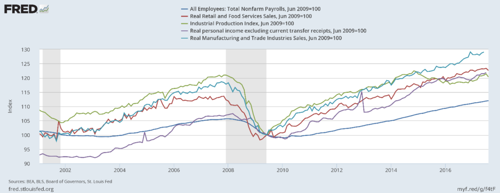
ip-and-coincident-indicators

The above chart shows all the primary coincident indicators shifted to base 100. All – except industrial production – have risen above their respective pre-recession highs. It peaked at the end of 2015, dipped for a few years, and only recently increased to higher levels.

Next, consider capacity utilization:
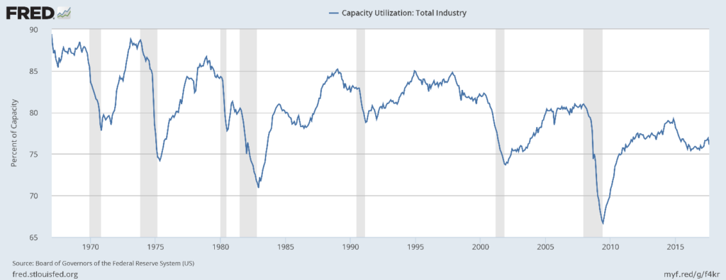
capacity-utilization

This statistic has hit consistently lower peaks for the last three expansions. This has two important ramifications. First, it weakens investment demand. Why add to your physical plant when you’re employing a lower percentage of it? Second, this may be a fundamental reason for weak price pressures. Why raise prices when instead all you have to do is bring more of your dormant capacity online?

There are two categorization systems used by the Federal Reserve to break down industrial production: major industry groups and major market groups. We will take those in turn.

Major Industry Groups

We’ll break this data down into 4 sub-components, starting with durable and nondurable manufacturing.
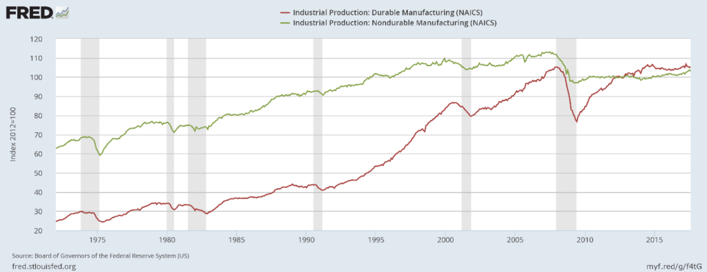
durable-and-nonduable-manufacturing

Durable manufacturing (in red) first peaked in mid-20124 and again in 2017. But it still hasn’t advanced much beyond its pre-recession level. It’s doubtful it will do so; auto sales are declining and the auto dealer sales/inventory ratio is near a multi-decade high. Non-durable goods dropped about 10% during the recession and only recently started to rise from the pre-recession lows.

Here are the charts of the final two industry groups:
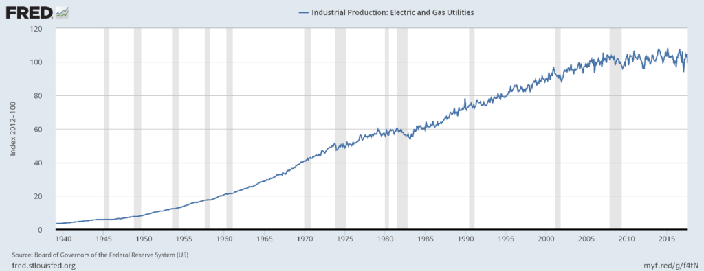
electircity

ip-mining

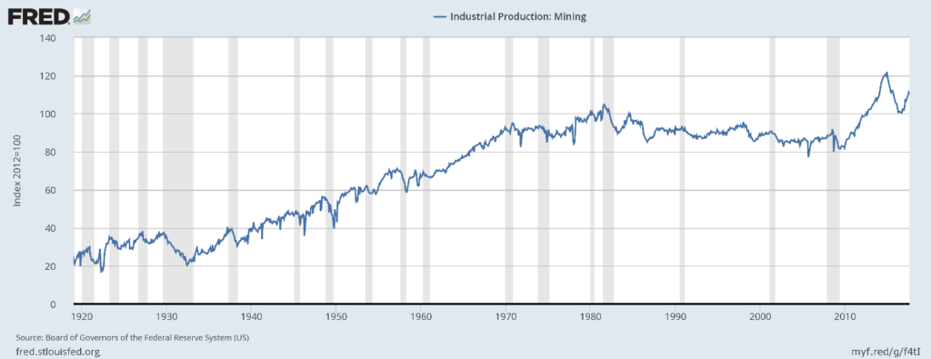
Utilities (top chart) have moved sideways for the duration of this expansion. We suspect increased energy efficiency is having an impact, a good thing. That leaves mining (bottom chart) to provide the sold growth engine. It declined for 30 years (1980-2010) before growing strongly because of the fracking revolution. That has proved to be an unstable thing, but if it weren’t for fracking, there would be no major move in industrial production along industry lines.

Market Groups

Let’s first look at industrial production for consumer goods:
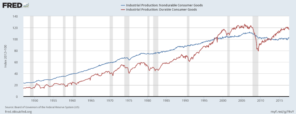
durable-and-nondurable-consumer

Durable production (in red) has risen to slightly above pre-recession levels, but has yet to move meaningfully beyond that level. Nondurable production (in blue) remains below its prerecession level – so much so that it’s highly doubtful it will advance beyond its previous high.

Next, here is business equipment:
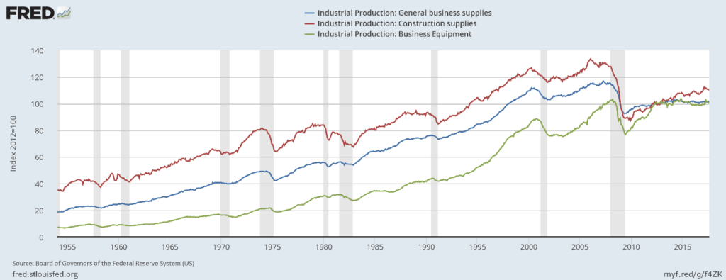
business-ip

Business equipment (in green) is stuck near its pre-recession level. Construction production (in red) was understandably high during the housing bubble. It dropped sharply during the recession and has been rising consistently since. General business supplies (in blue) is still far below pre-recession levels.

Defense and space production has recently declined:
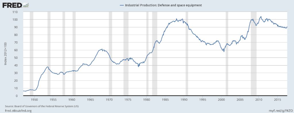
ip-defense

Next is durables and nondurables materials production:
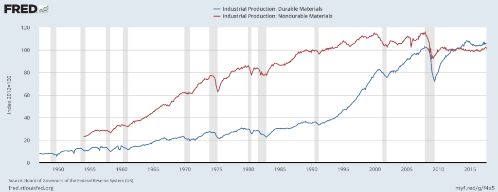
durable-and-nondurable-materials

Durables production (in blue) is slightly above it pre-recession level while nondurable goods are sharply lower. There has been no meaningful growth in either measure dor at least several years.

Energy is the last industry classification:
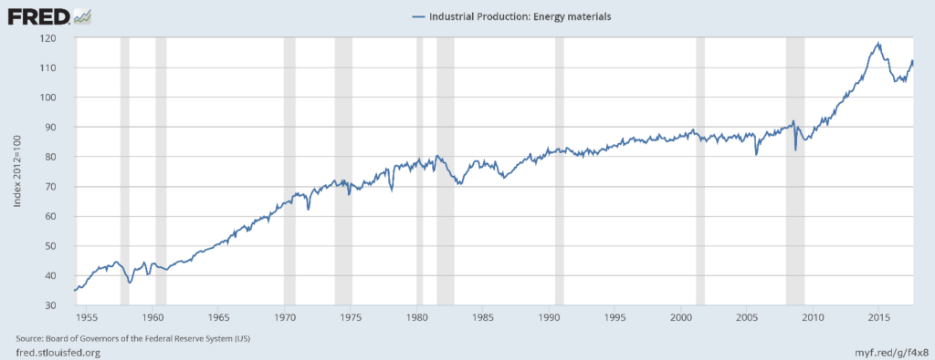
ip-energy-materials

And it is the only one that has meaningfully grown during this expansion.

Regardless of how you slice the data, The United States’ physical production hasn’t grown meaningfully during this expansion. The best performing sector in the consumer areas is durables, and they’re still near pre-recession levels. Overall business supplies levels are also lackluster. If it weren’t for oil, we’d be seeing no growth in industrial production.

by admin· · 2 comments · Employment & Productivity

Productivity: The Gruesome Details

Productivity is one of our obsessions, and it should be a national obsession as well.* Clearly it isn’t. The industry statistics presented here show that for a lot of industries, the last couple of years have been a real bust.

The stats, provided by the Bureau of Labor Statistics, cover scores of industries, with the manufacturing sub-sectors particularly finely broken down. Here we’ve provided what is fashionably described in some circles as a “curated” list of industries, since the whole set is beyond our scope.

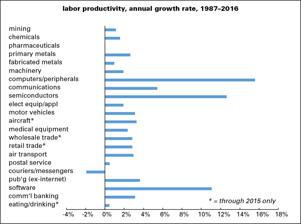
First the long sweep, from 1987 (when this series begins) through 2016, graphed below. (The 2016 data isn’t available for all industries; those for which 2015 is the terminal year are marked with an asterisk in all three graphs.) The standouts are, not surprisingly, in high-tech: computers, semiconductors, and software, all with annual gains in the double digits. Some old-line industries, like motor vehicles, aircraft, and wholesale and retail trade, turned in solid performances.

prod-by-indus-1987-2016

Eating and drinking establishments and, perhaps surprisingly, pharmaceuticals did quite poorly, with pharma slightly in the red—an amazing, if invisible on the graph, feat for such a technology-rich enterprise. And perhaps even more surprisingly, the postal service did better than private couriers and messengers, where productivity declined over the almost three-decade interval.

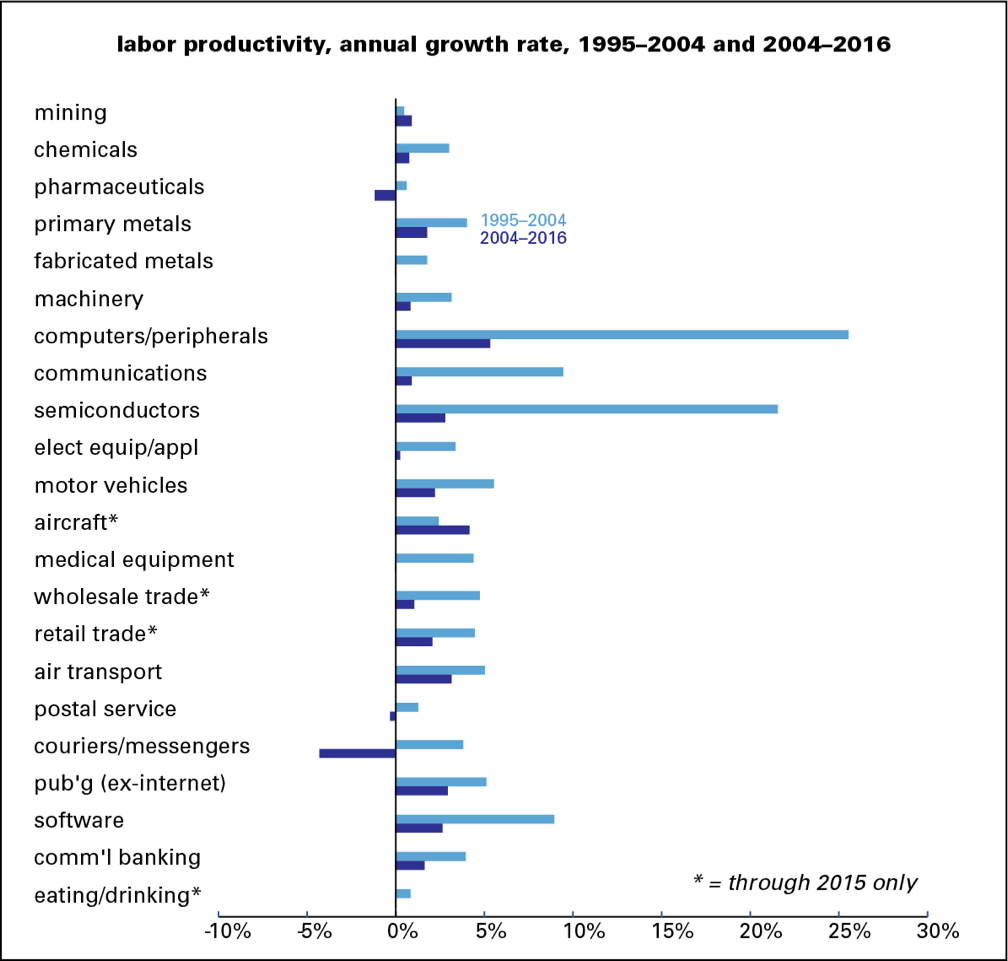
But as the graph below shows, most of the stellar performances were logged during the productivity acceleration of the late 1990s and early 2000s. Of the 22 industries shown, 20 saw a decline between that period and the last twelve years—a decline of over 4 percentage points on average. Only mining and aircraft showed a pickup. Computers and semiconductors fell by around 20 percentage points. Pharmaceuticals went from positive to negative.

prod-by-indus-boom-bust

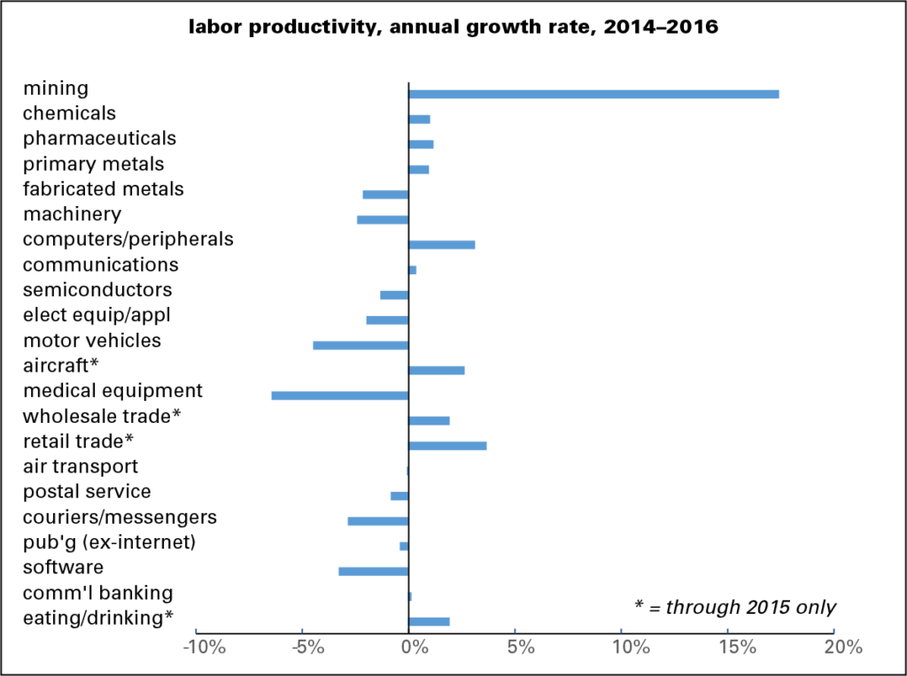
And the last couple of years have been fairly terrible. Half the industries showed a decline in productivity. Only mining—fracking, one assumes—had a strong performance. Computers remained in the black, but semiconductors fell below zero. Motor vehicles and medical equipment were firmly negative.

prod-by-indus-2014-2016

The productivity slowdown that we’ve been following at a high level is a pervasive problem at the industry level.

* For those of you not so obsessed, productivity determines our standard of living. An increase in productivity means greater output from the same input, which makes labor more valuable, which in turn lifts wages. Too many corporations are currently using their profits, and money borrowed on the cheap, to buy back their own stock and pay dividends to their investors instead of investing in productivity enhancing research & development, and physical capital. That’s one of the big factors in sluggish wage growth.

by admin· · 0 comments · Employment & Productivity

Just how weak, by historical standards?

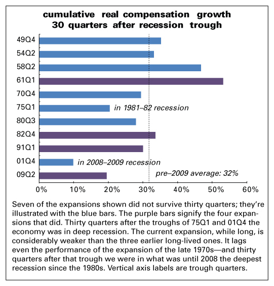
We all know that growth in this expansion has been weak, but it’s always surprising to do the historical work. Although there has been a lot of talk about a tightening labor market and wage inflation, the current expansion is a laggard when you look at employee compensation, just as it is when you consider GDP. A picture is worth a thousand words:

ws-30qs

As of 2016Q4, total real compensation was up 19.5% from the end of the recession in 2009Q2. This is the second-weakest performance for the 30 months after the end of a recession, coming in behind the previous expansion. But the major reason the previous cycle’s number was so weak is that 30 quarters after it began landed it in the heart of the Great Recession. Similarly, the weak performance 30 quarters after the 1975Q1 trough can be explained by the fact that it too was in the deep 1981–1982 recession. Of the expansions that lasted 30 quarters or more (the purple bars), the post-2009 performance is the weakest. All the others had recessions and subsequent recoveries within the 30-quarter period.

by admin· · 0 comments · Employment & Productivity

The More Things Change…

Last May we hauled out a comment Peter Drucker made 30 years ago when buyouts and buybacks were testing their wings:

Everyone who has worked with American management can testify that the need to satisfy the pension fund manager’s quest for higher earnings next quarter, together with the panicky fear of the raider, consistently pushes top management toward decisions they know to be costly, if not suicidal, mistakes.

Hard to improve on that.

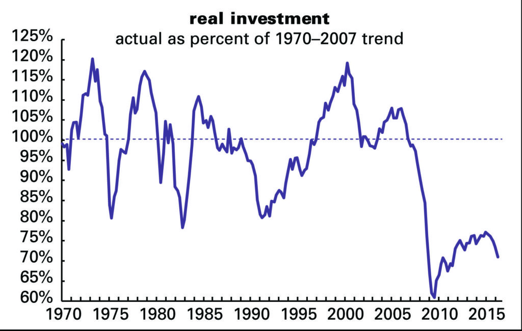
We have been stressing for years that the cost to R&D within these shores will be something we will come to regret. R&D investment is crucial to productivity and that old-fashioned concept, prosperity, yet we’re treating it as an annoying child.

Looking at current investment as a share of its 1970 to 2007 trend might scare us awake. After collapsing in the Great Recession, it staged a recovery, but has been declining for the last year and is now just 29% of trend—worse than overall GDP (17% below-trend), consumption (15% below), and government (19% below).

invest-v-trnd

by admin· · 0 comments · Employment & Productivity