Employment & Productivity

Nothing Mysterious about this “Mystery”

People sometimes describe significant changes in productivity growth as a “mystery.” For sure, it’s a complicated question, but for us the greatest mystery is why so few people care that trend U.S. productivity growth is approaching 0, the worst performance since modern statistics began. And why do one has the will to lead a charge in hopes of reversing that trend.

But the “why” is, of course, something worth investigating. As we’ve written in the past (most recently in our February 11 issue), a low level of investment in equipment and software is part of the explanation—a contrast with the late 1990s, when we saw a burst in such investment and a consequent sharp, though short-lived, acceleration in productivity growth. Both ended with the investment bust of the early 2000s. Productivity growth then entered a long downtrend that shows no sign of stabilizing yet. Investment (as a share of GDP) fell sharply from 2000 to 2004, picked up some into 2006, and collapsed with the Great Recession. It’s recovered from the depths of 2009–2010, but remains below its 1950–2007 average. As we point out regularly when we review the Fed’s financial accounts, it’s not because Corporate America is short of funds. Managers seem to prefer stock buybacks and M&A to capital expenditures.

But that’s not all. Two recent papers offer some interesting other theories of the productivity slowdown: the malignant effects of a credit bubble on the real economy (and not just after, but during), and a low rate of business startups.

The first paper, by Claudio Borio, Enisse Kharroubi, Christian Upper and Fabrizio Zampolli of the Bank for International Settlements, investigates the effects of credit booms, labor reallocations across major sectors, and financial crises on productivity growth. Their data comes from the experience of 21 advanced economies since 1969. Borio & Co. model changes in overall productivity growth as the joint product of “common,” economy-wide features and specific movements of labor across sectors with different rates of productivity growth. They find that credit booms often lead to the withdrawal of labor from high-productivity-growth sectors, especially manufacturing, and its shift to lower-growth ones, especially construction. (This was certainly a feature of the housing bubble in the U.S.: from 2004 through 2006, annual employment growth in construction ran between 3–7%, while manufacturing growth bobbed about between 0% and -1%.)

But the subsequent bust also does serious productivity damage. As we know all too well, post-financial-crisis recessions are deeper, longer, and more persistent than the garden-variety kind. Unlike the bubble phase, where the damage is mostly the result of the bad reallocation of labor, the post-crisis phase damages both the “common” component and the allocation component. The combined effects of the bubble and bust amount to a cumulative negative shock to productivity growth of 4 percentage points that can last nearly a decade.

The second paper, written by François Gourio, Todd Messer, and Michael Siemer and published by the Chicago Fed, looks at state level data in the U.S. to determine the effects of firm entry on macro variables like the growth in GDP, productivity, and population. They find significant and persistent effects. For example, a 1% increase in the number of startups leads to an 0.1 point increase in GDP growth on impact, rising to 0.2 point after three years, and persisting (at a declining rate) for 12 years. The effects on productivity is slower, barely above 0 at first, but rising to 0.1 point and persisting (with little decay) for nearly a decade. Employment effects are more modest, on the order of 0.05 point, but persisting for up to twelve years. All in all, “a one standard deviation shock to the number of startups leads to an increase of GDP around 1.2%.” That’s not trivial.

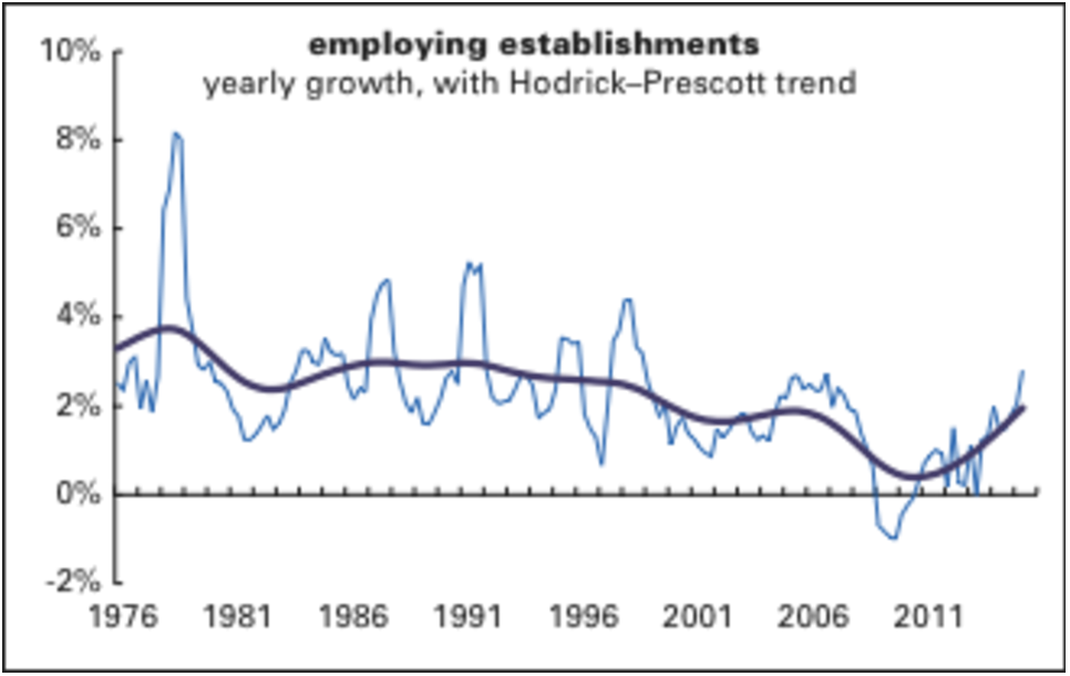
As the graph below shows, the annual growth in employing business establishments has picked up nicely from its 2009 lows, but even so, it’s just around its 1976–2007 average. (This series comes from the Quarterly Census of Employment and Wages, which is more timely than the series that Gourio et al. used, from the Business Employment Dynamics.) That pickup is encouraging, however, and might mean good things for future employment and productivity growth—if it’s sustained. But, as the next section shows, it may not be.

employing-establishments


by admin· · 0 comments · Employment & Productivity

How Disruptive is That?

Strong growth in transportation and warehousing, led by limo services (which is where Uber and the like would show up if they are getting picked up), has added fuel to the argument that Uber is a disruptive technology. That’s going to be hard to prove: the author of the theory of disruptive innovation, Harvard Business Schools’s Clayton Christensen, argues that it isn’t.

It’s worth taking a look at the article. Christensen at al. suggest that his theory may is “in danger of becoming a victim of its own success,” and that many of the people who throw it around have not “read a serious book or article on the subject.” In his recap he notes that his use of “disruption” relates to the process in which established businesses are challenged by small companies with fewer resources. He notes that incumbent companies tend to focus on the demands of their most demanding (read lucrative) clients, which causes them to go too far for some segments, and not far enough for others. The newcomer targets the neglected segments, and offers services, generally at lower prices, to them. The established businesses remain focused on their higher paying clients, allowing the newcomers to move up the ladder. Disruption occurs when mainstream customers flock to the newcomers’ offerings. Christensen suggests that Uber is not disruptive because it doesn’t cater to the low end of the market, and because the product it offers is not perceived as lower quality than current taxi services.

So remember, if you want to be a disruptive technology, you have to start out cheap and bad, and then get better while remaining cheap.

by admin· · 0 comments · Employment & Productivity

Establishment Surge!

The most vibrant piece of the most recent QCEW report for Q2 2015 was the 2.8% over-the-year increase in the number of employing establishments. These are not necessarily startups, as they can be new locations of existing corporations, but it is nevertheless encouraging to see some action in this vital component of the job machine. As we often point out, young businesses generate a mighty share of gross job gains, even if they fail at an alarming rate as well. The failure rate, though, has a bright side in that it reallocates resources, which contributes to productivity. (As does job churn—when workers move between jobs they often carry innovative ideas with them.)

And new employing establishments are the ones who would really benefit from low rates on their loans, which they can still ink.This is, of course, only one quarter, which doth not a trend make. It would be great news if demand remains steady enough to give would-be entrepreneurs the confidence to build their businesses.

Here’s the super-sectoral breakdown:

EmpEst

by admin· · 0 comments · Employment & Productivity

Hourly earnings: a longer view, but still weak

 It wouldn’t hurt to have some longer-term perspective on what’s been happening with average hourly earnings as the labor market tightens. In a couple of words: not much.

Graphed below is a history of the yearly growth in nominal average hourly earnings (AHE)—since 1965 for production/nonsupervisory workers and since 2007 for all workers. (The all-worker series is fairly short, making long-term comparisons impossible, but it does track the production worker series pretty well.) Note that both series are very close to their historical lows.

  AHE-yty

For the year ending in February 2015, AHE for production workers are up 1.6%—half the 3.1% 1983–2015 average. That figure was a little lower in 2012, but it’s quite close to three earlier troughs. In May 2014, less than a year ago, the annual gain was 2.4%. So we’re down 0.8 on wage gains—coincidentally, exactly what the decline in unemployment has been over the same period (6.3% to 5.5%). Wages aren’t usually thought of as decelerating as the labor market tightens, but that’s what’s happened.

The slowdown in all-worker AHE is less dramatic, but February’s 2.0% annual gain is below the 2.4% average for the entire series, and 2014’s 2.1%—and considerably below the 2008–2009 average of 2.9%, when the economy was falling apart. 

So, really, weak wage growth looks to be more of a macroeconomic problem now than wage pressures.


Current Quit Rate Consistent with 7.7% unemployment

March 6, 2014

Lately we’ve been seeing the argument made that the labor market is tighter than it looks. The argument goes like this: while the decline in the unemployment rate may have been boosted by labor force withdrawal, many of the dropouts will never work again, so it’s wrong to adjust the official jobless rate, either statistically or mentally, to compensate for depressed participation rates. So January’s 6.6% unemployment rate, 0.1 point above the Fed’s long-standing trigger, is getting close to “full employment,” and it would be prudent to start thinking about raising the fed funds rate sooner than most market participants expect. Is there anything to this?

We think not. For one, a 6.6% rate is about two-thirds of a standard deviation above the 1948–2007 average of 5.6%, which is not trivial. It’s even further above, in absolute terms, its 2002–2007 average of 5.3%, an expansion that was far from robust. It may be close to the Congressional Budget Office’s estimate of the “natural” rate of 6.0%, but as we showed last month, there’s nothing very scientific about these estimates; just six years ago, the CBO projected that the natural rate would be 4.8% right now.

A more subtle version of the argument looks at sectoral unemployment rates and finds some getting awfully close to full employment. We have a hard time seeing that. Graphed at right are unemployment rates by major sector compared to their 2000–2007 averages. In only one sector—manufacturing—is the January 2014 unemployment rate close to its average, though it’s 0.1 point above. Next closest is finance, 0.8 point above. The others are 1–2 percentage points above their average. A nice theory, but it just doesn't hold water.

Relatedly, some analysts are detecting wage pressures under a placid overall average—a 1.9% gain for the year ending in January. One argued that weakness in financial sector pay is dragging down the average. But if you do a weighted average of hourly wage growth excluding that sector, you still get 1.9%. Most major sectors, accounting for 72% of total private employment, exhibit wage growth below their 2007 average. In fact, wage growth is slower than it was a year ago—and that’s true of sectors accounting for 68% of private employment. It’s hard to see any tightness here either.

quit rates

Another place to look for signs of labor market tightness is in the quit rate. If workers perceive jobs as easy to get, they’re more likely to quit on their own. And, short of that, they’re more likely to demand raises from employers eager to keep them. But currently the quit rate is low by historical standards.

The BLS started publishing the quit rate in 2000. Since the quit rate tracks the number of those unemployed 5 weeks or less very closely, we used that series to estimate the quit rate going back to 1967. (Where the two series overlap, the fit is very tight—an r2 of 0.93.) December’s 1.7% rate is well below the full series’ 2.1% average. It’s also well below levels seen close to previous business cycle peaks, like 1979, 1989, 1999, and 2007.

The quit rate moves generally in line with the unemployment rate. You can “predict” the unemployment rate with decent accuracy with the quit rate, in fact. But as the graph on the bottom of this page shows, the unemployment rate associated with the December 2013 quit rate is a full point above its actual level. Or, putting it more bluntly, workers are acting as if December’s unemployment rate were 7.7%, not the 6.7% it actually was. If the job market were tighter than it looks, we’d expect a much higher quit rate.