Employment & Productivity

All about Jobs, 2: Should the Unemployment Rate Actually Be Lower?

There are now just 0.91 unemployed people per opening, compared to 1.12 in January 2001. Or, as the graph below shows if the relationship between the openings rate and unemployment rate that prevailed before the Great Recession were still in place, the unemployment rate “should” be well under 2%, less than half its current rate.

And that means? On to All about Jobs, 3: Phantom Job Openings, evidence from HWOL

by admin· · 0 comments · Employment & Productivity

All about Jobs, 3: Phantom Job Openings: Evidence from HWOL

We suspect that these are phantom job openings, a kind of tire-kicker index in which employers are hoping to land a really big fish, but not using very good bait.

Looking at the Conference Board’s help wanted online (HWOL) series underscores the possibility that employers may not be that serious about these openings.

Both versions of the HWOL series, new, unduplicated listings and total listings—have been trending downward for three years, while the openings rate has been working its way higher. If employers want to fill these jobs, why aren’t they advertising them? We first asked this question in October 2016 and last asked it in May, and the trends have only di-verged further with each asking.

Anything else? Yes! All about Jobs, 4: Should the quit rate be higher?

by admin· · 0 comments · Employment & Productivity

All about Jobs, 4: Should the Quit Rate Be Higher?

As this graph shows, the private sector quit rate is close to an all-time high for the series. Quits are a sign of worker confidence and can forecast wage pressures ahead. But as high as the quit rate looks, should it maybe be higher?

To answer that question, it’d be nice to have a quit series that goes back before 2001. We don’t have an official one of those, but we can construct one by using the share of voluntary leavers among the unemployed and those unemployed five weeks or less. For the period since 2001, the synthetic quit rate has an r2 of 0.93 relative to the actual rate.

Of course, things may have changed over time, but r2’s like that are rare in the world of economics, so we feel pretty confident that this is a good estimate of the pre-2001 history.

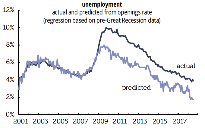
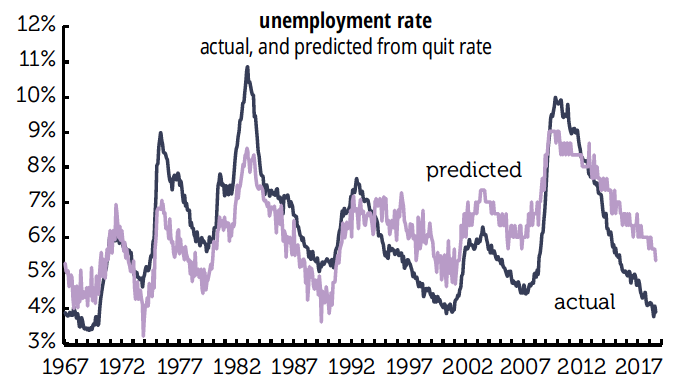
And if we take that long-term synthetic series and compare it to the unemployment rate, we get the results graphed above. Instead of the July unemployment rate of 3.9%, the predicted rate should be considerably higher, 5.3%. In other words, workers are acting as if the jobless rate is almost a point-and-a-half higher than it is. Note that the pattern was similar around previous unemployment troughs in 2000 and 2007.

But before 2000 the reverse was true, as the predicted rate was higher than the actual. We suspect what’s at work is a phenomenon that Alan Greenspan used to talk about in the late 1990s: the fear of corporate restructuring and job skill obsolescence that took hold in the late 1980s/early 1990s has changed worker psychology. It takes a lower unemployment rate to give rise to enough confidence to quit than it did several decades ago.

And finally, All about Jobs, 5: What about job leavers and wages?

by admin· · 0 comments · Employment & Productivity

All about Jobs, 5: What about Job Leavers and Wages?

Worker confidence can be measured by the quit rate, and it can also be measured by share of job leavers among the unemployed. (This doesn’t rely on a synthetic quit rate series, although we don’t really think that’s an issue in any case.)

Following up on a suggestion from David Rosenberg of Gluskin Sheff, we looked at the relationship between the leavers’ share and the annual growth in average hourly earnings six months later. (We used production workers because the all-worker series only begins in 2007. Where they overlap, they are tightly correlated.) As this graph shows:

wage growth is trending higher, but far less than predicted. Instead of August’s 2.8% annual gain in AHE, the leavers’ regression says it “should” be 4.2%. (By next February, it “should” be up to 5.2%.)

The gap is further evidence that while tighter labor markets are leading to wage pressures, structural changes in the labor market have probably reduced the intensity of those pressures. It appears Alan Greenspan had this one right.

by admin· · 0 comments · Employment & Productivity

Claims claims: Do Not Be Deceived

Much has been made of the low level of first-time unemployment claims. They are low, no doubt about it—0.16% of employment, a hair above March’s record low of 0.15% and well below the previous record of 0.20% set in March 2000. (You can say similar things about continuing claims.) But, as we’ve noted in the past, the record comes with an asterisk.

That asterisk is the declining share of the unemployed who are eligible for benefits. When we last visited this terrain, we noted that the insured unemployment rate was close to 70% of the official rate in the early 1970s; it’s less than half that, around 32%, today. Some readers countered that this could be explained by the rising share of the long-term unemployed in the total. True enough; now, those unemployed 27 weeks or longer account for 26% of the total, which would have been worse than a depth-of-recession neighborhood in the 1970s and 1980s.


But the long-termers can’t account for this: initial claims are now around 62% of the flows into unemployment, more than 20 points below the 1990–2007 average of 85%, and had never been below 74% before 2013.

A record, but for a weak reason.