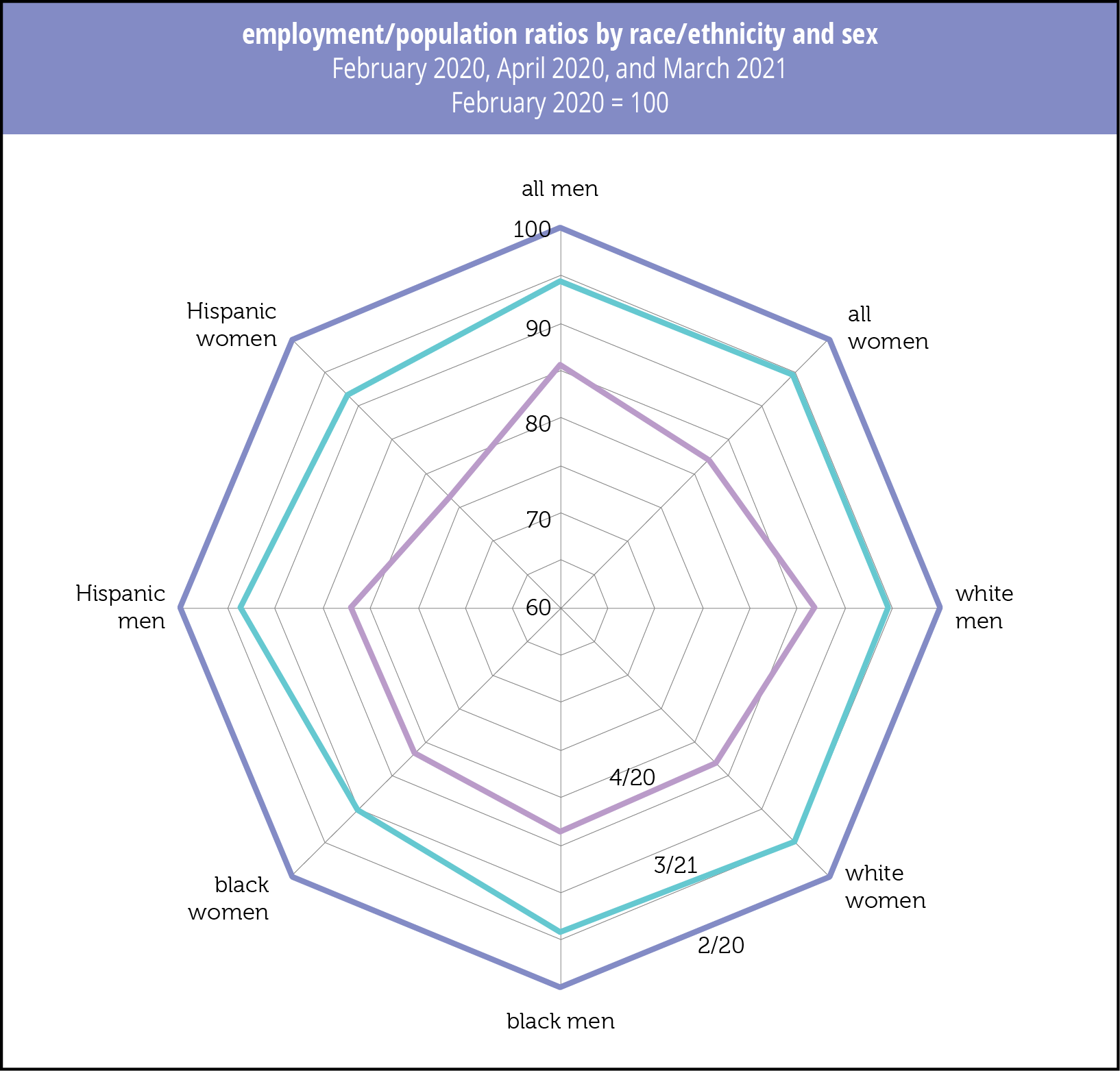
Frontier Knowledge & Start-Up Quality
In their 2015 research paper “Where is Silicon Valley?,” Jorge Guzman and Scott Stern set out a new method of ranking entrepreneurial ventures focusing on quality, not quantity as had prior reports, in part to provide policy-makers with information on how to promote entrepreneurship for economic and social progress.
They assemnbled five metrics, firm-name characteristics (named after the founder, long, short?), is it local or part of a regional trading cluster or high-tech industry cluster; is it a corporation, LLC, or incorporated in Delaware, and does it gain control of formal intellectual property rights within one year? They do not include location in order to step around the pitfall of assuming that businesses in a given location have a given level of quality. The quality metric is the probability of an initial public offering or an acquisition within 6 years of founding.
Their results are not surprising, but some of the magnitudes may be. Of course in California Silicon Valley stands out, with a quality ranking 20 times the average, and 90 times the lowest ranked cities. Quality is tied to the proximity of research universities and national labs. Finally, the high stakes are apparent in the difficulty of reaching the growth metric: Even those firms ranked in the top 1% have just a 5% chance hitting it.
Fast forward to 2021 and More than an Ivory Tower, the Impact of Research Institutions on the Quality and Quantity of Entrepreneurship, by Valentina Tartari and Scott Stern, who take on the possibly circular logic of the relationship of research institutes and start-up quality. (The former are often located in innovative environments and can themselves be sources of demand.) Three steps gets them there: assess annual business registration records using the analytics outlined above by zip code; link to presence or absence of research university or labs; and consider changes in Federal funding of those institutions, and whether it is directed to research or other activities.
They found that changes in Federal research commitments to universities are “uniquely linked” to positive changes in the quality-adjusted quantity of entrepreneurship, but that increases in non-research funding to universities as well as research funding to national laboratories has either neutral or no impact. In their conclusion they underscore that their research supports MIT’s Jonathan Gruber and Simon Johnson’s argument laid out in Jump-Starting America, for establishing a set of regional innovation hubs to support local “entrepreneurial ecosystems,” outside the established “superstar” hubs.
They suggest that although universities and national labs both conduct significant research, universities distinguish themselves both by also producing students, who often launch start-ups in the area—they suspect students with frontier knowledge play an important and “often underappreciated” role in disseminating knowledge generated at universities to activities in the private sector— and by promoting “policies and rules that encourage openness” and enhance “fluidity between research and industry.”
One of the reasons researchers so dislike non-competition employment constraints.
There’s much more, including interactive maps, from the team at Start-up Cartography Project.


Alabama Jumpers & Jobs
In a recent piece, Margaret Renkl detailed how the native species that once presaged spring have handed the job over to those from the old world that bloom earlier in the year. Acknowledging that many of the beautiful landscapes we have created are largely barren to our native fauna, and that many of our native early bloomers are now threatened in parts of their ranges, she ended, nevertheless, with the thought that the beautiful Yoshino cherries that flower in early spring now belong, “as much to the National Mall,” as they do to Japan.
And what a coincidence. Two days later, forest biologist Dr. Andrea Dávalos, of SUNY Cortland, mentioned in her presentation on the invasive jumping worms chewing into our woodlands that they are believed to have arrived in a 1912 shipment of thousands of cherry trees, a gift from the Japanese counsel to first lady Helen Taft who was partial to the trees. The cherries were eventually planted along the Mall, a beautiful gift gone wrong.*
By the 1940s, the jumping worms were being fed to platypuses in the Bronx Zoo, and sometime in the 1980s they made the jump to the North American wild. Now known by many names, including Alabama jumpers or Jersey wigglers, hitchhiking in bags of dirt, plant specimens, on our shoes, or populating from discarded fishing bait, they have made it into Canada and have been reported in Oregon.
Geum triflorun, Prairie Smoke, endangered in its Michigan and Western New York ranges.
Here’s the problem. Our northern forests grew up without worms. Most of our once-native worms are believed to have been ground away by the glaciers, and those that survive tend to live in wetlands.
Because there were no worms churning up the top soil, over the centuries a deep layer of duff developed on forest floors, becoming the requisite habitat of our woodland species, trillium and dog-tooth violets, ground-nesting birds, like thrushes and ovenbirds, the latter partial to urban playground structures during migration, and many amphibians. As the worms turn the soil layer into something that resembles coffee grounds, native invertebrates die off, and our salamanders lose food staples like millipedes, and are unable to consume the worms that can be bigger than they are.
We’re still learning how mycorrhizae function, but as these symbiotic relationships between mushrooms and plants break down, the soil comes so weak it can’t support our weight. No danger of falling into the Earth’s mantle, but in the breakdown our forest floors change from fungal dominated to bacterial dominated. As we learn more about degraded habitats and the transmission of dangerous pathogens, it is not alarmist to raise a red flag here.
And it that doesn’t get your goat, the worms are creating real problems on golf courses, for example in Kentucky, where the castings obstruct the ball and “are gross,” in forest ecologist terminology.
Where to start?
Dr. Dávalos knows exactly where. Killing off the worms is not an option—we need a broader approach, and many hands on deck. She and her colleagues are investigating the inter-relationship between jumping worms and invasive species in several sites in the Catskills. The work includes looking into possibly related sugar-maple die-offs, how invasive plants are favored over slower growing native species, some under scientific investigation for medicinal properties, in the degraded soils, as well as how our over-populations of deer make the whole mess a lot worse. All of this work can, and we would argue should, be scaled throughout our vulnerable forests.
The average STEM income is about $90,000, and biological techs and surveyors make about half that. Low for STEM, but well above the average pay for retail and restaurant work. And in sparsely populated rural areas with slim opportunity, the surveys Dr. Dávalos and her team are conducting are labor intensive. In addition to hiring young STEM graduates, these surveys take on and train relatively unskilled workers, allowing them entry to STEM careers
Job-world is looking up, but many remain sidelined. Projects that document the complicated relationships between invasive and native species provides real opportunity in rural regions, as well as being a main support of climate science.
To participate in the study, please get in touch with: andrea.davalos@cortland.edu, or learn steps you can take here.