What Jerome Powell thinks about ‘flation
Because he was more of a regulator than economist, Governor Powell flew below many radar screens. All that changed when he became a clear contender to be the new head of the Federal Reserve, and we’ve had a lot of homework to catch-up on, reading speeches he has given over the last year or so to become acquainted with his macroeconomic outlook. On the rate front, he told us what we need to know last June in his remarks, then ignored now widely quoted, to the Economic Club in New York City: “The Committee has been patient in raising rates, and that patience has paid dividends.”
Just as importantly, it appears he is among those questioning why inflation is so low, which would also encourage a patient approach to normalizing interest rates.
Let’s start with his understanding of interest rates. The following excerpts are from a speech given on January 7. 2017:
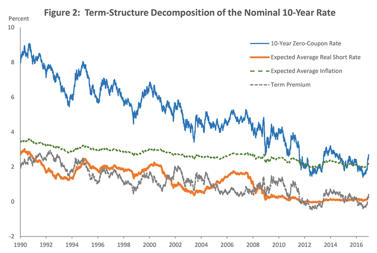
There are also many factors other than monetary policy that are holding down long-term interest rates. Long-term nominal and real rates have been declining for over 30 years. The next slide decomposes long-term nominal yields into expected future short-term real rates, expected future inflation, and a term premium. These estimates are based on one of the Board’s workhorse term structure models. All three components have contributed to the downward trend in long-term nominal yields….
The downward trend in nominal term premiums likely reflects both lower inflation risk and the fact that, with inflation expectations anchored, nominal bonds have become an increasingly good hedge against market risk. That has made bonds a more attractive investment and reduced the term premium.4 As shown in the next slide, a regression of the 10-year term premium on measures of 10-year inflation expectations and a rolling beta of Treasury returns with respect to equity returns (to proxy for the hedging value of bonds) shows that these two factors can account for a large part of the decline in the term premium.
The accompanying slide puts this remark into perspective:
There is a large amount of research explaining why global interest rates are so low. Bernanke’s global savings glut theory,an idea that is still relevant, was the famous first attempt. Others (Brainard) argue that lowered inflation expectations support the decline. As for inflation–another component of the interest rate equation–there are a number of theories about why it is so low. These range from increased international competition to technology creating more price transparency. Finally, research by the San Francisco Fed also explains low rates using standard, economically accepted methodology.
Regardless of the underlying reason, Powell clearly understands there are fundamental reasons for low interest rates. They are not low because of some vast conspiracy. By signaling his acceptance of the underlying research, we can conclude there will be no fundamental change in the underlying market philosophy espoused by the Fed.
What about the pace of increases? Those are likely to be slow:
The healthy state of our economy and favorable outlook suggest that the FOMC should continue the process of normalizing monetary policy. The Committee has been patient in raising rates, and that patience has paid dividends. While the recent performance of the labor market might warrant a faster pace of tightening, inflation has been below target for five years and has moved up only slowly toward 2 percent, which argues for continued patience, especially if that progress slows or stalls. If the economy performs about as expected, I would view it as appropriate to continue to gradually raise rates. I would also see it as appropriate to begin the process of reducing the size of the balance sheet later this year. Of course, both decisions will depend on the performance of the economy.
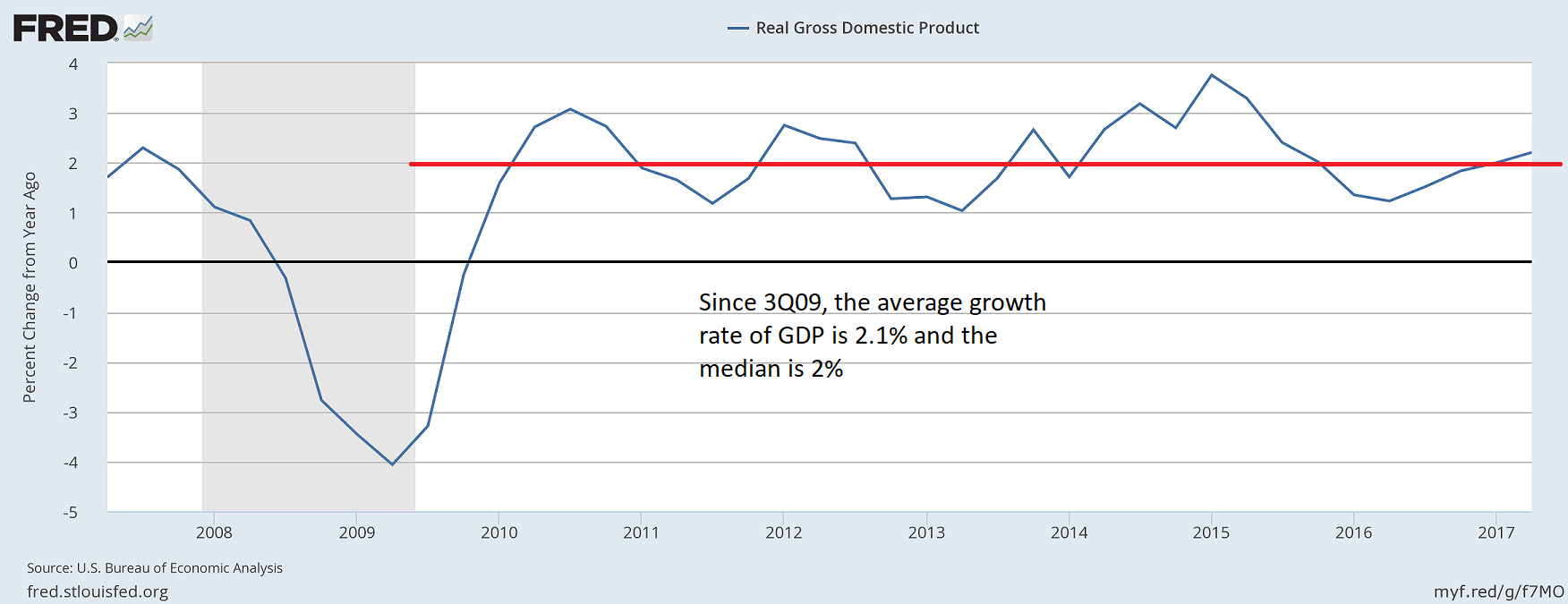
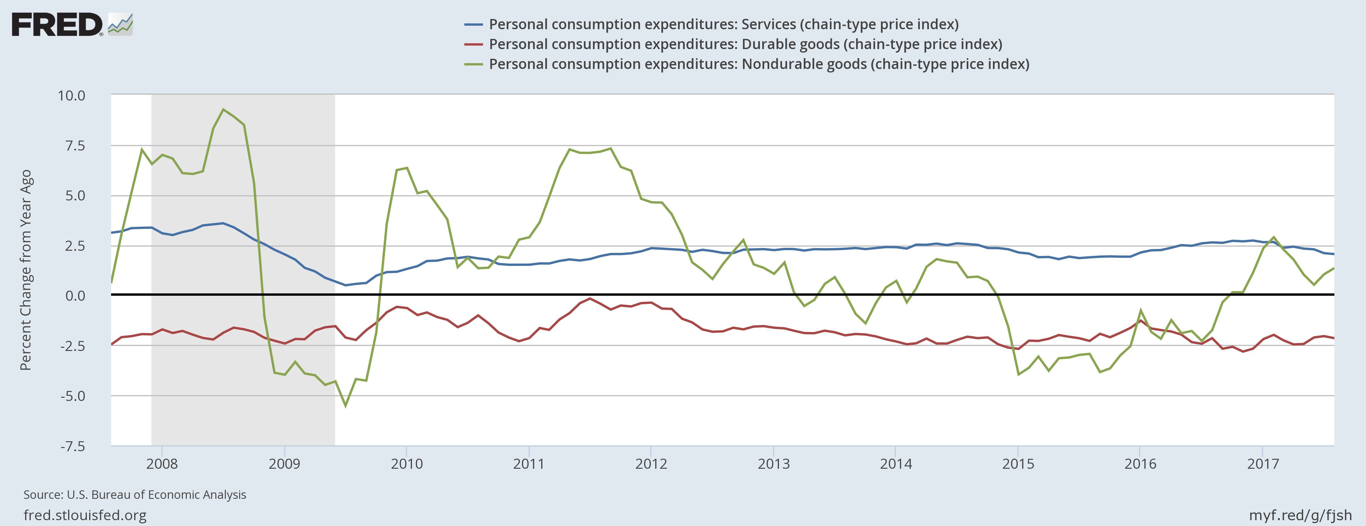
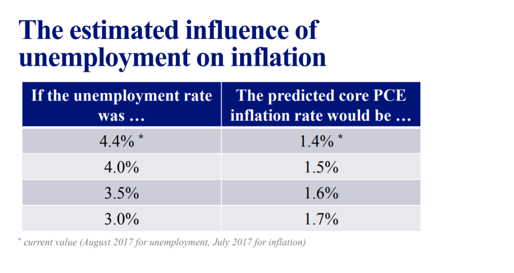
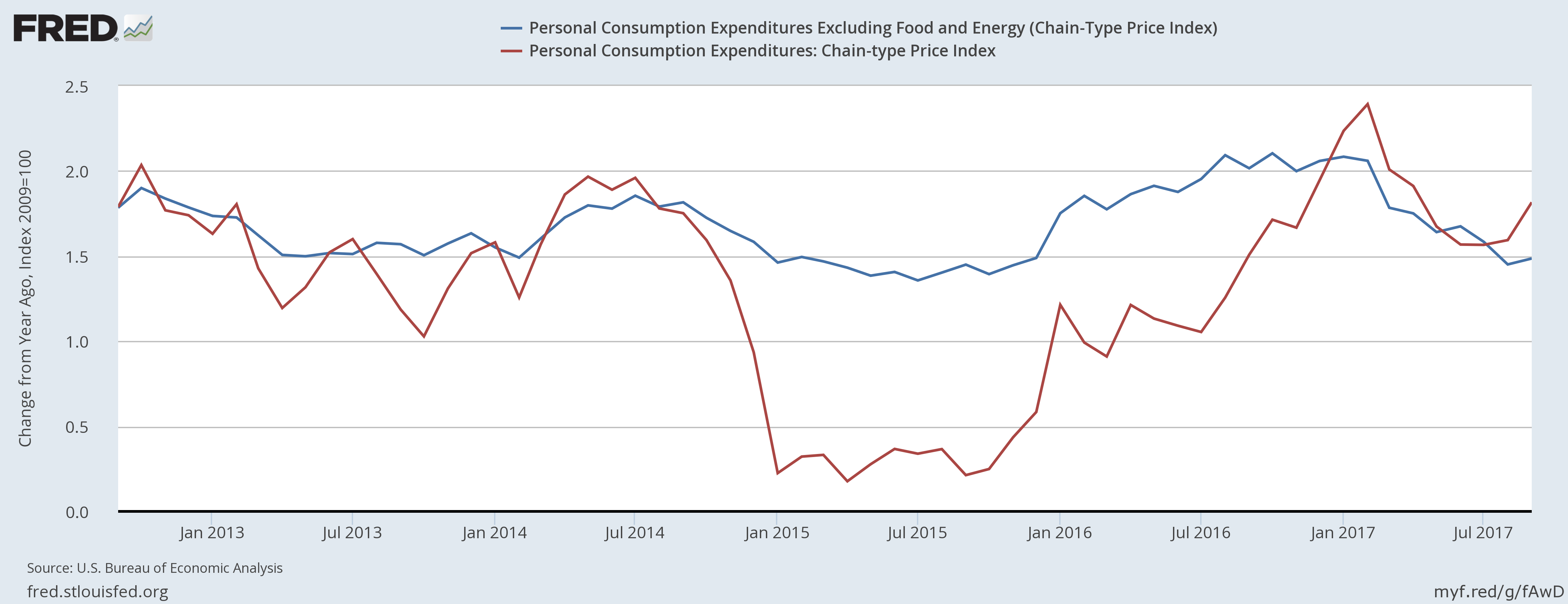
Powell has noticed the weak pace of inflation increases, which was again highlighted in this week’s PCE release:
He has made no more recent comment on the topic, so we don’t know if his thinking has changed. But recent Minutes indicate the Fed is starting to look more deeply into the low inflation situation and may start to rethink their overall philosophy in this area.
The bond market is stodgy, need we add? It would react poorly to a radical change in Federal Reserve philosophy. Powell seems to be a solid, middle-of-the road candidate. While he doesn’t have academic economic training, all evidence is he has worked diligently to learn. Overall, it appears Powell will provide “steady-as-she-goes” leadership.
…