Employment & Productivity

Dwindling Labor Share

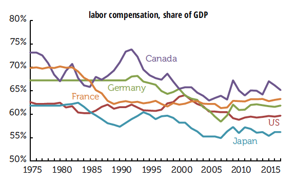
Here we revisit a familiar topic: the decline in the labor share of national income. We were prompted to revisit by a recent post to the St. Louis Fed’s website with the provocative title “Capital’s gain is lately labour’s loss” (Anglo spelling in original). It draws on the work of Loukas Karabarbounis and Brent Neiman (KN), which we’ve also discussed, though mostly in passing. KN’s data runs only through 2012; the St. Louis Fed post draws on their in-house FRED database to update it through 2017 for five major economies.

The declining labor share is interesting for several reasons. For decades, most economists assumed the share to be constant, which makes it far easier to develop economic models of production functions and economic dynamics. But the labor share is not constant. In their examination of 59 countries with at least 15 years of data between 1975 and 2012, BN found 42 with a declining labor share, measured against corporate value-added. A major reason is the declining cost of investment goods; the St Louis researchers present a series showing a near-relentless decline in the price of capital goods vs. consumer goods since 1948, with an acceleration in the 1980s. (The average decline from 1948 through 1979 was 1.6%; from 1980 to 2016, 2.6%.) That makes it easy to substitute capital for labor, to the detriment of labor’s share.

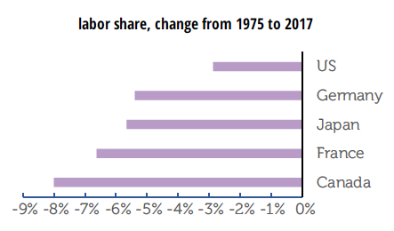
The extension of the data for the five years doesn’t change the fundamental story. The labor share in the five economies shown in the graph on the top of p. 7 was little changed between 2012 and 2017, despite sharp declines in the unemployment rates in most. You might think that a tightening labor market might boost labor’s share, but that hasn’t happened.

As the graphs above show, the declines happened to different degrees and over different intervals for the five countries shown. The declines range from 3 percentage points in the US to 8 in Canada; expressed as percentage (not point) declines, they range from 5% in the US to 11% in Canada (with the other four countries not far behind). Remember, it had been a well-established axiom in economics that this was not supposed to happen.

BN find that most of the decline in the labor share has happened within industries, so it can’t be explained by compositional changes such as the shift from manufacturing to services, which, among other things suggests things other than globalization are at work (given the varying exposure of different industries to international competition). And they also find a decline in the labor share within China, which makes it an unlikely culprit for the decline in the labor share in the richer countries.

They conclude that the decline in the price of investment goods accounts for about half the decline in labor’s share. An interesting question is what accounts for the other half. They don’t examine the effect of labor market deregulation and the declining power of unions, but those seem like worthy avenues of investigation, as they have been in other research pieces.

Longview: ECI

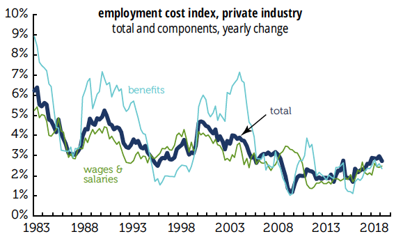
You might think a sub-4% unemployment rate would be nudging the employment cost index (ECI) higher, but it’s not.

In the first quarter, private sector compensation costs were 2.7% at an annual rate and were also up 2.7% for the year. That yearly gain was the lowest since the end of 2017. The softening was led by benefits, up 2.1% in the quarter and 2.4% for the year. Wage growth accelerated some, but still isn’t much above where it was at previous lows on the graph. And growth in overall compensation costs is also around the level of earlier lows. Wages remain the dog that didn’t bark.

by admin· · 0 comments · Employment & Productivity

NIPA review

There were some huzzahs over the first quarter GDP number. The 3.2% quarterly rate, while still below two of 2018’s quarters, was at the upper end of its recent range. And the yearly rate, also 3.2%, was the best in almost five years. But the quarter’s numbers do nothing to close the gap with the long-term trend, and the composition of growth was unimpressive.

As the graph below shows, actual GDP remains well below its 1970–2007 trendline, which is based on an average of 3.2% growth. Since 2019Q1 just matched that average, the trendline remained just as distant. GDP is now almost 17% lower than it would be had the 3.2% average prevailed after the Great Recession. That gap works out to a deficiency of almost $5,000 in per capita terms, which, given long-term relationships, works out to about $3,800 in after-tax personal income. Consumption is 16% below trend; nonresidential fixed investment, 15% below; residential investment, 40% below; and government, 20% below.

And important components of GDP sagged badly in the quarter.

Consumption contributed just 0.8 point to real GDP, less than half what it did the previous quarter, and well below the average for both this expansion and the average of all expansions between 1949 and 2007. The contribution of goods consumption was negative. Nonresidential investment was weak, with both equipment and structures contributing nothing, and only intellectual property making any contribution. Residential investment was a drag on growth. Imports were weak, which is actually a positive contribution to growth, since they’re counted as a subtraction from GDP, but it’s not a sign of strong domestic demand. Inventory investment—which was 0.6% of GDP in nominal terms, twice the average since 1980—contributed a hefty 0.7 point to the headline growth number.

But the headline number did look pretty decent.

by admin· · 0 comments · Employment & Productivity

Comments on December employment

Back when John Liscio was alive, we used to joke with him about using a New York Post style headline, “Job shocker!” This month’s report would qualify.

• Employers added 312,000 jobs in December, 301,000 of them in the private sector. The headline gain was 122,000 above the average of the previous three months, even after the upward revisions to October and November. Though it looks giant by recent standards, the monthly gain in percentage terms was only at the 60th percentile of all months since 1950. It looks better if you start the clock at 1980: then, December’s gain is at the 73rd percentile. Over the year, total employment was up by 1.8%, the highest since 2016. It had been sagging through 2017 and early 2018, but has largely recovered.

• Gains were widespread across sectors. Mining and logging were up 4,000 (slightly below the sector’s average over the last year); construction, 38,000 (well above average, with heavy/civil unusually strong); manufacturing, 32,000 (a third above average, with nondurables in the lead); wholesale trade, 8,000 (slightly above average); retail, 24,000 (three times its average, with a large contribution from general merchandise); transportation and warehousing, 2,000 (way below average, with hard-to-adjust couriers down 5,000); finance, 6,000 (a third below average); professional and business services, 43,000 (a bit below average); education and health, a boffo 82,000 (the health subsector was half again above its average, but private education, apparently enjoying its liberation from federal investigation, up over five times its average); leisure and hospitality, 55,000 (more than twice its average, enjoying a boost from the returning Marriott strikers and a strong performance by bars and restaurants); and other services, 8,000 (somewhat above average). The only major sector in the red: information, down 1,000, in line with its average. Government added 11,000, well above average, with more than all the gain coming from state and local; federal employment was down. (This was all before the federal government shutdown.)

• November’s gain was revised up by 21,000, and October’s by 37,000. The combined total of 58,000 largely came from concurrent seasonal adjustment distributing December’s “surprise” backwards. Before seasonal adjustment, the combined gains in October and November were revised up 12,000; adjustment pushed that up to 58,000.

• Unsurprisingly, diffusion indexes were strong, with all intervals up to levels not only above their 2017 averages, but above the mighty 1995–2000 averages as well.

• The workweek rose 0.1 to 34.5, its level for eight months of 2018.

• Average hourly earnings were up 0.4% for both all workers and nonsupervisory workers. For the year ending in December, the all-worker series was up 3.2%, matching October; the latest readings are the highest we’ve seen since 2009. No major sector showed a decline, and a couple were quite strong, notably retail, up 1.1% for the month and 5.0% for the year.

• The household survey was less exuberant. Total employment was up 142,000. When adjusted to match the payroll concept, household employment was up a more modest 180,000. On a yearly basis, which is a much better way to look at this volatile series, adjusted employment was up 1.8%, exactly in line with its payroll counterpart. Employment growth lagged the increase in the labor force, which was up 419,000. Consequently, the participation rate rose by 0.2, to 63.1%, its highest level in nearly five years, but the employment/population ratio was unchanged at 60.6% for the third consecutive month. Part-time employment was up by 159,000, though all of it came from the willing, up 305,000; those working part-time for economic reasons fell by 146,000. Unwilling part-timers accounted for 3.0% of employment, which is pretty much where the share has been since June.

• The number of unemployed rose by 276,000, and the rate rose 0.2 to 3.9%, its highest level since June. Because of separate seasonal adjustment, the component of the unemployed don’t add to the total, but voluntary leavers, a proxy for the quit rate, accounted for a big chunk of the increase, though the strong message of that number was countered by a relatively large number of permanent job losers. All durations of unemployment showed an increase except the very shortest, less than five weeks; the median and mean durations both rose 0.1 point, though they’re still at the low end of their recent ranges. The broad U-6 rate was unchanged at 7.6%. It’s up 0.2 since August.

• The age distribution of employment gains is curious. Given the volatility of the month-to-month figures in the household survey, we’ll look instead at changes for the year ending in December. Of the 2.9 million jobs gained over the year, nearly half, 49%, came from workers aged 55 and over, over twice their share of the workforce. Prime-aged workers, those aged 25–54, who account for nearly two-thirds of the workforce, or 64% to be precise, accounted for less than half the gains (45%). Their contribution was dragged down by the older group within that cohort, as the number of those aged 45–54 actually declined. Those aged 35–44 showed gains slightly smaller than their share of the workforce, while the youngest subgroup, 25–34, were up strongly. Also over-represented in the gains: older teens, those aged 18–19; just 2% of the workforce, they accounted for 11% of the year’s gains.

• Job flows numbers lacked drama, with all categories showing little change. One bright spot: the three-month month moving average of the share of the unemployed dropping out of the labor force—a lingering blemish on the expansion—fell to just 1.1%, matching the series all-time lows, set in late 2000.

Strong employment gains (at least in the establishment survey) and strong wage gains would normally excite some trigger fingers at the FOMC, though recent financial market turmoil might calm the itch (as Powell’s speech this morning suggests). With aspects of this expansion that look quite long in the tooth, you can’t not be impressed by these numbers.

by admin· · 5 comments · Employment & Productivity

Light truck detailing with an insider

In our mid-November report, we noted that auto-industry expert Kim Hill pointed out at a recent conference that automobiles’ share of total sales had dropped five percentage points over the year, and that the average price had risen 3% over that same period, because of light trucks. You can see that on the graph below, and also the, we’d say, shocking fact that light trucks were about 15% of total sales in 1970 and are close to 70% today. We’d like to give Kim a hat-tip for pointing out that within this trend auto jobs in nine states were at risk, with four plants in Michigan, six between the Great Lakes and the Gulf Coast in danger, and plants in California and Kansas possibly targeted.

As we heard from a small percentage of those plants, we picked up the phone, and Kim immediately cut to the chase, highlighting two trends. First, “One of the ugly parts of this industry transformation is that you have a bunch of older workers who just don’t have the skills they need for the future.” Them’s harsh terms about “cutting out dead wood,” so they can hire the tech-savvy younger workers, and we all agree that that is a public policy issue.
Kim says that General Motors has been looking at the plant in Ontario for a long time, and they are going to take some PR lumps for that because Canada and Ontario governments helped out GM during bankruptcy.

Here in the U.S. they are contractually obliged with unions to give long leads when they are closing plants, so don’t pencil these layoffs into your forecasts yet. Kim thought there would be more shuffling of workers, and was surprised to hear about the outright closings, although he knew the risk was there. He also suspects that the two plants being scrutinized, one in Ohio and one in Michigan, will be whipsawed against each other, and the states will get involved in a kind of bribing process with lots of money on the table. As sales of sedans “fall off the table,” these shifts to truck-style products will continue.

Auto manufacturing multipliers are always a subject for debate, if you go in for that kind of thing, and you could drive a SUV through the range here. The Bureau of Economic Analysis puts a 2.87 on the auto industry, meaning $1.87 in spending for every direct dollar, but Kim says there are big differences if you look at regions or the entire nation. Regionally he and his colleagues can tell “the minute they get off the freeway” if a plant is thriving or wilting. “In Fort Wayne there make a ton of pickup trucks and small businesses are thriving, but for the last 10 years in Lordstown there are more and more empty parking lots.”

The auto-industry’s rule of thumb is that you’re safe if you take a multiplier of 7, that means 6 jobs for every direct job, for the industry overall. On the state level, that may fall to 4 or 5 because you are not picking up work generated outside the limited region, and if you look at the national level you can get up to a 10 multiplier for assembly plants because then you are picking up all the small suppliers and service firms throughout the country.

Plants at risk include those in Lansing, Michigan, assembling Camaros and Cadillacs; in Lake, Orion assembling Sonic and Bolt; in Georgetown, Kentucky assembling all sedans; in Fairfax, Kansas, making Malibus; in Chattanooga assembling small utility vehicles—as well as the Alabama Hyundai plant, and the Mississippi Blue Springs/Tupelo Corolla plant. More to come and not as sweet as Tupelo honey.

Many have reported that tariffs are a driving force in these plant closings, but Kim isn’t so sure. He didn’t refute our suggestion that tariffs may have been a deciding factor in the decision to shift employees between plants and outright closings, but he said there is too much in flux: many assembly plants might be able to absorb a 10% tariff but would choke on a 25% tariff, and it’s impossible to expect anyone to make a “massive industrial decision” without that information. It’s also very hard for decision makers to deal with “whimsical buyers driven by fuel prices.” Customers can turn on a dime, but manufacturers can’t. We’ll be featuring intermittent interviews with Kim Hill, so expect one in a few months when the effects of tariffs become clearer.

by admin· · 0 comments · Employment & Productivity, TLR Wire