Non-Productive Poaching: It’s a Thing
Hat tip to Josh Lehner, of the Oregon Office of Economic Analysis, for suggesting we look at The Dual Beveridge Curve by Anton Cheremukhin and Paulina Restrepo-Echavarría, of the Dallas and St Louis Feds.
We’re outlining their research here, and strongly recommend you look at the graphs if you don’t have time to read through the paper. We were planning to take up a few other papers on the Great 3-Rs Debate—Resignation, Retirement and now Renegotiation—in this issue, but we’ll leave that for later to focus on this paper. It presents a very different way of considering the Beveridge Curve. To us it’s a real relief to have creative researchers getting into this instead of shrugging it off as a mystery, or building inaccurate narratives.
Some ads are looking for workers from the pool of the unemployed, others aim to poach employees. The two objectives target different skill sets, and have different effects on the labor market: a job shift has no effect on un- and employment rates, but a hire from the pool of unemployed workers does.
When the authors first call their view “extreme,” we thought, hey, it actually could just as easily be called highly logical. The extreme comes in because their “simple” model breaks the overall search and matching process into two non-overlapping processes: the two sets work in “separate, segmented” markets.
This departs from the usual practice that aggregates all workers, the employed and the unemployed, who may be searching for a job, with all vacancies, adds something new to the literature, and also contributes to the measurement of the searches of the employed.
In their underlying remarks they note that 99% of the unemployed spend some time actively looking for work, which is in line with the Bureau of Labor Statistics’ definition of being unemployed and with survey results, but that a far smaller share of the employed search for work. Using the Survey of Consumer Expectations and work by Jason Faberman they put that at about 22%. The employed are more efficient than the unemployed at finding work.
In their words, a “proper” Beveridge Curve should only include ads aimed at the unemployed. To do this, they break the Beveridge Curve out by sector, creating adjusted curves, which take the mystery out of the curve’s behavior. If you exclude the poaching ads, you end up with a very ordinary curve. (Please note they used the Household Survey adjusted to be like the Payroll Survey for this, not that other noisy thing.)
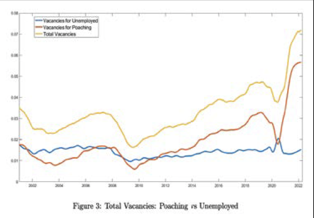
We snapped their graph (below), and you can see that the increase in poaching ads increased significantly in 2015. In their words, the curve shifted up at that time because of “a dramatic increase in non-productive poaching vacancies.” (We’ll say dramatic. That graph is as stunning as the openings rate was unbelievable to us.)
There was some drama in the most recent recession. Poaching vacancies dropped in 2020 and quickly recovered, but vacancies fishing for the unemployed rose in the recession, a time of social distancing, high unemployment, and decreased poaching. Spurred by measures to control the pandemic, more workers were laid off than could be explained by the fall in demand, and many were hired back quickly.
At this point, fiscal and monetary policy drove up demand, firms needed to expand, and that poaching reaccelerated. Supply bottlenecks and demand led to a surge in goods inflation, and poaching drove up wages. That’s what happened recently, and Cheremukhin and Restrepo-Echavarría are searching micro data to understand what drove the poaching surge in 2015.
Considering what will happen to unemployment, they note that in the 2000s ads designed to poach and those designed to draw were about the same, but now the majority of job openings target the employed. That would suggest the decline in openings might have an historically small effect on unemployment, and here they mention a soft landing.
But they add a caution. If mismeasurement is improving, then the Beveridge curve has shifted outwards, but the slope has not changed, and we don’t have the steepened curve required for the soft landing. Then a decrease in vacancies could drive an increase in the unemployment rate.
They also reference work done in 2013 showing that as of 2011, 42% of hires came from firms that did not report any openings. Alas, wider knowledge of that study might have saved us a lot of time spent squabbling over the openings rate.
Coda: Back in 2015, just as the yet-to-be-explained surge in poaching got underway we renamed, and in print, the openings rate the “Tire Kicker Rate,” on the belief that employers were just fishing, and raised many red flags that the openings rate was not doing well as an indicator, and it was likely driving faulty policy.
And that’s the sobering fact in this paper: The narrative was that unemployed workers were either too unskilled or too lazy to work. All the hullabaloo about job openings and the unemployed was misdirected. The companies were angling for workers already employed elsewhere, and the unemployed took the rap.



Does a starry sky have protections?
Based on potential orbital debris and light pollution, The GAO recently published recommendations that the FCC review and document whether licensing of mega-constellation satellites “normally does not have significant effects on the environment,” establish review process and a time frame for its “categorical exclusion” of such licensing, and make public the factors FCC considers in determining “extraordinary circumstances.” They also report that FCC agreed with their recommendations.
Although a debate over whether people have a right to a dark night sky hasn’t been on the radar screen for all but a tiny and recent sliver of human history, in early 2020 then Vanderbilt law student Ramon J. Ryan argued in The Fault of Our Stars that the FCC should back away from its categorical exclusion of satellites from environmental review, and complete an environmental assessment of direct, indirect and cumulative effects of commonly used satellite components on the environment. Noting that programs like Starlink have the potential to provide internet to billions of people lacking access, such a process would create standards in the commercial-satellite industry that would comply with Congress’s mandate that the federal government proactively consider environmental impacts of its actions, without denying possible positive effects on economic stability and access. He cites NASA’s environmental review of routine payloads in their missions as a model.
In 2019 about 2,200 satellites were orbiting the planet, a number Ryan suggested should increase five-fold in the next few years. Scientific American (SA) now reports that SpaceX alone has been granted permission to launch 12,000 in the next years, with plans for another 30,000, and almost all brighter than anything currently in orbit.
Then a FCC spokesman rejected Ryan’s argument, but other lawyers interviewed for the SA piece believe there is ample precedent, including a successful questioning by environmental groups of the National Institute of Health’s approval of recombinant DNA bacteria without proper review, and the US Army Corps approving licenses for gambling ships in the Mississippi. Considerations mandated under the National Environmental Policy Act include direct and indirect effects on “aesthetic, historic, and cultural” considerations, and Sarah Bordelon, an environmental lawyer, believes that Ryan’s argument that the night sky falls into those categories is “not a crazy argument.” Good to know! Bordelon’s argument includes astronomers’ inability to do their jobs, which would give them standing, and she believes if the FCC missed a significant issue, they would likely lose a legal challenge.
In what the SA calls a “belated attempt” to solve astronomers’ concerns, SpaceX has tried a light-reducing coating for some satellites, but it’s not clear that is working. A court battle would last for years, and there could be an injunction prohibiting new launches. Please remember, it’s our money and this is important information on balancing the possibilities of mega rockets—like obviating the need to fold the James Webb Space Telescope up so it would fit into a rocket—with our love of our night sky.
And anyone reading through a startup’s prospectus that includes such things as a use of mercury rejected by NASA fifty years ago, please take heed.
Philippa Dunne & Doug Henwood