Articles by: admin

Spidery Views on Inflation and Employment

We are happy that our interpretation of Fed Governor Lael Brainard’s speech on Tuesday, May 30th, to the New York Association of Business Economists seems to have had an effect on how analysts are viewing the current economy. As we wrote here, her talk was not the shedding of her dovish feathers, but a continuation of her focus on ongoing weakness in inflation despite, as she put it, the growing number of forecasters who believe the U.S. economy is at or very close to full employment. We decided to let the spiders do the talking on the state of US employment, and on inflationary pressure, or lack thereof, the now ubiquitous tag.

First employment. Here’s an updated employment spider inspired by one put together by James Bullard, the president of the St. Louis Fed, when he was feeling “Halloweenish” back in 2015.

job-spider

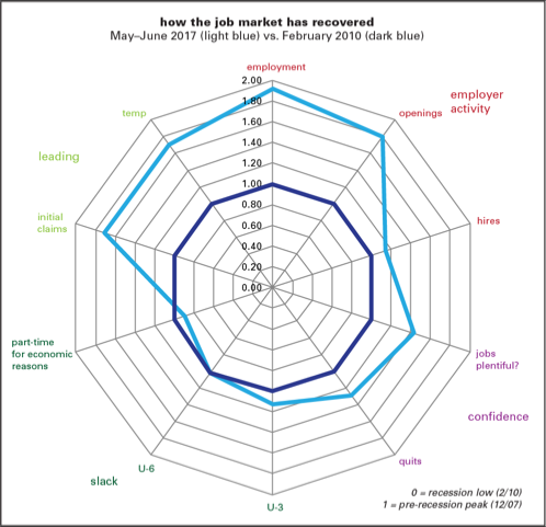
The graph uses an integer measure showing the percentage of recession losses that have been regained in recovery and expansion. (For example, an 0.5 reading means that 50% of the losses have been regained; 1.5, 150% have been regained. In most of what follows, the numbers are well above 1, meaning that they’ve recovered and then some.) In a phrase, we’re well beyond the recovery phase and firmly into expansion.

Bullard sorted ten major employment indicators into four groups: employer activity (payroll employment, job openings and hires from JOLTS), confidence (“jobs plentiful” from the Conference Board’s confidence survey, quits from JOLTS), slack (narrow and broad unemployment, share working part-time for economic reasons), and leading (initial claims and temp employment). The measures of slack are the least recovered, with the share working part-time for economic reasons the only one of the 10 still in a hole. Hires are lagging both openings and employment. The leading indicators are looking good, though with the growing casualization of employment, temporary firms may have lost some of their leading characteristics. And the confidence measures have also picked up nicely.

Which takes us to the next spider (or radar, if you prefer) graph. With the job market relatively strong, how would a such a graph look for inflation? Much, much weaker.

inflation-spider

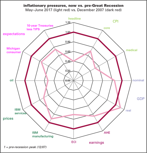
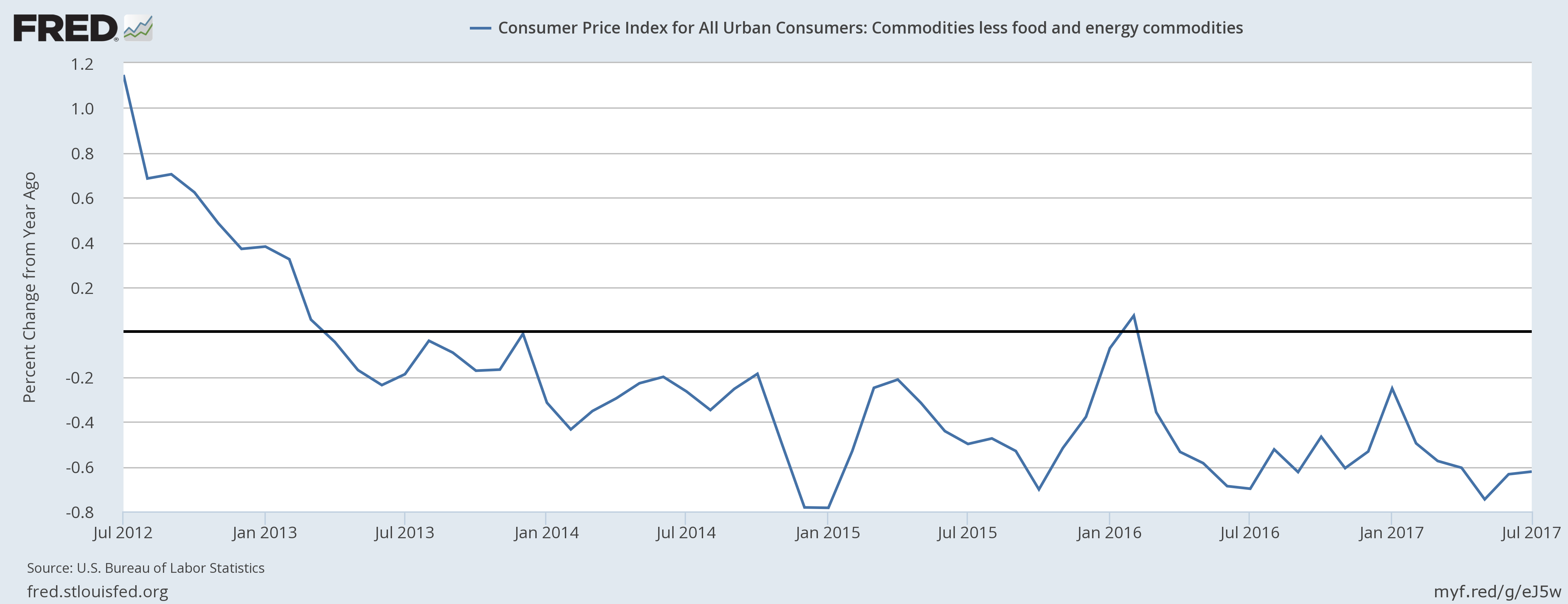
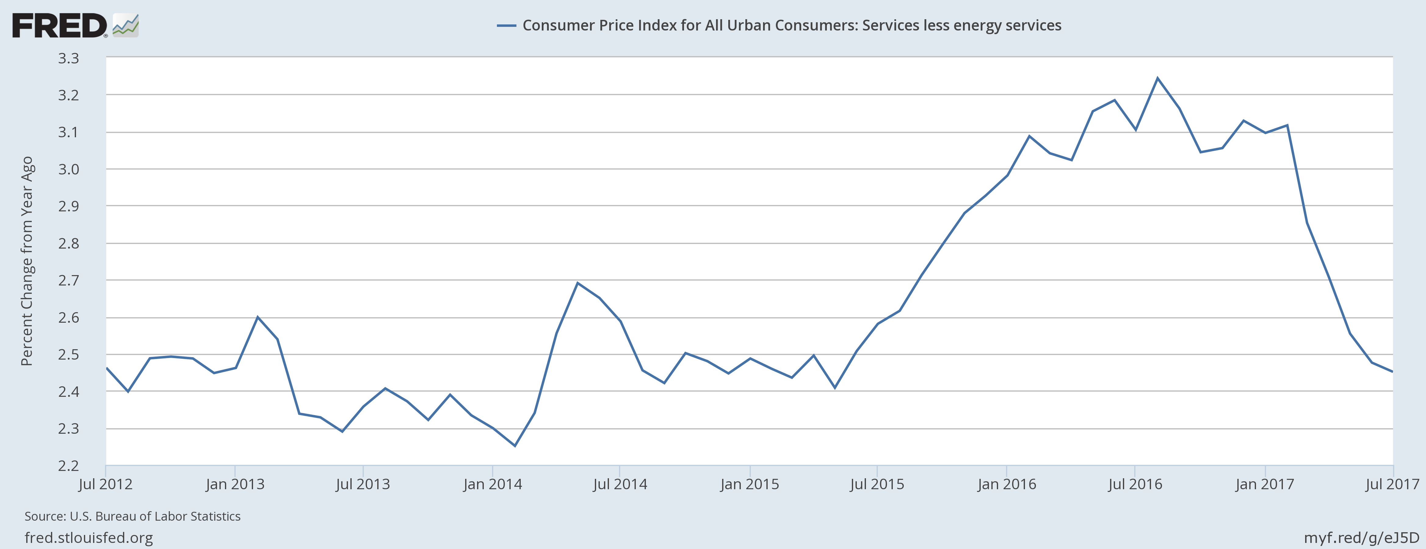
In this graph, we’re not looking at losses recovered but how the inflation-related indicators look compared to their levels at the onset of recession in December 2007. Following Bullard’s model, we sorted twelve inflation-related indicators into five groups: CPI measures, GDP measures, earnings, prices, and expectations. Headline year-to-year inflation is 60% below its pre-recession level; core, 30% below. Even medical inflation is down by half. That’s true even though real GDP growth in 2017Q2 was a little above where it was in 2007Q4. Underscoring the point about the lack of inflation, nominal GDP growth is well below end-2007 rates, unlike its real counterpart. That speaks to calls by Fed advisor Michael Woodford to track nominal GDP as a way of getting around problems with inflation adjustments Average hourly earnings growth is more than a sixth lower than it was ten years ago, and the employment cost index, over a third lower. Price indexes in the ISM surveys, especially services, are also below where they were at the end of 2007—and the oil price is down by half. And inflation expectations—measured by the Michigan survey of consumers, and what is implied by the spread between 10-year Treasuries and comparable TIPS—are about a quarter below where they were then.

With monetary policy gently lifting and fiscal policy in great disarray for now, deflation looks like more of a risk than inflation.

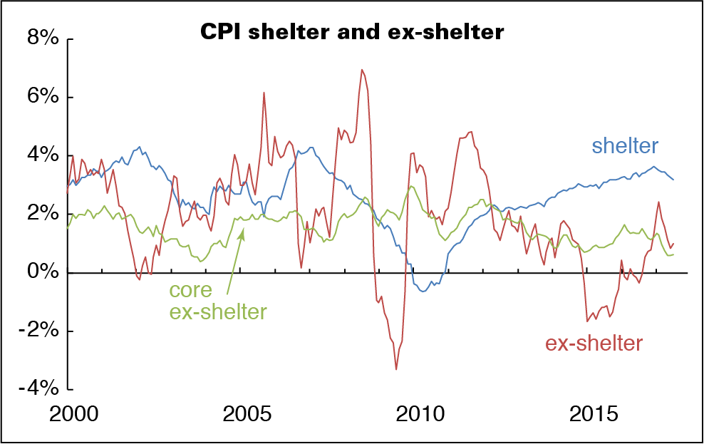
Spotlight on shelter inflation

It’s been nearly a year since we looked at the outsized contribution of shelter to the overall inflation. It’s still outsized.

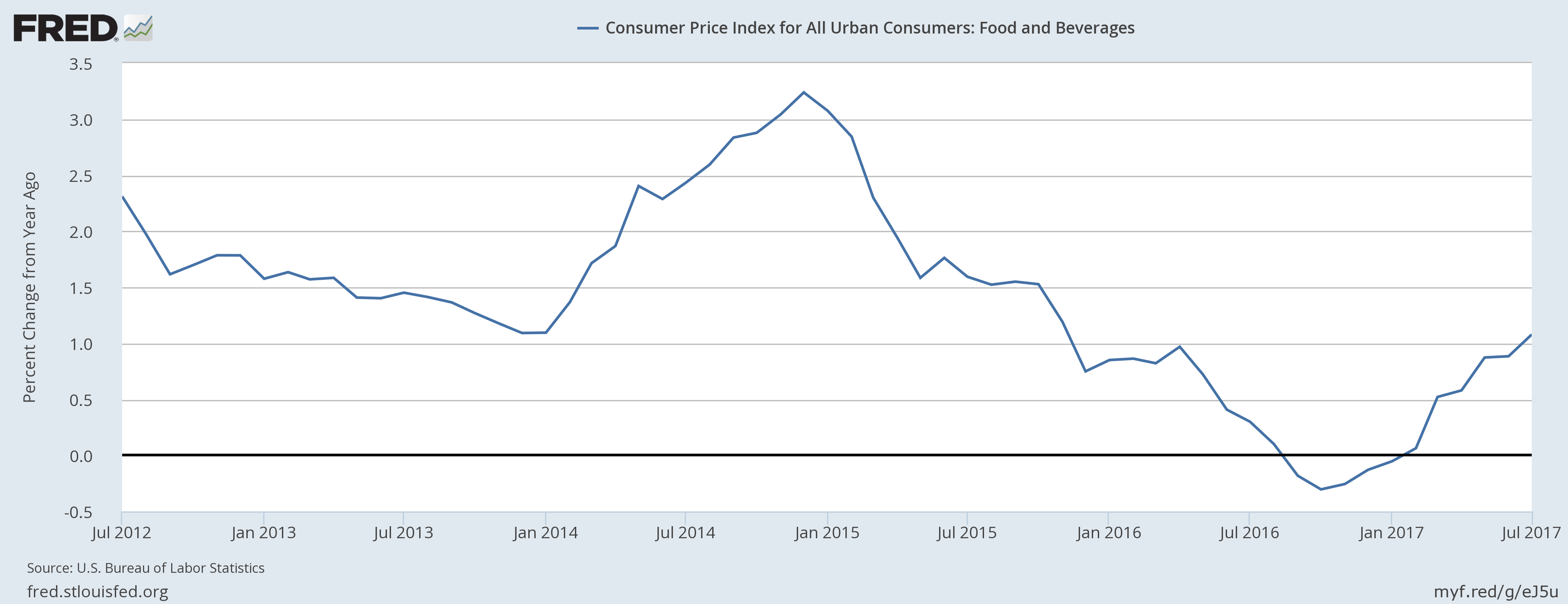
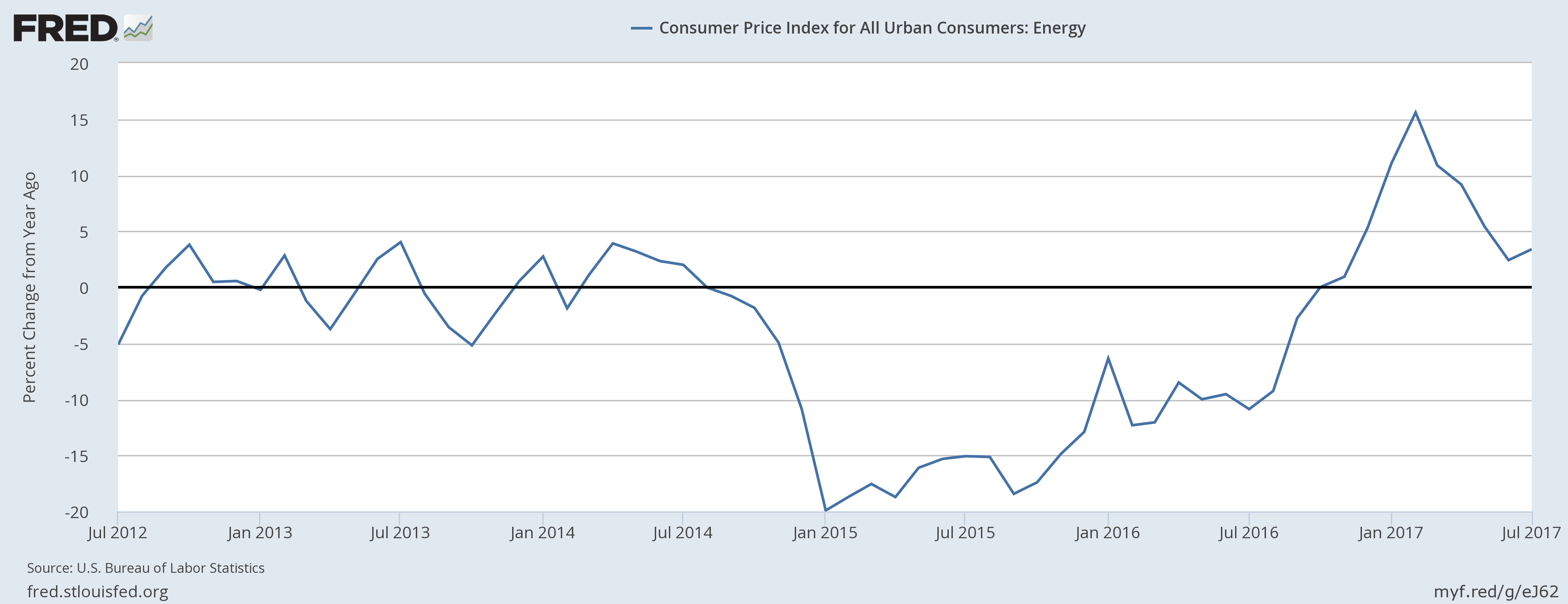
For the year ending in July 2017, both headline and core inflation were up 1.7%. That’s about where the headline number was a year ago; core was half a point higher. But inflation in shelter was 3.2%, down only 0.1 from a year ago. Take shelter out of core inflation, and prices are up 0.6% for the year, less than half the rate twelve months earlier.

Now we realize that taking food, shelter, and energy out of the CPI takes slightly more than half out of the market basket. Our dear John Liscio used to joke that some analysts wanted to take so many things out of the price indexes that poor Hampton Pearson of CNBC would have to report the numbers while standing in front of the BLS in the dark, wearing only a barrel. But inflation that’s largely concentrated in shelter and (from time to time) energy doesn’t have much to do with the shape of the labor market.

cpi-shelter-etc

Tire kicking

Quite the buzz arose on the release of the June Job Opening and Labor Turnover Survey (JOLTS) numbers, showing record-tying openings in the private sector. (There wasn’t much else of note in the report; the hires rate was flat, and the layoff rate was up 0.1pp from May and the prior year.) The inability to find qualified employees is the standard explanation; a creative variation that’s arisen recently is that too many fail their drug tests, or would if they had the nerve to take them.

We’re flipping that argument. How can the high level of openings coexist with a less exuberant quit rate (which, by the way, slipped a notch in June)? In 2006, openings ran 0.9 points above quits, the spread tightened into 2009, and then widened again. It’s averaged 1.7 since 2015, and in June was 1.9. Why has the gap widened so?

jolts-openings-and-quits

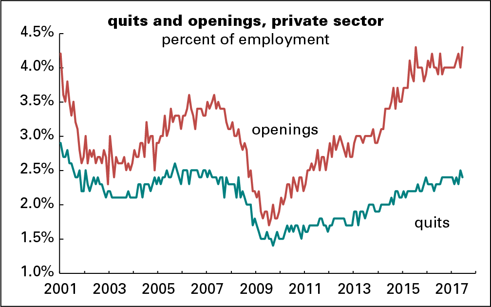
Presumably the already-employed are qualified and capable of passing a drug test. It seems odd that employers with all those openings don’t bid them away. Could it be that employers just don’t want to pay up, or can’t with productivity so weak?

Perhaps, also, the already employed are aware that their own employers are putting out feelers but reluctant to follow up with actual hires.

We’re not even talking about drawing the unemployed or marginally attached in from the sidelines. If there is real information in the openings rate, we are confident there would be more job-switching.

July sales tax collections

In July, 54% of the states in our survey met or exceeded their forecasted sales tax collections, down from June’s 70%, and 97% reported growth over the year. That’s better than June’s 82%, but was padded by the fact that July 2016 ended on a weekend, forcing payments into August last year. The average over-the-year rate of change moved to 4.7% from June’s 52%, and the margin from forecast rounded down to 1% having rounded up to 1% in June.

sdi-7-17

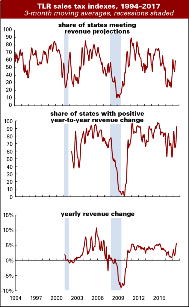
July collections tend to be a “throw away” month in revenue departments. Some of the collections accrue back to June, and July is what’s left, so trend watching resumes in earnest in August. The positive comments were subdued. Our contact in a large western state noted that they are continuing their “trend of beating forecast,” but that’s a conservative 1.2% for the current quarter.

The energy extraction states had another strong month, but recent state detail on job gains in those states does not suggest that extraction employment is leading the way. No surprise there, it’s a tiny sector. For example, in Texas, logging and mining work constitutes just under 2% of total employment, so its 7% contribution to the over-the-year gain of 313,000 jobs is impressive. But that contribution is eclipsed by professional & business services, and government work’s contributions of 20%, or 60,000 jobs each. Each of those sectors comprise about 14% of total employment.

In some states collections soared toward the end of the month and faded in the early days of August, reflecting the calendar effect. Our contact in one such state noted that his conversations with industry leaders does not suggest a consistent “more jobs=more spending” scenario, but rather that perhaps the better job gains among college students this summer is contributing to decent withholding and quite strong sales revenues. He’s also concerned that debt may be creeping up.

State-level GDP: Down on the farm with energy rising

During first quarter of 2017, economic growth declined in five of the seven Plains states. Within this region, only Missouri and North Dakota saw their economies grow during the quarter. North Dakota’s growth came from a reviving energy sector that contributed 1.7pp and offset almost the entire 1.9pp drop in its agriculture sector. Missouri’s agriculture sector declined by 0.8pp, but this was offset by relatively strong growth in durable goods manufacturing and wholesale trade.

The states that experienced the greatest declines in output were Nebraska (-4.0%), South Dakota (-3.8%), and Iowa (-3.2%). Lower prices for row crops likely explain the decline. During the first quarter of 2017 corn prices averaged 4.4% below the prior year and wheat prices were down 11.7%. Soybean prices were up somewhat compared to 2016 but were trending lower.

Nationwide the agriculture, forestry, fishing and hunting sector subtracted 0.41pp from the overall annualized growth, which totaled 1.1%. As the accompanying chart shows, absent the agriculture sector national GDP grew by 1.6% during the first quarter.

The fasted growing sector in Q1 was mining, which includes oil extraction. It was up 0.3%. As shown in the accompanying chart, excluding the mining sector national GDP would have only increased by 0.8%.

gdp-xag-xmin

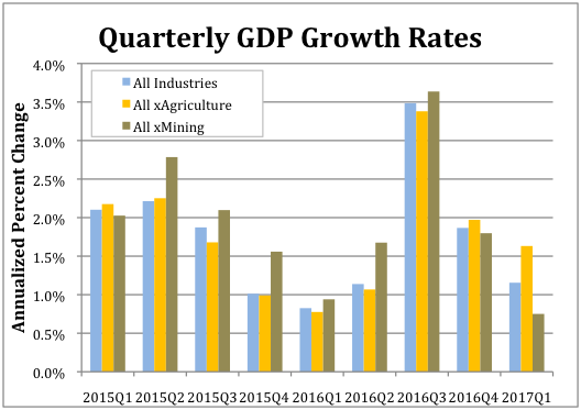
Texas 3.9% gain was the strongest. Its mining sector increased by 2.1pp. West Virginia experienced the second highest rate of overall growth at 3.0% and its mining sector contributed 3.2pp. New Mexico had the third highest growth rate at 2.8% with its mining sector contributing 1.8pp. Other energy states also experienced increased growth. Oklahoma’s 1.9% growth in output ranked 11th and noisy Alaska’s 1.8% growth ranked 14th. (A revenue estimator from the state told us they basically don’t even try to forecast revenue growth in the state because the economy is so volatile.)

But other energy states did not fare as well. Lousiana’s economy grew by only 1.0% (ranked 28th). Growth in Wyoming clocked at just 0.9% (32nd), and Montana saw a 0.5% decline (45th)

Finally, a couple of standout states for the quarter were Washington and Wisconsin. Washington continued a pattern of strong performance from 2016 when it took the blue ribbon. Its economy grew at an annualized rate of 2.7% during the first quarter and by 3.8% for all of 2016. This growth was driven by its information sector, which accounted for 1.7pp, and durable goods manufacturing, which accounted for 0.7pp, of the overall growth. Wisconsin’s 2.1% annualized growth for the first quarter represents a reversal of fortune from 2016 during, when its economy grew by only 0.9%. The sectors that contributed the most to its first quarter 2017 growth were real estate (0.6pp), durable goods manufacturing (0.4pp) and nondurable goods manufacturing (0.4pp).

by admin· · 0 comments · Uncategorized

Protected: A new culprit lurks in the footnotes

This content is password protected. To view it please enter your password below:

by admin· · Enter your password to view comments. · Comments & Context, Red Flags

The Fed: Climate Change Ahead?

My formative years stretched from the mid-1970s to mid-1980s. While my economic awareness of the time was at best weak, I do remember that inflation was a very important issue that was constantly on my father’s mind. In case you’re wondering, the “I” in this piece is Hale Stewart.

It’s also obvious that this period haunts today’s central bankers as they continue to worry about inflationary pressures despite all evidence to the contrary. But the latest minuteswhich were released on Wednesdayshow a Fed that is beginning to realize some of them just may have it wrong.

Let’s start with their observations about the current state of inflation:

Total U.S. consumer prices, as measured by the PCE price index, increased 1-1/2 percent over the 12 months ending in May. Core PCE price inflation was also 1-1/2 percent over that same period. Over the 12 months ending in June, the consumer price index (CPI) rose 1-1/2 percent, while core CPI inflation was 1-3/4 percent. The median of inflation expectations over the next 5 to 10 years from the Michigan survey edged up both in June and in the preliminary reading for July. Other measures of longer‑run inflation expectations were generally little changed, on balance, in recent months, although those from the Desk’s Survey of Primary Dealers and Survey of Market Participants had ticked down recently.

Let’s put that into quantitative perspective:

fredgraph-5

The chart above show 12 months of the Y/Y percentage change in core and overall CPI and PCE prices. Core CPI is purple. It was greater than 2% until April and has been below the Fed’s target since. The green bar is overall CPI, which was greater than 2% for five months but fell below 2% in April. The bottom chart tracks the same data over the most recent 5-year period; none of these measures meaningfully breached 2% in that stretch. The conclusion is clear: inflation has not meaningfully penetrated the Federal Reserve’s 2% target since 2012.

The next paragraph discussing inflation highlights the fed’s inflation projections:

The staff’s forecast for consumer price inflation, as measured by the change in the PCE price index, was revised down slightly for 2017 in response to weaker-than-expected incoming data for inflation. As a result, inflation this year was expected to be similar in magnitude to last year, with an upturn in the prices for food and non-energy imports offset by a slower increase in core PCE prices and weaker energy prices. Beyond 2017, the forecast was little revised from the previous projection, as the recent weakness in inflation was viewed as transitory. The staff continued to project that inflation would increase in the next couple of years and that it would be close to the Committee’s longer-run objective in 2018 and at 2 percent in 2019.

This line of reasoning is becoming increasingly perplexing. Although the Fed acknowledges that near-term inflationary pressures are weak and are getting slightly weaker–the Board once again concludes that prices will hit the Fed’s 2% target in the coming years. For the last few years, the Board has consistently believed that price pressures will perform as projected despite all evidence to the contrary.

A later paragraph not only explains why the Fed continues to use this thinking, but also presents several reasons why perhaps they should drop it:

A number of participants noted that much of the analysis of inflation used in policymaking rested on a framework in which, for a given rate of expected inflation, the degree of upward pressures on prices and wages rose as aggregate demand for goods and services and employment of resources increased above long-run sustainable levels. A few participants cited evidence suggesting that this framework was not particularly useful in forecasting inflation. However, most participants thought that the framework remained valid, notwithstanding the recent absence of a pickup in inflation in the face of a tightening labor market and real GDP growth in excess of their estimates of its potential rate. Participants discussed possible reasons for the coexistence of low inflation and low unemployment. These included a diminished responsiveness of prices to resource pressures, a lower natural rate of unemployment, the possibility that slack may be better measured by labor market indicators other than unemployment, lags in the reaction of nominal wage growth and inflation to labor market tightening, and restraints on pricing power from global developments and from innovations to business models spurred by advances in technology. A couple of participants argued that the response of inflation to resource utilization could become stronger if output and employment appreciably overshot their full employment levels, although other participants pointed out that this hypothesized nonlinear response had little empirical support.

The Fed’s model is based on a standard economic cause and effect theory: increased demand absorbs excess supply; this increases resource utilization beyond current production capacity; which forces producers to raise prices. Increased demand is also a signal to producers that they have pricing power – the ability to raise prices without negatively impacting demand.

Let’s take a look at some of the reasons the Fed raises as possible reasons for the disconnect between growth and prices late in the paragraph.

First up, a lower natural rate of unemployment: Consider Japan, where unemployment is currently below 3% yet inflationary pressures remain nonexistent.

Next, the possibility that slack may be better measured by labor market indicators other than unemployment: here, the Atlanta Fed’s the labor market spider chart provides the necessary detail.

atlanta-fed_labor-market-historical-distributions-spider-chart

The lower left-hand corner of the chart shows three data points that quantify labor utilization: the employment to population ratio, employees working part time for economic reasons, and employees who are marginally attached to the labor force. Despite a nearly record long expansion, all three levels are still below previous peaks.

Restraints on pricing power from global developments and from innovations to business models spurred by advances in technology are real and here to stay. U.S. business is now competing against any company who has access to the U.S. market. Some of foreign competitors have lower cost structures, lowering their input costs. This, in turn, constrains prices.

The Fed is slow to act, so don’t expect them to radically change their policies or outlook overnight. However, it does appear they are re-evaluating their understanding of how inflation materializes in the economy and the looking for new relationships to explore. This is a very good development.

We hope they will take their own advice on that score. In a recent interview outlined here St. Louis President James Bullard brought up what drives inflation as a key issue, noting that, “…the answer you get from various angles is always the same: that inflation doesn’t seem to be related to the variables that we think it should be related to.” The Phillips Curve seems to have lost its swag. Bullard maintains it never had much, and that we’re better off looking at the recent trend to gauge inflation.

by admin· · 0 comments · Fed Focus, Uncategorized

Inflation, that dog just won’t bark

We are happy to report that Hale Stewart will be contributing to our blog going forward. Here’s a longer look from him, with an assist from the St. Louis Fed, at pricing trends.

Friday’s inflation report was, yet again, underwhelming, further confirming that upward price pressures are contained. Core and overall CPI are 1.7% Y/Y:

fredgraph-16

Both measures are below the Federal Reserve’s 2% inflation target. Core (in blue) was slightly above 2% for most of 2016 while total CPI (in red) was rising. But its increase did not influence overall CPI, indicating that commodity pressures are weak. Although they are part of the misery index, neither food nor energy prices should concern us in terms of sticky inflation:

fredgraph-17

fredgraph-21

The top chart shows the year Y/Y percentage change in food and beverage prices, which were declining from the beginning of 2015 to 3Q2016. They are now increasing, but are only slightly above 1%. The bottom chart shows energy prices which were negative for approximately two years, turning positive at the beginning of 2017. Yes, they did spike to about 15%, but that’s as much a function of statistics as the marketplace activity. Now they are quickly declining. Just as importantly, food and beverage prices are only 13.63% of CPI while energy prices are 7.35%, meaning both would have to increase at sharply faster rates for an extended period time for us to be concerned.

Energy and food prices are the only commodity prices adding to CPI:

fredgraph-19

All commodities less these two items have subtracted from CPI for over four years. This sub-index of overall CPI accounts for 18.95% of CPI. Its negative contributions counterbalance any upward pressure from food and energy prices.

Finally, we have the sub-index for services less energy:

fredgraph-20

This was between 3%-3.2% for most of 2016, but has since decreased sharply. The underlying reasons for this spike have dissipated.

Readers sometimes suggest we adjust spending measures, like retail sales, for certain segments’ own personal deflation in order to show that spending is actually quite strong. That gets a “Huh?” from us. If spending were strong, prices would be floating up. The point is that they are not.

by admin· · 0 comments · Comments & Context

Lael Brainard: Status Quo Not Good Enough

Last Friday, Fed Governor Lael Brainard addressed trainees attending the 20th annual summer program intended to advance diversity in the economics profession, a demanding and often lonesome trail. The program takes place at Michigan State U in East Lansing, and is sponsored by the American Economic Association and the National Science Foundation.

Brainard notes that, “Between 1995 and 2014, the share of women obtaining a doctorate in economics held roughly steady in the neighborhood of 30 percent. Among U.S. citizens and permanent residents earning doctorates, the representation of those identifying as black, Hispanic, or Native American among the pool of doctorate recipients improved from 6 percent in 1995 to 11 percent in 2007. But the improvement has since unwound and the underrepresented minority share stood at about 7 percent in 2014.” [This is at odds with progress in the other STEM professions.]

The idea that broadening diversity and opportunity is the right thing to do sometimes obscures the truth that it is best practice. As Brainard put it, “The quality of the economics profession and its contributions to society will be stronger when a broader range of people are engaged…. We now have substantial empirical evidence documenting the benefits of diversity in broadening the range of ideas and perspectives that are brought to bear on solving problems.”

If you’re a hard-nosed pragmatist interested only in results, perhaps you already knew this.

Here’s some of that evidence, accessed through Brainard’s footnotes, as well as some possible reasons and suggestions.

“Ethnic diversity deflates price bubbles,” tested the authors’ conjecture that bubbles can be thwarted by ethnic diversity. Looking at markets in Singapore and in Texas, they found that traders in homogenous markets are more likely to accept speculative prices, their errors are more tightly correlated, and when the markets crash they do so with a bigger bang than more diverse markets, where prices fit true value 58% more accurately.

A McKinsey study found that companies ranked in the top quarter by ethnic and racial diversity are 35% more likely to beat national industry means in financial returns, and companies ranked in the top quarter by gender diversity 15% more likely to do so. Companies in the bottom quarter are less likely than the average to produce above average returns, and therefore are not just not leading, they are dragging. This unequal performance suggests that diversity is a competitive differentiator.

And Credit Suisse reports that large-cap companies with at least one woman on the board have outperformed their peers who have no women on the board by 26% in the 6 years leading into 2012. That’s a bit of an old study. Perhaps it’s no longer true that there are large-caps that have no women on their boards.

And, the last word in stark…

Another Personality and Social Psychology study involved 3-person teams taken from the same fraternity or sorority house and tasked with solving a murder. Each “detective” worked independently to identify the most likely suspect and then joined up to provide a collective answer. A few minutes into the discussion the Greek groups were joined either by another member of their house or by an outsider. After turning in their answers, the more diverse groups thought their interactions were less effective than the homogenous teams, and were less confident in their conclusions.

But they were “starkly” wrong. The addition of an outsider doubled the teams’ chances of getting the correct answer, from 29% to 60%.

Tough is good

David Rock, Heidi Grant and Jacqui Grey, who wrote the HBR mentioned directly above, believe that working with people who are different from ourselves challenges our brains to overcome our “stale ways of thinking.”

The discomfort that caused the more diverse teams to feel less confident when they should have been more is the point: such difficulty improves the outcome and sharpens thinking. The authors cite a study carried out in mock juries where white jurors processed the facts of the case more carefully when blacks were added to the juries. So…

Why so slow?

In their, “Diversity in the Economics Profession: A New Attack on an Old Problem.” Amanda Bayer, Professor of Economics at Swarthmore, and Cecilia Rouse, Dean of the Wilson School of Public and International Affairs at Princeton, quickly get to some possible reasons for our lack of success in diversifying the economics profession, spotlighting evidence that “may be less familiar to economists,” than the problem itself.

Although many hypotheses advance math prep, instructor race/gender, past experience in economics as the culprits, it is hard to get to a conclusion. One team looked at a dataset for 11 large state universities and found that an array of variables, including aptitude, do not explain the disparity in going beyond that first intro economics course.

(We have an anecdote here. Coincidentally, one of us spoke with a college sophomore the other day. She had taken one economics course and passed on the second: the tenets that were taught did not fit with her own experience, and when she, therefore, questioned their validity, the professor’s answers did not convince her. She’s a chemistry/physics major, so it’s unlikely it was an aptitude issue. The conversation at the table was about economic issues, and she kept up with the grown-ups handily, but after that one class she had lost interest in the academic side.)

Other STEM fields are far more diverse: One study that found “no significant sex differences” in promotion of professors in fields with heavy math requirements, labeled economics an “outlier with a persistent sex gap that can’t be explained by productivity differences.” And, in 2014, women earned 43% of degrees in math and statistics, well above that 30% in economics.

Although implicit bias research has not been targeted to economics, the authors cite a study of economics professors up for tenure at the 30-top universities between 1975 and 2014. The study showed that while an additional co-authored paper has the same effect on a man’s chances of attaining tenure as does a paper he published on his own, women are penalized for co-authoring, especially if the co-author is male.

As an example of how deep such bias runs they note that in the business sector, a serious offender, identical research queries were sent under names designed to telegraph that the sender was Caucasian, African-American, Hispanic, Indian or Chinese. Eighty-seven percent of the “white” males received responses; only 62% of the others heard back. It seems unlikely that economics is not similarly plagued.

Let’s move on to some of the less-known possibilities. One unintended effect might be that economists generally don’t put together programs that would make the field more inclusive to under-represented populations. Bayer and Rouse wonder how much we can trust economists, who so often frame choices as “individual objective decision-making,” to police themselves for discrimination? In one role-playing experiment, men who thought of themselves as “objective and logical” were more likely to favor male applicants.

And it probably doesn’t help that salaries of female full-professors fell from 95% of those of males in 1995 to 75% in 2010.

Creative destruction to the rescue

Bayer and Rouse advance some concrete approaches. First and foremost they believe we need to revise how economics is taught. In recent years, the lecture has repeatedly been shown to be “inferior” to other teaching strategies, and yet it remains dominant.

Bayer and Rouse suggest professors adopt an ask rather than tell approach. This won’t bog down intro courses as students can use clickers to respond to questions quickly. Also, we could use more in-class experiments and labs, again rather than relying on lectures. Such active learning is all good in terms of higher scores and lower failure rates. And maybe those more diverse teams could come up with some better answers to those old economic questions we’re grappling with these days.

On the draw side, there’s attention to recruitment and mentoring programs, and abatement of bias and discrimination. Small changes can do a lot in things: balancing the number of women and minorities shown in class materials reduces stereotype threat. The Harvard study stresses that it’s better to be direct: acknowledging that differences exist and diversity is valued is far more effective than those somewhat humorous mock-ups that show one of every known stereotype beaming in unison. It’s also a good idea to wait a few seconds after asking a question so that the first students to raise their hands are not always the ones to answer questions. That way the more reticent students also have the important experience of public speaking.

Other small things include listening, encouraging, and giving credit to others for their ideas. What a concept.

by admin· · 0 comments · Fed Focus