Here are two examples of our regional and state-level research. Transportation fuel usage, and especially diesel fuel usage, has proven to be an excellent indicator of the economic outlook. For Sightlines Bulletin we have developed regional and national indexes, and have linked fuel consumption with trends in overall and manufacturing employment. Here is an example of how the trends looked in April, followed by some work we did on the states where employment is growing the fastest, and where employment is growing the most slowly.
DIESEL FUEL UPDATE
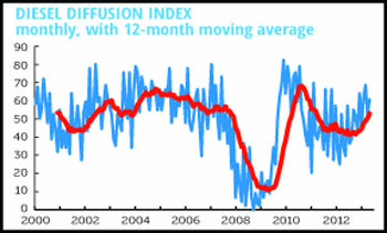
The Federal Highway Administration’s most recent release of sales data for diesel fuel shows sales for the year ending in October up 3.0%, down from September’s 6.0%. Thirty-three states reported sales increases. As the graph below shows, the one-month diffusion index rose a hair, but with this noisy series it’s best to look at the twelve-month moving average, which is in a clear uptrend.
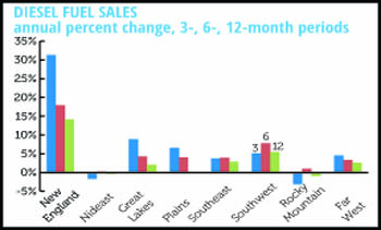
Diesel sales strongest in New England, Mideast, and Southwest
The graph that follows shows sales growth by BEA region. The three regions showing the strongest growth were the same as in September. Weakness in the Great Lakes might be thought to reflect a slowdown in auto production, but on closer look, much of the sag comes from Wisconsin. The Plains are the laggard, but they did go positive.
Diesel fuel by region
Employment growth slows along with diesel
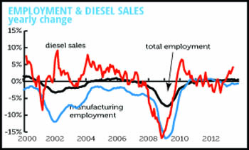
Nationally, diesel fuel sales perform well as a forward indicator of changes in employment. The third graph presents year-over-year percentage changes in total and manufacturing employment, and a three-month moving average of diesel fuel sales.
During the most recent 3-months for which data are available (August–October), diesel sales increased by 3.3% compared to 2012. The three month moving average shot up beginning in March and increased every month through September. October marked the first slowdown in eight months.
In comparison, the yearly change for total payroll employment continued trending upward through November when the rate reached 1.8%. But from January to February there was a sizable drop in the growth rate, to 1.5%. The pattern in manufacturing was similar. The growth rates for both total and manufacturing employment followed the decrease in the diesel fuel sales growth rate, but with a lag of three to four months.
Employment and diesel sales
STATE LEAGUE TABLES
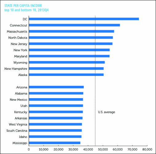
Graphed below are the ten states with the highest income per capita, and the ten with the lowest. At the top is an entity that technically isn’t a state, the nation’s capital. If it were a state, it would be the third smallest, behind Wyoming, also in the top ten, and Vermont.
The richer states of the northeast are heavily represented, as are two energy-rich states, Wyoming and Alaska. At the bottom are mostly southern and interior western states. DC has a per capita income more than twice the poorest state, Mississippi.
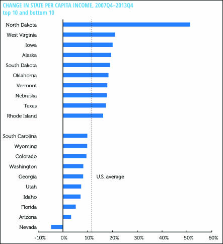
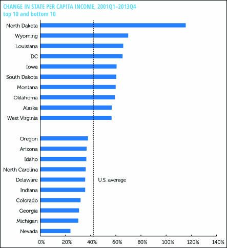
There is also substantial variations in how the states have done in the last decade. The next two graphs show the growth in per capita income between the most recent business cycle peak, 2007Q$, and the previous one, 2001Q1.
Between the 2007 peak and the end of 2013, by far the fastest growing state has been North Dakota, riding an energy boom. There are a few other energy states in the top ten. It’s not surprising to see the three housing bust states at the bottom of the list: incredibly, Nevada’s per capita income is almost 5% below where it was when the Great Recession hit.
What’s striking about the longer term rankings is the even greater role of mining and other natural resource extraction in the big gainers. Seven of the top 10 gainers were heavy mining states, defined as having a mining share of total income more than twice the national average. North Dakota’s gain was close to five times that of the weakest state, Nevada.
But for all the economic changes, the rankings have remained remarkably stable. The correlation coefficient between the states’ income rankings in 2001 and 2013 was a rather high 0.83, and almost all the mobility came from the outperformance of the mining states. Of the ten richest states in 2001, 7 were still there in 2013. California, Colorado and Illinois fell out, to be replaced by Alaska, North Dakota, and Wyoming. Of the 10 poorest 2001 states, 8 were still there 12 years later, Energy-rich Louisiana and Montana fell off, replaced by Idaho, despite it’s growth in tech, and housing-bust Arizona.
Income mobility over time is generally lower than most people realize; the same is apparently true of states, unless you are sitting on generous deposits of carbon.

