Wildlife ranges are forever changing. As is becoming more widely understood, species most now migrate to find appropriate new habitats in our changing world, not just to find food and shelter as the seasons change. These days, with the climate changing more quickly than species are able to migrate, they need our support through scientifically planned wildlife corridors, overpasses, and breeding refuges.
Citizen scientists have long assisted in tracking changes in migration patterns and ranges, a crucial role as field science is notoriously under-valued and underfunded. If you ever see a truly distinctive bird, like a swallow-tailed kite, out of its usual range, you need to discipline yourself to trust your eyes, even if your bird book suggests the bird is 1,000 miles too far to the north. In the old days you then had to search around for print reports confirming such sightings, but now we have eBird.org, a wonderful example of how citizen scientists can support conservationists. In recent years black vultures, glossy ibises, and Mississippi kites have all extended their breeding ranges far northward, and eBird has been tracking their progress. A vibrant roseate spoonbill showed up in New York last week—its official range extends from South American into the coastal waters along the Gulf of Mexico.
eBird also tracks dramatic cases that excite some birders eager to see a distant species, and trouble others because a vagrant of a vulnerable species is clearly lost. In August of 2020, a Steller’s Sea Eagle showed up near Alaska’s Denali Park. A bird presumed to be the same eagle was spotted in March of 2021 along Route 59 in Goliad, Texas, perhaps blown off course by a winter storm. In December the eagle again believed to be the same (we have to keep saying that because we don’t actually know) was seen around Taunton, Massachusetts, before passing through Nova Scotia, and landing in Maine in early 2022. Sightings a few weeks ago put it in Spaniard’s Bay in Eastern Newfoundland. The usual range of this vagrant runs from Korea up through the Kamchatka Peninsula, home to a large breeding population. Sometimes the raptors, with a wing span of 8 feet, show up in the Aleutian Islands and even Juneau, but this trip is clearly stunning.
The Texas sighting included a photograph—there is close to zero chance such a sighting would get past the eBird.org proctors without digital evidence—and to confirm the accuracy, a team from the Texas Bird Records Committee went out into the field and found the exact post where the eagle had perched. One birder reported that the unexpected appearance of hundreds of birders at a working wharf in Maine could have caused an ugly scene, but instead the mood was “bemused, pleasant, and happy.” Although these days science often drives a wedge between us, that’s an example of how it can bring us together.
Citizen scientists can also take a lead in the health of their own communities. Mount Desert Island Biological Laboratory introduced such a project in one of their ongoing Science Cafés, informal open-floor events intended to advance ground-breaking biomedical research.
Jane Disney who, among other things, oversees the Community Environmental Health Laboratory at MDI labs, has been working with hundreds of citizen scientists testing for toxins like arsenic, a crew that has now turned their sights to PFAS as well. Perfluoroalkyl and polyfluoroalkyl substances, PFAS, are manufactured chemicals used to make products water- and oil-repellent. But they also contain carbon-fluoride bonds that do not break down naturally, hence the moniker “forever chemicals,” and have been linked to many serious diseases generally associated with aging. In 2021 Maine’s Department of Environmental Protection released a list of priority towns where contamination is linked to the use of sludge, septic-tank sewage, and industrial waste as fertilizer, often on dairy farms. To give you an idea of the complexity of the work, the DEP staff compiled lists of sites they suspected had received 10,000 cubic yards of sludge that was likely contaminated with PFAS, in small rural communities in both Aroostook and Waldo counties, and in cities like Lewiston. These all fall within a half-mile of people’s homes and include a dairy farm where PFAS levels in milk were 150 times the state standard, with some sites perhaps cross-contaminated.
Dr. Disney is working with local homeowners who do find PFAS in their wells to come up with a strategy. Here the divide between wealthy and poor communities is pretty stark. Filtration systems are beyond the reach of some households, and concerns about PFAS are coming up “a lot” in discussions with the residents. A poorly maintained filtration system can be worse than no system, and one participant made the point that since people who rely on municipal water supplies are guaranteed water free of dangerous pollutants, provisions should be made for those without access to such commodities who rely on their own resources. Some scientists are working on ways to break down those carbon-fluoride bonds, but citizens need protections now.
Fred Bever, the Chief Communications Officer at MDI, and he really is an excellent communicator, invited everyone to the upcoming Science Café, the Science of Beer, that will be held at Fogtown Brewing in Ellsworth. If you’re in the region, be there or be square.
Birds, bright and beautiful as they are, tend to get more attention than other species critical to our habitats, like small solitary pollinators, and grubby bugs. A species that really needs our help is the American eel, a critically endangered creature whose life cycle remains an ongoing mystery. Homer’s mentions “eels and fish” in the Iliad, which caused ancient Homeric scholars to question the passage, noting that Homer would surely have known eels are in fact fish. Aristotle was puzzled by their life cycle, and even young Sigmund Freud tried to figure out how they reproduce.
Their spawning grounds in the Sargasso Sea weren’t discovered until 1920, and even now no one has seen an eel breed. Damming of rivers, over-fishing, and pollution have devastated eel populations. In 2003, Bob Schmidt, a founding biologist Hudsonia, an ecological research firm in the Hudson Valley, set up nets at the mouth of the Sawkill on the Hudson River to track their population levels. (If you are in the area, please get in touch with Philippa if you want to join us on the water next spring. Your fingers and toes get cold, but on sunny days the elvers shimmer as they briefly pass through your hands.)
Newly born elvers are transparent, making it hard for fish finning beneath them to see them, and soon after birth drift up from the Sargasso on the currents, a voyage that takes a year. Upon reaching our tributaries, they begin the next stage of their lives, swimming up over waterfalls and human structures, getting further and further inland as, in the words of one researcher, they become larger and more experienced at negotiating the waters. After twenty or so years they swim back to the Sargasso, now they are dark above and white below, camouflaged against both predatory birds and fish, to breed and die.
Science communities are international, and it’s pretty certain that the many individuals contributing to these efforts do not vote along the same party lines. We’ve highlighted research in the past underscoring the importance of volunteer work and social interaction to ameliorate the isolation and depression so often in the headlines these days. Nature provides us with everything we need to stay alive for free. In the three instances outlined above, cooperation not only benefits those working together, it improves the chances that the natural world can continue to labor on our behalf.
Philippa Dunne & Doug Henwood
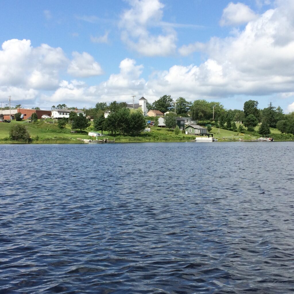
Photograph: Passamaquoddy Indian Township Reservation


Eagles, Eels, and Forever Chemicals
Wildlife ranges are forever changing. As is becoming more widely understood, species most now migrate to find appropriate new habitats in our changing world, not just to find food and shelter as the seasons change. These days, with the climate changing more quickly than species are able to migrate, they need our support through scientifically planned wildlife corridors, overpasses, and breeding refuges.
Citizen scientists have long assisted in tracking changes in migration patterns and ranges, a crucial role as field science is notoriously under-valued and underfunded. If you ever see a truly distinctive bird, like a swallow-tailed kite, out of its usual range, you need to discipline yourself to trust your eyes, even if your bird book suggests the bird is 1,000 miles too far to the north. In the old days you then had to search around for print reports confirming such sightings, but now we have eBird.org, a wonderful example of how citizen scientists can support conservationists. In recent years black vultures, glossy ibises, and Mississippi kites have all extended their breeding ranges far northward, and eBird has been tracking their progress. A vibrant roseate spoonbill showed up in New York last week—its official range extends from South American into the coastal waters along the Gulf of Mexico.
eBird also tracks dramatic cases that excite some birders eager to see a distant species, and trouble others because a vagrant of a vulnerable species is clearly lost. In August of 2020, a Steller’s Sea Eagle showed up near Alaska’s Denali Park. A bird presumed to be the same eagle was spotted in March of 2021 along Route 59 in Goliad, Texas, perhaps blown off course by a winter storm. In December the eagle again believed to be the same (we have to keep saying that because we don’t actually know) was seen around Taunton, Massachusetts, before passing through Nova Scotia, and landing in Maine in early 2022. Sightings a few weeks ago put it in Spaniard’s Bay in Eastern Newfoundland. The usual range of this vagrant runs from Korea up through the Kamchatka Peninsula, home to a large breeding population. Sometimes the raptors, with a wing span of 8 feet, show up in the Aleutian Islands and even Juneau, but this trip is clearly stunning.
The Texas sighting included a photograph—there is close to zero chance such a sighting would get past the eBird.org proctors without digital evidence—and to confirm the accuracy, a team from the Texas Bird Records Committee went out into the field and found the exact post where the eagle had perched. One birder reported that the unexpected appearance of hundreds of birders at a working wharf in Maine could have caused an ugly scene, but instead the mood was “bemused, pleasant, and happy.” Although these days science often drives a wedge between us, that’s an example of how it can bring us together.
Citizen scientists can also take a lead in the health of their own communities. Mount Desert Island Biological Laboratory introduced such a project in one of their ongoing Science Cafés, informal open-floor events intended to advance ground-breaking biomedical research.
Jane Disney who, among other things, oversees the Community Environmental Health Laboratory at MDI labs, has been working with hundreds of citizen scientists testing for toxins like arsenic, a crew that has now turned their sights to PFAS as well. Perfluoroalkyl and polyfluoroalkyl substances, PFAS, are manufactured chemicals used to make products water- and oil-repellent. But they also contain carbon-fluoride bonds that do not break down naturally, hence the moniker “forever chemicals,” and have been linked to many serious diseases generally associated with aging. In 2021 Maine’s Department of Environmental Protection released a list of priority towns where contamination is linked to the use of sludge, septic-tank sewage, and industrial waste as fertilizer, often on dairy farms. To give you an idea of the complexity of the work, the DEP staff compiled lists of sites they suspected had received 10,000 cubic yards of sludge that was likely contaminated with PFAS, in small rural communities in both Aroostook and Waldo counties, and in cities like Lewiston. These all fall within a half-mile of people’s homes and include a dairy farm where PFAS levels in milk were 150 times the state standard, with some sites perhaps cross-contaminated.
Dr. Disney is working with local homeowners who do find PFAS in their wells to come up with a strategy. Here the divide between wealthy and poor communities is pretty stark. Filtration systems are beyond the reach of some households, and concerns about PFAS are coming up “a lot” in discussions with the residents. A poorly maintained filtration system can be worse than no system, and one participant made the point that since people who rely on municipal water supplies are guaranteed water free of dangerous pollutants, provisions should be made for those without access to such commodities who rely on their own resources. Some scientists are working on ways to break down those carbon-fluoride bonds, but citizens need protections now.
Fred Bever, the Chief Communications Officer at MDI, and he really is an excellent communicator, invited everyone to the upcoming Science Café, the Science of Beer, that will be held at Fogtown Brewing in Ellsworth. If you’re in the region, be there or be square.
Birds, bright and beautiful as they are, tend to get more attention than other species critical to our habitats, like small solitary pollinators, and grubby bugs. A species that really needs our help is the American eel, a critically endangered creature whose life cycle remains an ongoing mystery. Homer’s mentions “eels and fish” in the Iliad, which caused ancient Homeric scholars to question the passage, noting that Homer would surely have known eels are in fact fish. Aristotle was puzzled by their life cycle, and even young Sigmund Freud tried to figure out how they reproduce.
Their spawning grounds in the Sargasso Sea weren’t discovered until 1920, and even now no one has seen an eel breed. Damming of rivers, over-fishing, and pollution have devastated eel populations. In 2003, Bob Schmidt, a founding biologist Hudsonia, an ecological research firm in the Hudson Valley, set up nets at the mouth of the Sawkill on the Hudson River to track their population levels. (If you are in the area, please get in touch with Philippa if you want to join us on the water next spring. Your fingers and toes get cold, but on sunny days the elvers shimmer as they briefly pass through your hands.)
Newly born elvers are transparent, making it hard for fish finning beneath them to see them, and soon after birth drift up from the Sargasso on the currents, a voyage that takes a year. Upon reaching our tributaries, they begin the next stage of their lives, swimming up over waterfalls and human structures, getting further and further inland as, in the words of one researcher, they become larger and more experienced at negotiating the waters. After twenty or so years they swim back to the Sargasso, now they are dark above and white below, camouflaged against both predatory birds and fish, to breed and die.
Science communities are international, and it’s pretty certain that the many individuals contributing to these efforts do not vote along the same party lines. We’ve highlighted research in the past underscoring the importance of volunteer work and social interaction to ameliorate the isolation and depression so often in the headlines these days. Nature provides us with everything we need to stay alive for free. In the three instances outlined above, cooperation not only benefits those working together, it improves the chances that the natural world can continue to labor on our behalf.
Philippa Dunne & Doug Henwood
Photograph: Passamaquoddy Indian Township Reservation