TLR Wire

We keep our eyes on the data, both the kind that helps you with financial planning and investment, and the kind that helps us all evaluate our socio-economic structures.

In addition to sending you unique insights derived from ongoing conversations with state-level revenue estimators–economists & statisticians, not politicians–we look at a lot of incoming data. We concentrate on details that have been overlooked in the mainstream, and we’re always on the lookout for data abuse, reflecting either misunderstanding or ideological slant. Known for our expertise, we focus on labor and debt data. Please see examples below.


Subscribe >

by admin· · 0 comments · TLR Wire

Little Wonder the BQE is about to Fall Over

For another striking measure of shortfalls in public and private investment, check out the graph below. These are real dollar amounts, not percentages of GDP. In real dollar terms, net fixed investment of all kinds is 20% below where in was in 2005. Net private nonresidential investment is just 12% above where it was in 2007. Net residential investment is 63% below where it was at the peak of the housing bubble, 2006. And net public investment is 39% below. Again, real dollars. These are paltry numbers considering that real GDP is up 36% since the pre-recession peak in 2007.

So net private investment is limp, and net public investment is struggling to keep one nostril above water. This has a lot to do why it feels like things are falling apart, and not just in rural America. An important section of the Brooklyn–Queens Expressway is about to fall down, and there are many other similar cases across the country. Visitors from China routinely express shock about the state of the infrastructure in a country that is still far richer than theirs. And crises like the coronavirus really bring home the effects of inadequate public and private investment. Tending to long-lasting things has gotten highly unfashionable, but that approach has some pitfalls.

by admin· · 0 comments · Comments & Context, TLR Wire

Diminishing Dynamism

The BLS is just out with the Business Employment Dynamics (BED) release for the first quarter of 2019—not exactly breaking news, but of longer-term interest. First quarter gross job gains fell to 5.9% of employment from 6.3% of employment in 2018Q4, while gross job losses slipped only from 5.6% to 5.5%. A year earlier the numbers were 6.1% (gains) and 5.5% (losses). Not only were net gains weaker in 2019Q1 than 2018Q1, job turnover, the combined total of gross gains and losses, 11.4% vs. 11.6%, is down, further evidence of the eroding dynamism of the US economy. From 1992 to 2000, turnover averaged 15.5% of employment; from 2001–2005, 14.2%; since 2010, 12.1%.

BED also includes stats on establishment openings and closings, which is important because employment growth is driven by young (but not newborn) firms. New establishments grew 3.1% in the first quarter, pretty much where they’ve been since 2010. That compares with 3.4% growth in the 1990s and 3.3% in the early 2000s. Despite the unchanged birth rate, the number of jobs produced by these newborn establishments fell to 0.6% of employment, tying the all-time low for the series. Establishment deaths are only reported with a three-quarter delay (gotta make sure they’re dead and not just asleep): closings were 2.9% of the total, up two ticks from the previous quarter, and also 0.2 above the average since 2010. The gusher of entrepreneurship that was supposed to flourish under a regime of tax cuts and deregulation has yet to materialize.

Further evidence of that comes from the Census Bureau’s business application series, which is derived from applications for new employer ID numbers. From those, Census derives a subset with a high propensity of producing a payroll. Third quarter figures were released on October 16. They showed an 0.5% overall decline in applications from the second quarter, an 0.7% decline in high-propensity formations, and a 2.1% decline in those with planned wages. For the year, new applications were off 1.5%, and off 0.8% for high-propensity ones. As this graph shows, there was a brief surge in formations in 2017 and 2018, but that burst of animal spirits looks to have run its course.

New Trends: EPOPs

There’s evidence of new trends in the employment/population ratios (EPOP), the wages of production workers, and in the expectations components of the University of Michigan confidence surveys: trends are stronger and views are brighter among those with lower levels of education, and recently wage gains for supervisory workers are dragging behind those of production workers in all but four sectors.

As we and many other analysts have noted, despite a very low unemployment rate, improvements in the employment/population ratio (EPOP) have been much less impressive. Part of this reflects an aging population, though not all. Our guess is that just over two-thirds of the gap between the early 2000s peak and the present is the result of an aging population. We’ve looked at some of those explanations in the past and will again for sure.

But what interests us now are movements in EPOPs by demographic group, as shown in the graphs below. Since the all-time peak in the EPOP in April 2000, the overall figure is down 4.1 points. Younger adults have been especially hard-hit (which is one reason the aging population story is an incomplete explanation)—though many of them are staying in school. But even prime-age workers are down. Older workers, however, have gained (though their levels are much lower than their younger counterparts).

Broken down by race and sex, only Hispanic women have a higher EPOP than they did in April 2000; Hispanic men are way down. Women overall have seen much smaller declines than men in their demographic group. By education, only those with less than high school have gained (though they’re a small and shrinking part of the workforce—7% now, compared to 10% in 2000). EPOPs among the more educated are down.

The story is somewhat different if we measure changes from the post-Great Recession low in the job market, February 2010. The overall EPOP is up 2.1 points, with all age groups participating, and the younger doing better than the older. Blacks and Hispanics of both sexes have done much better than whites. The education breakdown is striking though: those who didn’t finish high school have seen the strongest improvement in their EPOP, up nearly 5 points. Those with some college or a bachelor’s or higher have seen their EPOPs decline. This is not what you might expect. Since those with some college account for 26% of employment and with a bachelor’s or higher, 42%, the less educated third of the population have been doing a lot of work driving the overall EPOP higher over the last almost-nine years—with some assistance from the 20–24 set, who are not counted in the educational attainment EPOPs. We’re happy to see improvement for those with lower levels of education, but it’s something new.

by admin· · 0 comments · TLR Wire, Uncategorized

New Trends: Wages, Sectors, & Workers

Something new here too. Since 2006 wage gains among production workers are stronger than for all workers in all but four sectors, which suggests, of course, that managers are falling behind.

The Bureau of Labor Statistics has wage data for manufacturing production workers running back to 1939. In 1939, average hourly earnings for nondurable manufacturing were just 52% of those for durable manufacturing, 34 vs. 65 cents, but rose almost straight up in the 1940s to 80% and continued to drift up to their current 89%.

In the Trade, Transportation and Utilities sector, however, retail wages have lost ground, falling from 84% of TTU wages, to 80% currently, while wages for transportation & warehousing have fallen from 127% to 110%. Wages for wholesale trade have risen from 109% of TTU wages to 126%, while utility workers have seen their wages climb from 132% to 184%.

Back in 1964, when records were established for the goods producing and service providing sectors, wages were even, but by the 1980s wages for services had slipped to 80% of goods. They began a rocky climb back up and have levelled out at about 94% currently. Since 1964, construction and manufacturing wages have risen by similar percentages, but logging & mining wages have gained an additional fifteen percentage points.

We’re looking back to 2006 now because that is as far back as the all-worker series goes. Since then, wages in logging and mining have made the strongest gains, up 49%, to $28.96, followed by leisure & hospitality, up 47% to $14.11. Production workers in finance and in professional & business services made similar percentage gains, to about $27.00, as did construction work, to about $28.00. Since 2006, wages in services are up 40% and in goods up 36%.

Weakest gains for production workers are in manufacturing, transportation & warehousing, and retail trade, all up around 30% to $21.77, $22.07, and $16.15 for retail.

Since 2006, however, production workers have seen greater wage gains than all workers in all but four sectors, so managers are dragging that broad tranche down. In manufacturing production workers lagged all workers by 1 percentage point, in durable manufacturing by 3pps, in utilities by 5pps, and in information by 11pps. In leisure & hospitality, production workers were 6pps ahead; in retail trade, 5pps; and in logging & mining, construction, and education & health, all ahead by 4pps.

Over the last year, production workers wages are up over 5% in logging & mining, up 4% or more in information, retail trade, leisure & hospitality, and construction. In only other services, 1.9%, and finance, 1.6%, are they up less than 2 percent.

Over the last year wages for all workers in information, a struggling sector by other measures, are up 6%, up 4% or more in construction, retail trade, leisure & hospitality, and finance, followed by a string of 2-3% gains, with non-durable manufacturing, and transportation & warehousing reporting the weakness growth at 1%.

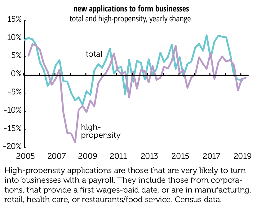
The wage picture is certainly complicated, with some of the largest percent gains occurring side by side between the highest and the lowest hourly wages, and quite a few “not as we expected” trends. By a number of metrics the different sectors are going in different directions, which further confuses an already cloudy picture.

by admin· · 0 comments · TLR Wire, Uncategorized