Sightlines Bulletin

Inversion: What is the Yield Spread Telling Us Now?

A Little Background

On March 22nd the spread between the yields on 3-month and 10-year Treasury debt securities inverted. This reversal of the normal relation between yields for short- and long-maturity Treasuries typically signals an impending recession. Each of the past three recessions has been preceded by similar yield spread inversions.

The question often asked about this particular economic indicator is “Does it simply signal an impending recession, or does it somehow cause one to occur?” At least over the past thirty years inverted yield spreads have been followed by recessions. Depending on how long the inversion lasts and how large the reversal of yields is, the inversion can also be a major contributor to an economy’s decline into recession, something people tend to forget.

Particularly in more recent years, when banks have come to rely more on borrowed funds and less on savings deposits for the money they lend, a yield inversion has resulted in banks tightening their lending standards as the profitability of loans declines. This in turn can result in less business investment and slower economic growth.

In their 4th-quarter survey of senior bank loan officers, the Federal Reserve found a tightening of loan standards for commercial real estate, while standards for other commercial and industrial loans remained unchanged from the prior quarter. Combined with the finding that demand for all types of loans to households weakened, the results imply the nation is moving into a period of slower economic growth.

Here’s a review of some of the characteristics of the inverted yield spreads that preceded the past three recessions.

Yield Curve vs Yield Spread

The yield curve shows the relationship among the yields across all Treasury debt maturities. A single yield curve shows the relationship among the yields for different maturity Treasury debt securities at a single point in time. Graphing multiple yield curves on the same axes reveals changes in the location and slope of the curve over time.

The following chart presents yield curves based on average monthly yields for each of the past five Januaries and for March 2019. For January 2015, 2016 and 2017 the curves are generally parallel but move up by about 0.5pps between 2015 & 2017. In 2018 the curve begins to rotate and flatten with the yield for the 3-month Treasury bill rising by 0.91% from January 2017 to January 2018, while for 30-year Treasury bonds the yield declined by 0.14%.

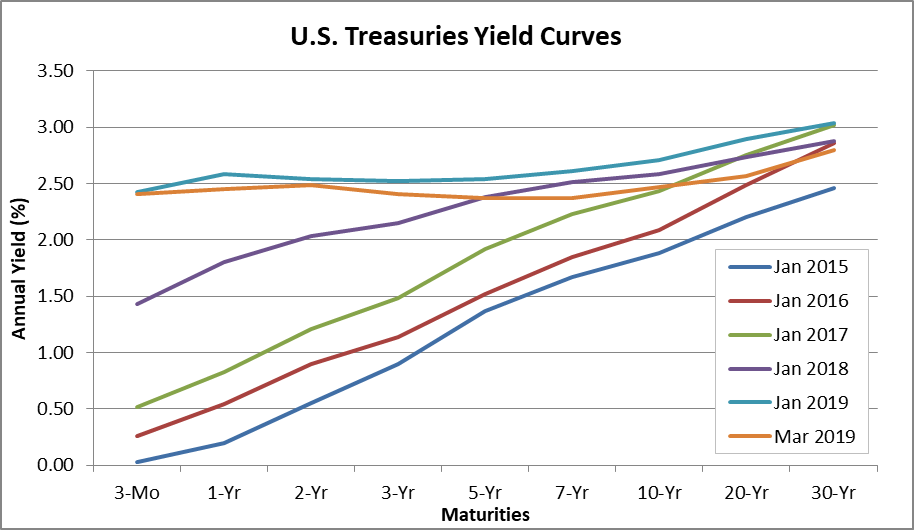
By January 2019, the yield for the 3-month Treasury bill moved up to 2.42%, 0.99% above the average yield in January 2018. The yield of the 30-year Treasury bond averaged 3.04%, just 0.16% above the prior January, meaning that at the beginning of this year the spread was just 0.62%. During March 2019, the 3-month yield held at about 2.41%, and the 30-year bond yield fell to 2.80%, which reduced the spread from the bottom to the top of the curve to just 0.39%. Of greatest interest: In March, the yields for the 5-year and 7-year notes fell below the yield for 3-month Treasury bills.

The yields for any two debt securities may be used to compute a yield spread. As the result of past studies, attention has focused on the spread between the 3-month Treasury bill and the 10-year Treasury note yields because this particular spread has proven to be a particularly good predictor of coming recessions about one year into the future. The following chart from the St. Louis Federal Reserve Bank economic data site shows this relationship.

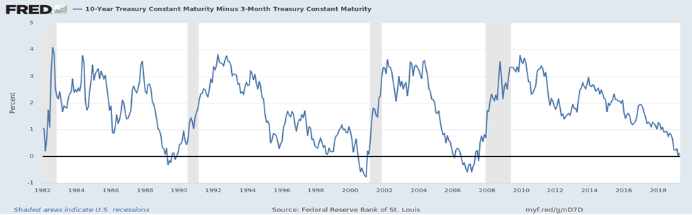
As the chart shows, inversions do not occur suddenly, but after a long period of decline in the spread between the yields of these two Treasury debt maturities. For example, the decline in the 3-month to 10-year yield spread began in April 5, 2010. Nevertheless, given the current apparent strength of the U.S. economy, and the long period of law rates, some skeptics believe this time is different, and that the U.S.economy will not slip into recession over the next year.

So let’s take a look at the conditions that led up to the last three recessions to see if such skepticism is justified, including the date the spread first inverted, the length of the inversion, the maximum value of the inversion, the changes in the 3-month and 10-year yields that caused the inversion, changes in Fed policy an inflation, and the lag between the end of the inversion and the beginning of the recession.

Note bene: For all three cycles, the yield spread peaked between 3.76% and 3.85%.

Cycle 1: October 28, 1987 through November 6, 1992

At the beginning of this cycle the yields for the 3-month and 10-year Treasuries were 5.25% and 9.01%, resulting in a spread of 3.76% and the Fed’s federal funds rate target was 7.31%, while the year-over-year rate of change in the consumer price index (CPI) was 4.36%, the good old days.

During this cycle 17 months elapsed between the maximum value and the inversion. Over that period the yield on the 3-month Treasury bill rose by 4.20%, from 5.25% to 9.45%, and federal funds target rate increased by only 2.4% from 7.3% to 9.8%. The yield on the 10-year Treasury note increased only slightly from 9.01% to 9.44%, and the rate of inflation ticked up by 0.53% from 4.36% to 4.89%. That means most of the decline in the spread occurred due to an increase in the 3-month Treasury bill yield. The increase in the 3-month yield may have been partially due to the increase in the federal funds target rate, but other factors must have played a role since the 3-month yield increased by much more than the target rate.

And the expectation of continued relatively high inflation, running at 5% when the inversion occurred, surely influenced both the 3-month and 10-year yields.

The spread initially inverted on March 27, 1989, and almost two months the cycle’s extended inversion period began, running from May 22, 1989 until December 28, 1989. The maximum inversion occurred on June 9, 1989, -0.35%, and the spread was negative for 98 (44.5%) of the 220 days of inversion.

This economic cycle’s recession began during July 1990, 15 months after the 3-month to 10-year yield spread initially inverted, and run for eight months into March 1991. Unemployment peaked at 7.8%, GDP dropped by 1.4%, and at the end of the recession inflation remained at a relatively high 4.82%, little changed from the beginning, and the federal funds target rate was 6.0%.

Cycle 2: November 6, 1992 through May 13, 2004

At the start of this cycle the yield for the 3-month Treasury bill was 3.13% and the yield for the 10-year Treasury note, 6.97%, giving a 3.84% spread. The federal fund target rate was 3.00% and the year-over-year growth rate of the CPI equaled 3.12%.

This is a different picture, and the close correspondence of the 3-month yield, the federal funds target rate, and the CPI growth rate is noteworthy. During this cycle the 3-month and 10-year Treasury yields initially inverted on September 10, 1998, with the 3-month yield at 4.78%, the 10-year yield at 4.76%, and the federal funds target at 5.50%, while the CPI measure of inflation stood at only 1.43%.

Following the initial inversion 22 months elapsed before an extended inversion period began, extending from July 7, 2000 until February 9, 2001. During this 217 day period, the yield spread was negative for 61.3% of the period, or 133 days. The deepest inversion occurred on January 2, 2001, when the 3-month Treasury bill yield was 5.87% and the 10-year Treasury note yield was 4.92%, and the spread was -0.95%. The federal funds target rate and the CPI inflation rate stood at 6.50% and 3.72%.

A recession followed 30 months after the initial inversion, and 8 months after the extended inversion began, running from March 2001 and until November 2001. This was a relatively mild recession with peak unemployment reaching only 6.3% and GDP declining by only 0.3%. At the end of the recession the 3-month yield was 1.92% the 10-year yield, 4.79%, the spread 2.87%. The federal funds target rate equaled 2.00%, 4.00% below the level at the end of the last recession, and over the cycle CPI inflation rate dropped from 4.82% to 1.89%.

Cycle 3: May 13, 2004 through April 5, 2010

At the start of this period the yields for the 3-month and 10-year Treasuries was 1.00% and 4.85% resulting in a spread of 3.85%. The federal funds target rate was 1.00% and the CPI measure of inflation was 2.90%. By the mid-2000s inflation had largely been tamed, and except for a short uptick during the last recession it has remained low, which has complicated matters for monetary authorities.

On January 17, 2006, a relatively short 20 months later, a shallow and brief inversion occurred: the 3-month yield rose to 4.38% and the 10-year yield fell to 4.34%. There were 3 inversion days during January and 6 more in February. The extended period began on July 17, 2006, and by August 27, 2007 there had been 233 inversion days, or 57.4% of the period. The deepest inversion, on February 27, 2007, was -0.64%.

During those 13 months, the CPI fell from 4.1% to 1.9%, and the Fed left its target rate unchanged at 5.25%.

The recession that followed began in December 2007, 23 months after the initial inversion and 18 months after the beginning of the sustained period. As we all know, the Great Recession that extended until June 2009 was our worst economic downturn since the Great Depression: unemployment rose to 10.0% GDP shrank by 5.1%, and the misery indexes soared.

The Current Cycle: April 5, 2010 to Whenever

At the beginning of this period yields on the 3-month and 10-year Treasuries were 0.16% and 3.57%, and the spread, 3.41%. The first inversion took place on March 22, 2019, with 3-month Treasury bills at 2.46% and 10-years at 2.44%.

Over the 9 years & 11 months since the beginning of this cycle the upper range of the federal funds rate target rose from 0.25% to 2.50%, suggesting that the 3-month Treasury bill appears to have been pushed higher by Fed policy actions. Over the same period the yield on the 10-year Treasury note declined by 1.13%, and the CPI measure of inflation declined by 0.35% from 2.21% to 1.86%. Over this period the spread between the 10-year Treasury note and the 10-year TIPS (Treasury Inflation-Protected Security) declined from 2.35% to 1.91%, showing inflation expectations to be in check.

Summing Up

The following table provides a summary of key dates, yields, federal funds targets, and inflation rates for the past three economic cycles and for the beginning of the current cycle.

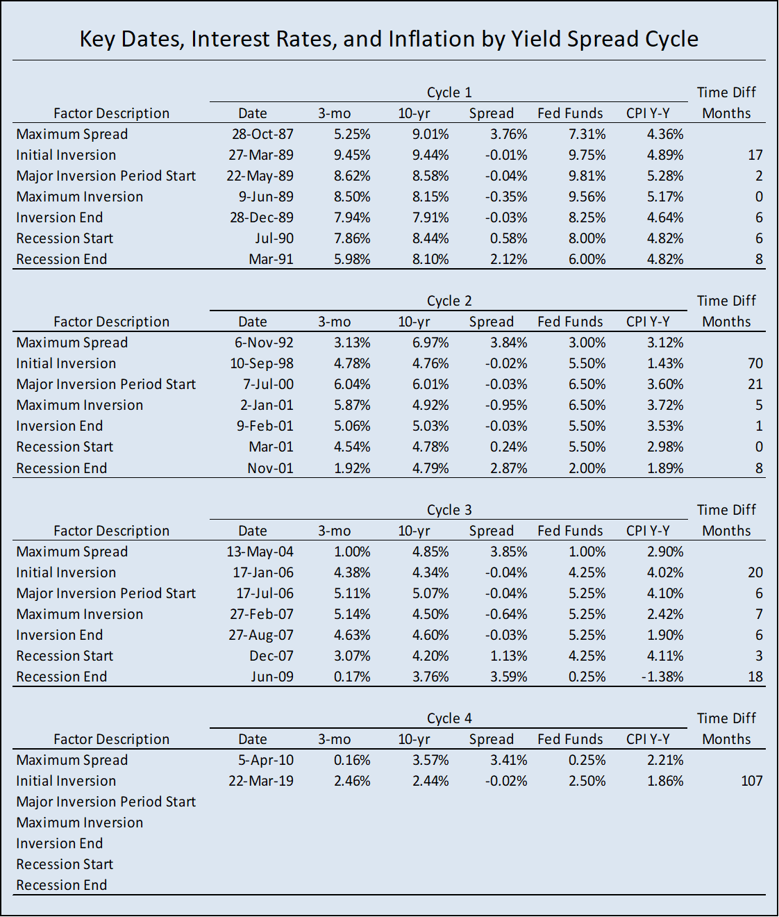
As the past three cycles have shown, a considerable amount of time may pass between the first inversion and the longer, sustained period. On May 1, the spread between the 3-month and 10-year Treasury yields was 0.10%.

Here are the take-aways:

• The peak values of the 3-month to 10-year Treasuries yield spread were tightly clustered between 3.76% and 3.85% at the start of the prior three yield spread cycles, but at the beginning of the current cycle the spread is somewhat lower at 3.41%.

• Federal Reserve Board increasing the federal funds target rate contributed to the shrinking of the yield spread during all three prior cycles, but this does not entirely explain the changes in 3-month Treasury bill yields. From the beginning of Cycle 1 until the first inversion the Fed funds rate target was up 2.44%, but the 3-month Treasury bill yield was up 4.20%. From the beginning of Cycle 2 until the first inversion, the Fed funds rate target rose by 2.50%, but the 3-month Treasury bill yield increased by only 1.65%. From the beginning of Cycle 3 until the first inversion the Fed funds target increased by 3.25% and the 3-month Treasury bill yield increased by 3.38%. For the current cycle the federal funds rate target increased by 2.25% and the 3-month Treasury bill yield increased by 2.30% from the cycle’s start until the initial inversion date.

• The nature of changes in the yields for the 10-year Treasury notes are mixed. From the time of peak yield spread until the first inversion the 10-year Treasury yield increased by 0.43% during Cycle 1, decreased by 2.21% during Cycle 2, decreased by 0.51% during Cycle 3, and decreased by 1.13% during the current cycle. For Cycles 1 and 3 and for the current cycle increases in the 3-month Treasury bill yield explain the majority of the collapse of the yield spread. But for Cycle 2, during the late 1990s and early 2000s, the decline of the 10-year Treasury note yield had the greater impact on the inversion of the yield spread.

• In addition, changes in the rate of inflation distinguish Cycles 1 and 3 from Cycle 2. During Cycle 1 the rate of inflation increased from 4.36% to 4.89% before the first inversion. For Cycle 3 the inflation rate rose 2.90% to 4.02% in the comparable period, but for Cycle 2 the rate of inflation decreased from 3.12% to 1.43%, a likely explanation for the drop in the 10-year Treasury note yield at the beginning of Cycle 2. During the current cycle inflation has also fallen, from 2.21% to 1.86%.

• For the prior three cycles the lapse between the initial inversion and the sustained inversion were 2 months, 21 months, and 6 months, and the lapse between the beginning of periods of sustained inversion and the start of the recessions were 13 months, 8 months, and 16 months.

Based on the analysis of the last three yield spread cycles, I would argue that long-term shrinkage of the 3-month to 10-year Treasuries yield spread indicates that the United States economy is headed for recession, with the obvious question, but when?, since lapses between initial inversions and the start of recessions has ranged from 15 to 30 months. And we are in uncharted territory.

I think Cycle 2, which extended from the mid-1990s to the early 2000s, is the most like the current one. That was a period of strong economic growth, low unemployment, and low and declining inflation. The bursting of the dot.com bubble put a major dent in that expansion, and although the 9/11 terrorist attacks were followed by declines in payroll employment, there was evidence at the beginning of September that such losses were coming.

Now there is considerable economic froth generated by the federal tax cuts & the resulting explosion of the federal deficit: inflated equity prices as tax savings flow into stock buy backs and increased dividends; and a rush of new tech initial public offerings that is goosing stock markets exuberance, which is curious since many of the companies issuing stock have no profits. And we have a long list of political unknowns that could disrupt the economy: domestic political turmoil, a Brexit related economic slowdown in Europe, a possible revolution and proxy war in Venezuela, and deepening trade disputes. Maybe I’ll stop there.

To me a reasonable guess is that we have another year to 18 months before recession provided no major political shocks occur. If the Federal Reserve continues in a holding pattern there will be little pressure from below to push up the 3-month Treasury yield. This time there may actually be a higher probability of downward pressure on the yield spread with inflation in check and a variety of factors pushing prices lower. These include a stronger dollar due to weakening foreign economies, government budget tightening, and continued growth of domestic oil and natural gas production.

The best advice for now is to just be watchful. Keep an eye on the 3-month to 10-year Treasuries yield spread. When it falls into a period of sustained inversion there will still be many months until a recession sets in. This should provide alert businesses and households with adequate time to plan for and adjust to the coming economic slowdown.

Mike Lipsman

by admin· · 0 comments · Sightlines Bulletin

Tracking the American Economy

Sightlines-image

At Sightlines Bulletin we:

Provide businesspeople and long-term investors with concise data-driven monthly analyses of the direction of the American economy so they can successfully formulate their business plans and fine-tune their resource allocations;

Use unique indicators that have proven successful at flagging turns in the economy to provide early warnings of shifts in the economic outlook;

Test and debunk commonly held misperceptions about current conditions, often employing the histories of crucial economic indicators we have compiled over the years, some back to the 1800s.

Sightlines Bulletin is published mid-month when the prior month’s important data points have been released. Each issue includes the results of our monthly surveys of state-level withheld and sales tax receipts (see Reference for more detail), our breakdown of important labor market and domestic consumption developments, a rundown of trends in fuel/electric usage and what they mean for coming months, comments on the direction of interest rates, and a two-page summary of important economic indicators, all in historical perspective.

For Sightlines Bulletin, we have developed proprietary data series based on monthly surveys of state revenue agencies and state fuel/ energy sales reports. These series provide the basis for the analysis of economic turning points and growth trends using diffusion indices, historical trend correlations, and forecasts. Analysis is done for the nation, regions, and states. In addition to guiding business planners and investors, including those who manage municipal debt portfolios, we believe the detail offered by these data series will help our clients create new jobs and better understand the advantages of returning jobs to the United States.

Additionally, each month we highlight a data series we follow, for example the Quit Rate or the Insured Unemployment Rate, so our readers become more fluent with our ongoing analysis and with the often ignored but rich data sources that offer our subscribers an edge over their competition.

Finally, we issue Special Bulletins as necessary to alert our subscribers to one-off developments like changes and biases in data collection methods, and other subtle but important signals missed by the mainstream media likely to affect employment, consumption, and interest rates.

Philippa and Doug have collected and analyzed state-level tax receipts since the early mid-1990s, and are widely respected for their ability to parse out the importance of trends in those revenue flows. Mike was, for many years, a state revenue contact in this work. His expertise in successfully developing off-beat indicators, like diesel fuel usage, spurred the development of Sightlines Bulletin.

We came together to provide a monthly forward-looking summary of current economic conditions, supported by our proprietary data, to fill a void in what is currently available to the business world. Financial professionals have long relied on the insights of The Liscio Report, a newsletter specifically tailored for traders. Sightlines Bulletin presents a broader perspective, based on these same insights and our combined experience, for decision-makers with a longer time frame.


Subscribe  >


by admin· · 0 comments · Sightlines Bulletin

What’s Going on with Oil Prices?

The WTI price of crude oil began 2018 at $60.37 per barrel. It rose to a peak price for the year of $77.41 on June 27th. From July through September the price moved within the range of $65.07 to $74.19 per barrel. It then again peaked at $76.40 on October 3rd after which it began a spectacular fall and ended the year at $45.15 per barrel. Daily movements in the WTI price during 2018 are shown in Figure 1.

The imbalance between the supply of and the demand for oil drives price changes. Many factors influence the relationship between oil supply and demand. Most important among these factors are:

• Domestic oil production
• Oil imports
• Refinery oil usage
• Oil exports
• Oil storage capacity and reserves

This paper explores how each of these factors influences the balance between oil supply and demand and the resulting change in the domestic price for oil. This analysis is based on data from the U.S. Energy Information Administration (EIA). The analysis focuses on the different components of crude oil supply and demand by month. There are obvious limitations with this approach. For example, crude oil produced in a giving month can require a month or more to reach refineries depending on the mode of transportation.

Domestic Oil Production

Figure 2 shows the average monthly amount oil produced per day within the United States since 1950. During January 1950 domestic oil production averaged 4.9 million barrels per day. Over the next twenty years oil production increased to a peak value of 10.0 million barrels per day during November 1970. Then production started a steady decline until it bottomed out at 4.2 million barrels per day during September 2005. Since then domestic oil production began to grow again reaching 5.5 million barrels per day by January 2011, which marks the beginning of the tight oil boom. As of October 2018 U.S. oil production totaled 11.5 million barrels per day.

The revival of oil production in the United States began during the 1980s with the development of horizontal drilling and hydraulic fracturing technology, but the adoption of the new extraction techniques did not begin to dramatically impact oil production until about 2011.

Domestic oil production now consists of oil produced by two types of wells. Conventional wells extract oil from underground reservoirs at atmospheric pressure and temperature. Tight oil is extracted from shale or sandstone formations by the process of horizontal drilling and hydraulic fracturing.

During January 2011 tight oil production first exceeded one million barrels per day. That month oil from conventional wells accounted for 81.7% of domestic oil production, while tight oil accounted for the remaining 18.3%. Since 2011 U.S. oil production has exploded. Most of the growth in production is attributable to tight oil wells. During October 2018, oil production from conventional wells equaled 4.6 million barrels per day and from tight oil wells it equaled 6.9 million barrels per day.

Figure 3 presents conventional and tight oil average daily production levels since 2000. This chart shows that all of the U.S. oil production growth over this period is attributable to tight oil. From January 2000 to October 2018 conventional oil production decreased from 5.4 to 4.6 million barrels per day, while tight oil production increased from 0.4 to 6.9 million barrels per day.

Parity between tight and convention oil production occurred during December 2014. That month both conventional oil wells and tight oil wells produced 4.7 million barrels per day. During October 2018 tight oil wells accounted for 59.8% of total domestic oil production.

U.S. Oil Imports

The United States began importing oil near the end of World War I in order to meet both domestic needs and to provide exports to Britain and France. The source of these early imports was Mexico. At the beginning of 1920 oil imports equaled 203 thousand barrels per day. In comparison, domestic production equaled 1.1 million barrels per day.

Figure 4 shows changes in the share of the United States’ oil supply derived from imports since 1920. From equaling about one-quarter of the U.S. oil supply during the early 1920s, the import share declined to almost nothing during 1942. After World War II the import share increased again and from the mid-1950s to 1970 averaged a 12.5% share. From the beginning of 1971 to the middle of 1977 the import share jumped from 10.4% to 46.6%. Then, through the late 1970s and early 1980s the import share declined bottoming out at 18.9% during February 1985. From that point in time imports experienced strong growth reaching a peak share of 68.5% during September 2005. The actual volume of oil imports peaked at a rate of 10.8 million barrels per day during June 2005.

By the start of the domestic tight oil boom, imports averaged 9.2 million barrels per day and accounted for 62.6% of the U.S. oil supply. But as tight oil production grew imports dropped. As of October 2018 oil imported averaged only 7.3 million barrels per day and they accounted for only 38.8% of the U.S. oil supply.

Figure 5 shows the shares of the U.S. oil supply accounted for by imports and domestic tight oil and conventional oil production from January 2000 through October 2018.

U.S. Refinery Oil Usage

During October 2018, U.S. oil refineries input on average 16.4 million barrels of crude oil per day. During 2018 there were 135 operable and operating oil refineries in the United States. These refineries had the capacity to process 18.6 million barrels of oil per day.

The previous two sections presented information on the sources of supply for U.S. oil refineries. Figure 6 combines the monthly oil supply amounts with refinery input demands from the beginning of 2000 through October 2018. This chart shows a fairly close correspondence between oil supply and demand from 2000 through the middle of 2014. In fact, over that period there were exactly the same number of months of oil surplus and deficit. One should recall that during June 2014 the WTI price of oil peaked at $105.79 per barrel.

Since July 2014 there have been 45 months during which the U.S. supply of oil has exceeded domestic refinery input levels, while there have been only seven months of oil deficit. Also, the spread between supply and demand has been growing. During 2015 the average spread equaled 608 thousand barrels per day, while during the first ten months of 2018 the average surplus has increased to over 1.7 million barrels per day.

U.S. Oil Exports

From 1977 through 2015 the export of domestically produced crude oil was largely banned. However, there were certain exceptions, such as for exports to Canada, oil from Cook Inlet, oil flowing through the Trans-Alaska Pipeline System, heavy oil from California, certain trade with Mexico, and the re-exporting of foreign oil.

The ban was implemented by the Energy Policy and Conservation Act of 1975. This followed the 1973 OPEC oil embargo. But with the growth of tight oil production and the dramatic drop in domestic oil prices beginning in the middle of 2014, political pressure to eliminate the ban grew. The export ban was ended as part of the Consolidated Appropriations Act of 2016 (HR 2029), which was signed by President Obama on December 18, 2015.

As shown in Figure 7, U.S. oil exports averaged only 33 thousand barrels per day from 2000 through 2012. From 2013 through 2015, U.S. oil exports increased to an average of 317 thousand barrels per day. Since the lifting of the ban oil exports grew to an average of 591 barrels per day during 2016, to 1.2 million barrels per day during 2017, and to 1.9 million barrels per day during the first ten months of 2018. During October 2018 exports actually averaged over 2.3 million barrels per day.

Figure 7 also shows the surplus (deficit) of crude oil in the United States by month. As shown in this chart, the oil surplus or deficit equals domestic production plus imports minus refinery input. As stated previously, although the surplus (deficit) line shows considerable variability over the entire time period, from 2000 through the middle of 2014 the number of months of surplus exactly equaled the number of months of deficit. Over these fourteen and half years refinery input of crude oil exceeded domestic production and imports by only 94.8 million barrels. On the other hand, from July 2014 through October 2018 the aggregate U.S. oil surplus equaled 1,249.2 million barrels.

With the rise of exports the relationship between the supply of and demand for crude oil in the United States is now nearly balanced. A final factor that is essential to the maintenance of this balance is the oil reserves held in storage facilities around the country.
U.S. Oil Storage Capacity and Reserves

The U.S. Energy Information Administration (EIA) publishes statistics on the capacity of crude oil storage facilities twice a year in March and September. These reports identify two primary types of storage facilities: refinery storage and tank farms (including underground storage facilities). Additional stocks include crude oil in-transit by pipeline, railroad, barge and ship. As of September 2018, the total amount of refinery and tank farm working storage capacity in the United States equaled 632.9 million barrels. These facilities held 296.5 million barrels of oil at that time. In addition, there were 119.6 million barrels of oil in-transit.

The storage facility capacity statistics are only available back to March 2011. Since that time the working storage capacity at refineries has decreased by 4.2 million barrels, but at tank farms and underground storage facilities working capacity has increased by 181.5 million barrels. The amount of oil in-transit has also increased by 40.4 million barrels. The storage facilities are particularly important as insurance so that refineries have adequate access to crude oil in order to operate efficiently and to satisfy the demand for refined products.

Figure 8 shows monthly commercial crude oil stocks and exports from 2005 through October 2018. From the beginning of 2005 through the end of 2014 the amount of crude oil in storage experienced a modest increase of 90.6 million barrels from 270.3 million barrels to 360.9 million barrels. Then over the next 27 months the amount of oil in storage rose to a peak of 538.6 million barrels. But then the amount of oil in storage began a significant decline to a low of 406.9 million barrel during August 2018 before moving back up to 432.5 million barrels during October 2018.

The line representing crude oil exports in Figure 8 shows a noticeable rise after 2014. From 2014 through 2016 oil exports increased from 128.2 million barrels to 216.3 million barrels, or by 88.1 million barrels (68.7%). Then during 2017 oil exports began to explode reaching 422.5 million barrel for the year, which is a 206.2 million barrel (95.3%) increase over 2016. During the first ten months of 2018 exports jumped to 575.3 million barrels.

Looking at the crude oil storage and the export curves together, initially exports did not seem to have much impact on the domestic oil supply. However, beginning early in 2017 the large drop in the amount of oil in storage implies that exports were having an impact on the domestic oil market. This appears to be reflected in the change in the WTI price of crude oil, which rose from $51.97 per barrel in December 2016 to $57.88 per barrel by December 2017 and then to $70.75 per barrel during October 2018.

Summing Up

Given that crude oil exports have been increasing at an exponential rate and that there is similar rapid growth in domestic oil production, predicting domestic crude oil surpluses or deficits is difficult. As has been seen in both domestic and foreign oil markets it does not require much of an imbalance between oil supply and demand to cause large price shocks. Therefore, to better understand what may happen to oil prices an orderly and incremental analysis of the different factors that influence the supply and demand sides of the oil market is required.

On the supply side of the market there are three components, which are conventional oil production, tight oil production, and imports. The demand side of the market consists of refinery input and exports. The rise and fall of oil stocks acts as sort of a shock absorber. Figure 9 shows how the year-to-year percent change in each of these components compares to the year-to-year change in the inflation adjusted WTI price of oil.

Figure 9 only addresses the years from 2011 through 2018. This is because 2011 marks the start of the U.S. tight oil boom. Also, it was shortly after this that the ban on oil exports began to be relaxed and eventually removed. At first glance this chart may just appear to be a bunch of random strands of spaghetti, but on closer inspection some interesting relationships appear.

The component that exhibits the least variation is refinery input. Over the eight years its average annual rate of change equals 1.8% and it only varies over the range of from 0.3% to 3.5%. There results provides little surprise as the domestic demand for refinery products grows at a fairly steady rate except during recessions and even then it does not decline as much as does overall economic growth.

The production of oil from conventional wells exhibits the second least variable component with an average annual rate of change equal to -0.2% and a range of from -6.3% to 5.2%. Similarly, the annual rates of change for oil imports averaged a modest -1.9% and varied in the range of from -9.6% to 6.9%. More importantly, the growth for this source of oil has been trending downward.

As previously discussed, the birth and growth of tight oil extraction technology has driven most of the growth of the domestic oil industry. Over the eight years beginning in 2011 tight oil production has increased at an average annual rate of 30.5%. But there has been one year of contraction over this period, -7.3% in 2016. The highest rate of growth occurred during 2012 equaling 66.1%.

Looking at changes in the inflation adjusted WTI price reveals an interesting relationship with changes in tight oil production. Rather than tight oil production driving WTI price changes the relationship appears to be reversed at least through 2016. During 2017 and the first ten months of 2018 the growth rates for tight oil production and the WTI price have moved in unison.

Finally, the exports component has exhibited the largest variation among the domestic oil market components with an annual average change of 66.2% and a range of from 12.9% to 161.9%. But this growth range is somewhat deceiving due to early year growth being compared to very small base amounts prior to the elimination of the export ban. The most interesting thing about the annual rates of change for exports is how these fluctuations appear to impact the WTI price. When the growth declined between 2014 and 2015 so did the WTI price, then when the growth of exports jumped again during 2017 the WTI price followed with its own rise.

Not surprisingly, exports seem to be the main disruptor within the U.S. crude oil marketplace. The major destinations for U.S. oil exports are Canada and China. The amount of oil exports to Canada has been stable since 2014, but the amount of oil shipped to China has experienced a dramatic rise over the past year. If oil exports become a vehicle for reducing the U.S. – China trade imbalance, this can have significant implications for the domestic price of oil.

Looking into the future, the U.S. Energy Information Administration (EIA) projects that the WTI price will average $54.19 per barrel during 2019 and it will increase to $60.76 per barrel during 2020. In addition, the EIA projects that domestic oil production will increase from a rate of 10.9 million barrels per day during 2018 to 12.1 million barrels per day during 2019 and to 12.9 million barrels per day during 2020. U.S. oil exports are increasing at a much faster rate than forecast only a year ago. If this growth continues there will likely be considerable upward pressure on the WTI price.

by admin· · 0 comments · Sightlines Bulletin

SAMPLE RESEARCH: Bulletins, Domestic Regions, and Special Reports

We offer two subscriptions: Sightlines Bulletin itself, which is released monthly and includes information gleaned from our ongoing discussions with revenue officials around the country, analysis of macro-economic data, indexes of special fuel usage and what the trend portends for future growth, and a round-up of financial and real indicators. The subscription includes our Special Reports, released whenever we come across information between reports that we believe you need to know immediately. Additionally, we are developing forward looking regional and state indexes, available as a separate subscription. You can read through some samples of the three categories, Bulletins, Domestic Regions, and Special Reports using the links below.

SAMPLE BULLETINS

A NEW YEAR: SNAPSHOTS OF OUR PROGRESS, AND STATE DETAIL January 2015

After a shaky start, 2015 ended on a positive note, with payrolls up, unemployment down, and the long-term unemployed coming back into the labor force. Our updated spider, or radar, graphs spin an uneven, but encouraging tale; and the OECD recently ranked the U.S. pretty low on the financial vulnerability scale. Even so, we continue to face risks, both at homr and from abroad.

To read full report, click here: SL 1-15

TIME TO FRET ABOUT CORPORATE DEBT AND STOCK PRICES? June 2014

While the job market looked strong in May, consumption seems to be slowing. Worrywarts to the contrary, the labor market is far from tight, but some other indicators are looking a bit late cycle-ish. The Federal Open Market Committee lowered their projections for 2014 in their June meeting, a smart move given the most recent downward revision to Q1 GDP. Diesel fuel sales rose 5.1% over the year for the November-January period, an encouraging signal for future job growth.

read more

SAMPLE DOMESTIC REGIONS

Diesel Fuel Update
The three BEA regions showing the strongest growth in diesel fuel usage, the Northeast, the Midwest, and the Southwest, were the same as in September. Weakness in the Great Lakes might be thought to reflect a slowdown in auto production, but on closer look, much of the sag comes from Wisconsin. The Plains are the laggard, but they did go positive.

read more

SAMPLE SPECIAL REPORTS

How Much Has the Job Market Recovered?
We just updated our Jobs Spider, a graph taken from the work of James Bullard, President of the St. Louis Fed, who collected about a dozen takes on the health of the job market. The leading indicators are still a bit ahead of reality, but the distance has narrowed in recent months.

read more

by admin· · 0 comments · Sightlines Bulletin