Employment & Productivity

2023Q2 Hard Employment Data Confirms BLS Estimates

There’s been a lot of controversy about the accuracy of the Bureau of Labor Statistics’ recent job projections, but hard employment data from the Quarterly Census of Employment and Earnings released this morning show employment rose over the year in 2023’s second quarter by 2.4%, exactly what the QCEW’s sibling, the Current Employment Statistics, CES, or Establishment Survey is showing. As we know, the QCEW and the CES had been trading places for a few quarters. In the first quarter, the CES was ahead of the QCEW, resulting in the negative annual benchmark, -0.2% overall, and -0.3% private, announced in August.

Average weekly wages, which are notoriously not comparable to average hourly earnings, were up 3.2% year over year, compared to 4.4% gain currently estimated in the Establishment Survey. The QCEW includes many extras in the wage number, and may indicate how much better those with full benefit packages are doing than are those without. That difference may be in line with what we’ve been seeing for some time in the average hourly numbers: production workers have been seeing larger wage gains than have their supervisors.

Nationally, strongest wage gains were reported among natural resources & mining, 6.0%, and construction, 5.6%; weakest gains in financial activities, 2.1%. In half of the ten largest counties weekly wages in finance slipped over the year.

Midland, Texas reported the largest employment increase, 7%, led by a 12% increase in natural resources & mining; Elkhart, Indiana the largest decrease, -7.7%, driven by a 14% decline in manufacturing.

A 24% increase in trade, transportation and utilities wages lifted wages in Clayton, Georgia by 17%, while a 17% loss in earnings in manufacturing drove wages in Elkhart down by 13%. Elkhart has tended to lead national manufacturing over the years.

Jobs rose over the year in all states, with growth ranging from California’s 0.9% to to 3.6% in noisy Alaska, and 3.7% in Florida, 3.8% in New Mexico, and 3.9% in Texas. Alaska, New Mexico and Texas all have large resource extraction operations.

Largest wage gains included 6.1% in West Virginia, 6.5% in New Mexico, and 4.9% in North Dakota, 4.8% in Colorado, and 4.6% in Wyoming, all states with large extraction sectors. Those last three are the only states where wage growth rounds up to five, with growth in Indiana and Pennsylvania lagging at 2.0%, Maryland and Minnesota at 2.2%, and wages actually down over the year in Rhode Island.


by admin· · 0 comments · Employment & Productivity

Non-Productive Poaching: It’s a Thing

Hat tip to Josh Lehner, of the Oregon Office of Economic Analysis, for suggesting we look at The Dual Beveridge Curve by Anton Cheremukhin and Paulina Restrepo-Echavarría, of the Dallas and St Louis Feds.

We’re outlining their research here, and strongly recommended you look at the graphs if you don’t have time to read through the paper. We were planning to take up a few other papers on the Great 3-Rs Debate—Resignation, Retirement and now Renegotiation—in this issue, but we’ll leave that for later to focus on this paper that presents a very different way of considering the Beveridge Curve. To us, it’s a real relief to have creative researchers getting into this instead of standing on the mystery.

Some ads are looking for workers from the pool of the unemployed, others aim to poach employees, both have different skill requirements and are looking to fill different company positions. The two types have different effects on the labor market: a job shift has no effect on un- and employment rates, but that a hire from the unemployed pool does.

When the authors first call their view “extreme,” we thought, hey, it actually could just as easily be called highly logical. The extreme comes in because their “simple” model breaks the overall search and matching process into two non-overlapping processes: the two sets work in “separate, segmented” markets.

This departs from the usual practice that aggregates all workers, the employed and the unemployed, who may be searching for a job, with all vacancies, adds something new to the literature, and also contributes to the measurement of the searches of the employed.

In their underlying remarks they note that 99% of the unemployed spend some time actively looking for work, which is in line with the Bureau of Labor Statistics’ definition of being unemployed and with survey results, but that a far smaller share of the employed search for work. Using the Survey of Consumer Expectations and work by Jason Faberman they put that at about 22%. And they are more efficient than the unemployed at finding work.

In their words, a “proper” Beveridge Curve should only include ads aimed at the unemployed. To do this, they break the Beveridge Curve out by sector, creating adjusted curves, which take the mystery out of the curve’s behavior. If you exclude the poaching ads, you end up with a very ordinary curve. (Please note they used the Household Survey adjusted to be like the Payroll Survey for this, not that other noisy thing.)

We snapped their graph (below), and you can see that the increase in poaching ads increased significantly in 2015. In their words, the curve shifted up at that time because of “a dramatic increase in non-productive poaching vacancies.” (We’ll say dramatic—that graph is as stunning as the openings rate was unbelievable to us.)

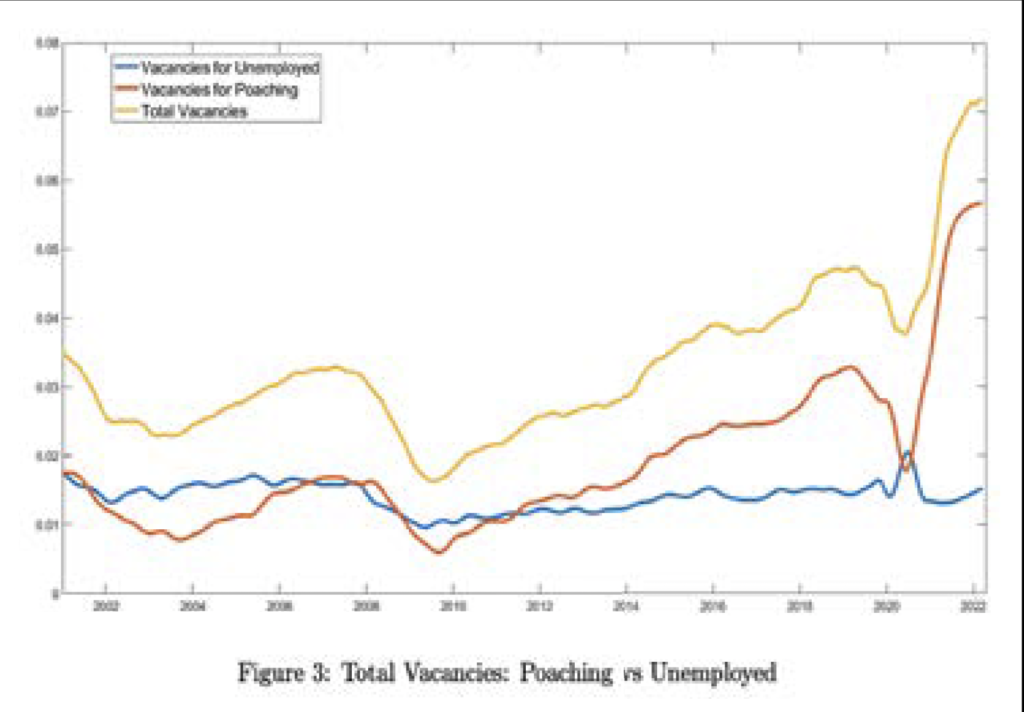
Although the two had travelled together up until, there was also drama in the most recent recession. Poaching vacancies dropped in 2020 and quickly recovered, but vacancies fishing for the unemployed rose in the recession, a time of social distancing, high unemployment, and decreased poaching. Spurred by measures to control the pandemic, more workers were laid off than could be explained by the fall in demand, and many were hired back quickly.

At this point, fiscal and monetary policy drove up demand, firms needed to expand, and that poaching reaccelerated. Supply bottlenecks and demand led to a surge in goods inflation, and poaching drove up wages. That’s what happened recently, and Cheremukhin and Restrepo-Echavarría are searching micro data to understand what drove the poaching surge in 2015.

Considering what will happen to unemployment, they note that in the 2000s ads designed to poach and those designed to draw were about the same, but now the majority of job openings are would-be poachers. That would suggest the decline in openings might have an historically small effect on unemployment, and here they mention a soft landing.

But they add a caution. HIghlighting work done in 2013 showing that as of 2011, 42% of hires came from firms that did not report any openings—what would wider knowledge of that study have done to the squabbling over the openings rate? If this mismeasurement is improving, then the Beveridge curve has shifted outwards, but the slope has not changed, and we don’t have the steepened curve required for the soft landing. Then a decrease in vacancies could drive an increase in the unemployment rate.

Coda: Back in 2015, just as the yet-to-be-explained surge in poaching got underway we renamed, and in print, the openings rate the “Tire Kicker Rate,” on the belief that employers were just fishing, and raised many red flags that the openings rate was not doing well as an indicator, and it was likely driving faulty policy.

And that’s the sobering fact in this paper: The narrative was that unemployed workers were either too unskilled or too lazy to work. All the hullabaloo about job openings and the unemployed was misdirected. The companies were angling for workers already employed elsewhere, and the unemployed took the rap.

by admin· · 0 comments · Employment & Productivity

State university systems or collapsing bridges? Our choice

It’s been a while since we looked at net investment in the US, and we weren’t surprised to learn that the basic story hasn’t changed. Private investment is only a bit ahead of depreciation, and public investment even less so. So far in 2022, net fixed investment by the private sector has been 2.1% of GDP, which is also its average so far for the decade. As the graph on below shows, that’s about half what it was from the 1960s through the 1980s and is only slightly above what it was in the 1940s, the decade when civilian investment was squeezed to supply war needs:

Low levels of net private investment aren’t driven by declines in gross investment, which has been pretty stable. Instead, the major reasons for the decline are a shift towards shorter-lived equipment and the immateriality of intellectual property (IP) and a shift away from buildings. From 1950–1999, net fixed private investment averaged 32% of gross; since 2000, it’s averaged 20%—and 16% since 2020. Every asset category has seen that shift. Net equipment investment went from 24% of gross from 1950–1999 to 15% since 2020. Even nonresidential structures aren’t being built for the ages; they went from 49% of gross to 16%. (Are they just building self-storage units these days?) And IP isn’t what it used to be either; its net went from 23% of gross in the earlier period to 16% in the most recent.

Residential net investment isn’t doing too great either: it went from an average of 2.8% of GDP from 1950 to 1999 to 1.7% in the 2020s. Unlike the mid-2000s housing bubble, which took net residential investment up to 3.8%, the highest since the post-World War II decade, the latest bubble took net housing investment up to just 1.9% of GDP last year. It’s fallen back to 1.4% in 2022. That’s not the way to meet a housing deficit estimated by Freddie Mac at 3.8 million units.

For the public sector, the decline in net investment has been more dramatic, falling from around 2% of GDP in the early decades on the graph to 0.4% since 2020. (It’s 0.3% so far in 2022.) Like the private sector, we’ve seen a shift towards shorter-lived assets, but unlike the private sector, we’ve also seen a decline in gross investment, which fell by almost half between the 1960s and 2020s. Net federal civilian investment is just 0.1% of GDP so far this decade, a third its 1950–1999 average. State and local investment has fallen harder, down by almost three quarters from that 50-year average to 0.5% in the 2020s (0.3% so far this year).

The graphs below give a yearly view since 1950. They tell the same story: steady decline, with cyclical oscillations around the trend. The burst of net private investment in the late 1990s gave us a major productivity acceleration, but it was not to last. And the burst in civilian public investment from the early 1950s through the late 1960s gave us interstate highways, schools, and state university systems. The long declines in net investment, both private and public, have given us stagnant productivity growth and a collapsing infrastructure.

by admin· · 0 comments · Employment & Productivity

Swans of Our Waters

The tundra swans that breed in the western arctic migrate thousands of miles to our west coast, gracing the skies and waters of California and scattered inland regions of Montana, Idaho and Utah. Close to two hundred of them were counted gliding on the Bear River wetlands near the Great Salt Lake last week. Other times, counts are in the thousands. The populations that breed in the eastern arctic travel to the Great Lakes and, mostly, the midAtlantic coast, some stopping over at the Harriet Tubman Underground Railroad National Park in Maryland these days, and are iconic on the Chesapeake Bay.

Our other native swan, the larger trumpeter, far more local, was brought back from the brink of extinction beginning in the early 1900s, when, after three centuries of overhunting, only a few dozen remained. Damage to muskrat and beaver populations also affected swan populations who nest on their dams and dens, and as these industrious rodents recovered, swan habitats improved as well.

There is another swan in the United States, the mute swan, introduced in the late 1800s largely as an ornament on wealthy estates. With few natural predators, and impressive survival agility, mute swan populations have grown, and in some coastal regions nesting species may have reached carrying capacity. Hudsonia, the small ecological research institute I work with, recently put together a round-up of current knowledge to help inform the ongoing debate on how to handle this charismatic, but potentially problematic, species, excerpted here.

As is often the case with introduced species, impacts of mute swans may be assumed rather than documented, raising the possibility that these birds are the subject of an ecological narrative, to borrow Robert Shiller’s well detailed economic narratives, those partial truths we repeat sometimes without much of a fact check. Sometimes those narratives are amusing, sometimes annoying, but in fact they drive policy decisions often with poor outcomes. Managing swan populations either by addling eggs or culling the birds themselves is an expensive long-term commitment, with no guarantee of success. Our conservation resources are limited.

Mute swans are accused of harassing other nesting waterbirds, depleting aquatic vegetation, attacking humans, and polluting bodies of water. Sometimes they are guilty as charged. And they aggressively defend their nests, as do our native swans who fend off many predators, including foxes. In the popular press, a mute swan defending his nest may come across as aggressive, a tundra swan, valiant.

And, like most birds, they eat a lot. Some ecologists and hunters are concerned that their habit of uprooting more than they eat could deplete submergent aquatic vegetation (SAV), the nursery grounds of fish and crustaceans, thereby reducing duck populations. And on their loafing sites, funny concept, apparently they have inadvertently trampled the nests of rare shorebirds. However, to Hudsonia’s knowledge there have been no species-specific studies of other birds’ nesting success in the presence of mute swans, and most aggression is directed toward also burgeoning year-round populations of Canada geese. Other than isolated accounts, there is “no evidence to support nesting disruption of marsh-nesting birds.”

The primary factor in the widespread declines in SAV beds, documented in coastal, estuarine and lacustrine habitats around the world, is reduced water clarity caused by inorganic sediment, nutrient additions, and eutrophication. For example, sediment that comes into the Hudson River during heavy rains persists for years and even decades, resuspended by recurrent rain storms. Exposed agricultural soils, point sources like treatment plants, and impermeable urban and residential surfaces all contribute, their effects tending to be exacerbated by the warming effects of climate change. There is evidence that animal herbivory is more damaging in areas already over-stressed by those effects.

We already have developed methods to improve water quality ready at hand, identified by the science as the driving factor in restoring and preserving SAV beds, and such projects create entry-level jobs in science and conservation work, sectors that look weak in Bureau of Labor Statistics’ projections. Managing runoff would potentially be of greater value than managing mute swans on many levels.

Focusing on one introduced species, here mute swans, also detracts attention from coming up with integrated solutions that treat the many stressors, including alien species, as part of a web to be rewoven as best we can.

Photograph of mute swans in New York, P. Dunne

by admin· · 0 comments · Employment & Productivity

Bring on the Solopreneur

Details on establishment formation from yesterday’s Quarterly Census of Employment and Wages show an acceleration beginning in 2020Q3, accompanied by a drop-off in the number of employees per establishment. As the graphs below show, between 2017 and 2019 average establishment growth ran at 1.7%, and from 2020Q3 onward at 3.8%, while the number of employees per establishment slipped from 14.5 to 13.2.

And a new term is born: the solopreneur.

Another take on this comes from applications for new businesses. Census statistics show they stumbled in March and April of 2020, and quickly recovered, rising from 3.5 million in 2019, to 4.4 million in 2020, and 5.4 million in 2021, a 54% increase over two years.

Venture Forward, a collaboration among GoDaddy and several universities to learn more about new business formations, estimates there are 45 million microbusinesses in the US, of which 90% have fewer than 10 employees. Many of these have been formed out of necessity, and 63% of those formed since March 2020 required less than $5,000.00 in funding.

The Kauffman Foundation reports that in 2020 the share of opportunity entrepreneurs, those who were not unemployed when they started a new business, fell from 87% in 2019 to 70% in 2020, and then rose to 81% in 2021, so that clouds the picture a bit. But small and growing businesses are drivers of employment, and it’s very good news that new businesses formed by blacks rose from 15% before March 2020, to 26% through July 2021, by women from 48% to 57%, and by those without a college degree from 36% to 44%. The share started by whites slipping from 70% to 60%.

National Bureau of Economic Research found that zip codes with higher numbers of black residents, especially with higher median incomes, were associated with higher startup rates. UC Santa Cruz’s Robert Farlie reported that between 2020Q1 and 2021Q3 black male business ownership rose by 33%, the largest by demographic, followed by a 22% increase among black female entrepreneurs.

The Harvard Business Review recently reported that 17% of black women were in the process of starting a business, compared to 10% of white women, and 15% of white men.

by admin· · 0 comments · Employment & Productivity