This was basically a solid report, with job growth above recent averages. (Part of that strength was good business practice, and part of it technical, more below.) Wage growth strengthened, but hours were surprisingly weak.
Employers added 200,000 jobs in January, 196,000 of them in the private sector. Both are about 20,000 above the average of the previous six months. Goods production extended its strength, with mining and logging up 6,000 (just above its average over the last year); construction, 36,000 (firmly above average); and manufacturing, 15,000 (slightly below average, with the plus signs concentrated in durables). Private services added 139,000, just above average, with wholesale trade up 10,000 (well above average); retail, 15,000 (quite a contrast with its average of -3,000, with most of the gain coming from clothing stores); transportation and warehousing, 11,000 (just below average); finance, 9,000 (also just below average); professional and business services, 23,000 (more than a third below average, with accounting/bookkeeping in the red for the second consecutive month, and temp firms unusually weak); education and health, 38,000 (just below average, though health care alone was almost a fifth below average); leisure and hospitality, 35,000 (above average); and other services, 6,000 (a third below average). In the red: information, off 6,000, twice its average decline. Government added 4,000, most of it federal, as losses in state gov were offset by gains in local.
As we mentioned in yesterday’s report, seasonal factors anticipated heavy lay-offs in construction and retail work. Surely construction businesses are holding onto their workers in the current environment; those are real jobs, if somewhat enhanced by the factor. The strength in retail, though, was probably driven by weak hiring in December, which caused the factor to over-adjust for anticipated January layoffs.
For the year ending in January, total employment was up 1.5%, and private employment, 1.7%. Both are down 0.2 point from where they were in January 2017 – and both those 2017 numbers were also down 0.2 from January 2016. And the 2016 numbers were down 0.3 (total) and 0.4 (private) from January 2015. Claims that employment growth over the last year have been extraordinary are overdone; the cycle’s peak employment momentum was February 2015’s 2.3%, almost three years ago.
Diffusion indexes were surprisingly weak, with all four intervals down. We wouldn’t make much of this now, but it bears watching.
The average workweek fell 0.2 to 34.3 hours. Declines of 0.2 in the hours series are rare: there have only been seven declines of 0.2 or more (six -0.2s, one -0.3) in since the all-worker series began in March 2006. We’ve seen several instances of 34.3-hour workweeks over the last couple of years, but it is the low end of the range since hours climbed out of the recessionary basement in late 2011. Both manufacturing and services were down.
Average hourly earnings rose 0.3%, taking the three-month moving average up from 0.2% to 0.3%. (We confirmed with the BLS that they have corrected a timing issue affecting wages, so no more fun with that flaw.) The annual gain is now 2.9%, and has risen 0.2pps in each of the last three months. In 2016 the gain for all workers was 2.5%, and in 2017 it was 2.4%. Oddly, you have to go back to June 2009 to see wage growth of 2.9%.
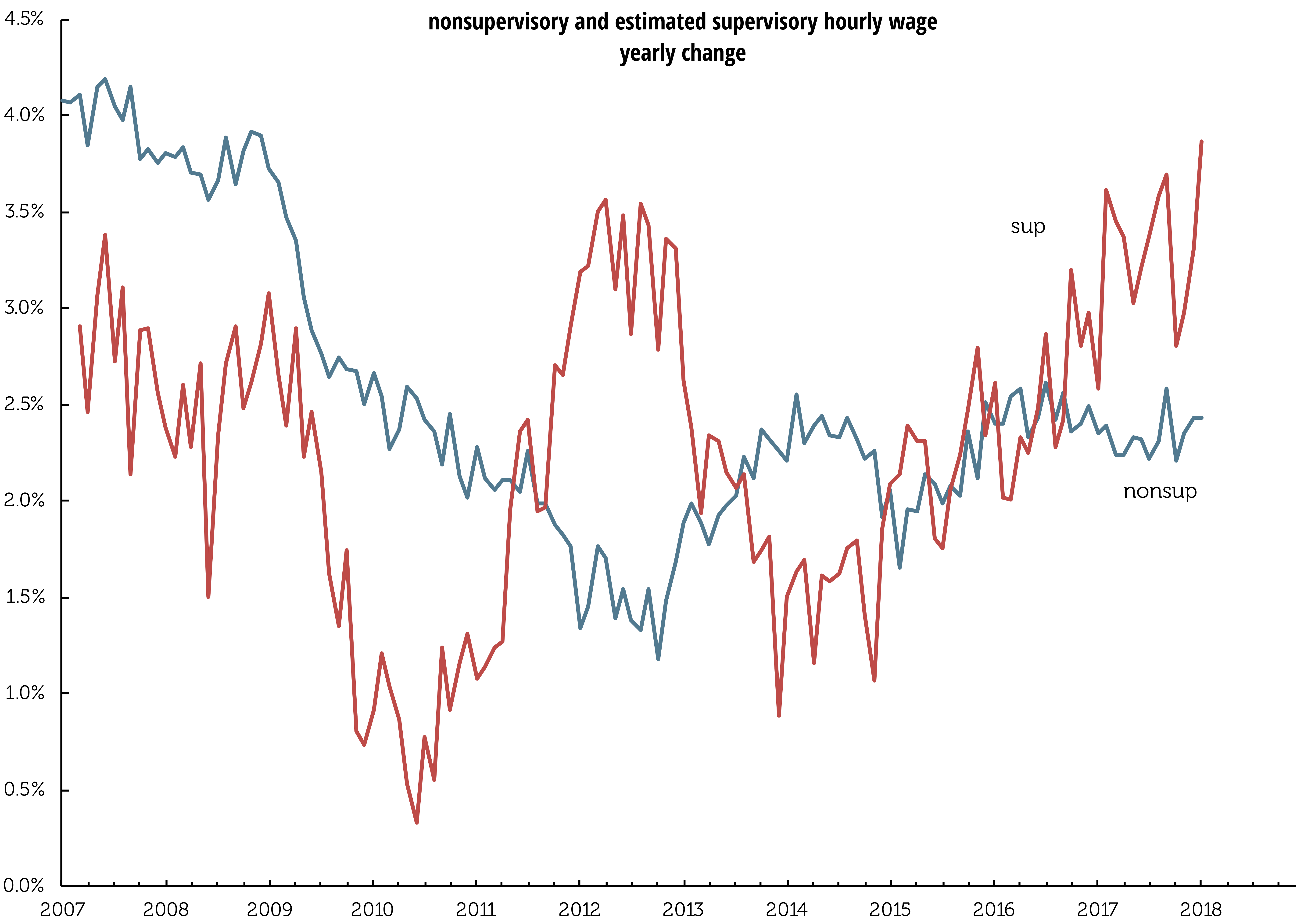
Production and non-supervisory workers’ wages were weaker at 2.4% over the year. We reverse engineered supervisory workers’ wage gains using their share of the workforce, graphed above. You’re see wages for supervisory workers are currently growing at 3.9%. A year ago wages of production workers were growing at 2.3%, while wages for supervisory workers were growing at 2.6%.
Because of the sharp decline in the workweek, aggregate payrolls – hours times earnings times employment – were off 0.1%, the first decline since March 2017.
The benchmark revision announced by the BLS last fall was put in place, once again a non-event. Total employment as of March 2017 was lifted 0.1%, which is below the 0.2% absolute average of the last 10 years. That average has fallen, by the way, which means the monthly estimates have been more accurate in recent years. Over the last five years the revisions were absolute 0.1%. with one too small to count.
This month brought the annual changes to the population controls for the household survey, which makes most month-to-month comparisons non-kosher. The BLS did provide information on several measures adjusted for the changes in the population controls, and those developments were not lapel-grabbing: the participation rate, the employment/population ratio, and the unemployment rate were all unchanged before the changes in the controls, as they were after. And total employment, up 409,000 as published, would have been up just 91,000 were it not for changes to the population controls. The changes increased the size of the noninstitutional population by 488,000, the labor force by 333,000, and employment by 318,000 – not large numbers in the long view, but large enough to muddle comparisons with December.
The unemployment rate has been 4.1% for four consecutive months now. While some analysts are calling for a move towards 3.5%, this stability is starting to look late-cycle-ish.
Weather effects were strictly average for a January.
Because of the changes to the population controls, there is nothing that can be reliably said about the duration of unemployment or the job flows numbers.
The above-consensus rise in employment and strengthening wage growth will bolster the case for further rate rises. It will be interesting to see how dependent on low rates the financial markets and corporate cash flows have become; preliminary signs from stocks suggest there will be some adjustments coming in 2018.


Trade: it’s complicated
With trade & tariffs much in the news, Colin J. Hoffman & Ryan Monarch, both in the International Finance Division of the Fed’s Board of Governors, just released the paper “Distributional Consequences of Trade for U.S. Consumers: Estimating Group-Specific Import Price Inflation.”
They work to shift the focus from the effects of international trade on different groups of workers to different groups of consumers, and want to know if changes in prices driven by increased international integration exacerbate or ameliorate real income inequality, driven by nominal income changes.
The authors reference a 2016 paper, “Measuring the Unequal Gains from Trade,” in which Pablo D. Fajgelbaum & Amit K. Khandelwal (of UCLA and Columbia) review the effects of import price disparity on high- and low-income consumers. Their scenario involves closing down trade, which is extreme and we don’t expect, but their work is still worth a look. Using the elasticity of imports, incorporating both trade costs and income, they find that such a closing off of trade would be about twice as hard on lower income groups than on the top decile: lower-income consumers spend more on traded goods, with lower elasticities, whereas higher income groups spend more on services. This bias extends around the world, but in countries with lower elasticity of exports, fewer gains would accrue to the poor from opening trade.
Hoffman and Monarch find that low- and high-income groups have about the same share of expenditures on imports, and both have increased to about 10% as of 2014 from around 7% in 1998. However, the 1st decile’s share of imports excluding food and fuel is about 70%. That share falls to about 66% for the second decile, and then rises through the deciles to 77% for the top. But all goods are not equal. Those much disparaged washing machines are about 1.8% of expenditures for the lowest decile, steadily falling to just 0.8% for the highest, whereas spending on imported sporting goods rises from about 0.5% for the lowest to 2.2% for the highest decile.
We can see where this is going. Although inflation in imported goods has risen for all groups, the lower income groups have faced higher inflation in import prices. Using prices for 228 Harmonized Commodity Description and Coding System sectors—let’s stick with HS—the authors find statistically significant differences in price changes across income groups. As the graph on p. 2 shows, import inflation was up 24% for the first decile, and 15% for the ninth.
And China held yearly changes in import inflation down for all deciles. Without China, yearly import inflation would have been up an additional 0.5–0.6 percentage points.
Since the method used to produce the results allows the authors to see different expenditure shares of the deciles within the same sector, and different expenditure shares across product varieties, the authors were able to demonstrate that taking out cross-sector differences aligns yearly increases for all deciles at 1%. That indicates to the authors that high-income consumers gravitated to sectors with lower inflation, and leads them to conclude that nominal income inequality that has risen owing to trade in the last decades, was not mitigated by changes in import prices across income groups. This is pretty specific information, but it underscores how much more specific the debate should be.