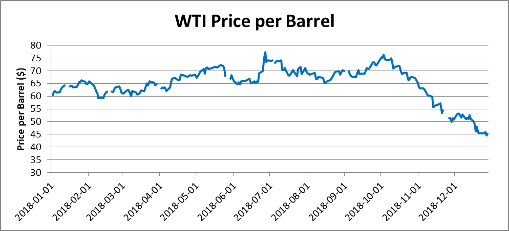
The WTI price of crude oil began 2018 at $60.37 per barrel. It rose to a peak price for the year of $77.41 on June 27th. From July through September the price moved within the range of $65.07 to $74.19 per barrel. It then again peaked at $76.40 on October 3rd after which it began a spectacular fall and ended the year at $45.15 per barrel. Daily movements in the WTI price during 2018 are shown in Figure 1.
The imbalance between the supply of and the demand for oil drives price changes. Many factors influence the relationship between oil supply and demand. Most important among these factors are:
• Domestic oil production
• Oil imports
• Refinery oil usage
• Oil exports
• Oil storage capacity and reserves
This paper explores how each of these factors influences the balance between oil supply and demand and the resulting change in the domestic price for oil. This analysis is based on data from the U.S. Energy Information Administration (EIA). The analysis focuses on the different components of crude oil supply and demand by month. There are obvious limitations with this approach. For example, crude oil produced in a giving month can require a month or more to reach refineries depending on the mode of transportation.
Domestic Oil Production
Figure 2 shows the average monthly amount oil produced per day within the United States since 1950. During January 1950 domestic oil production averaged 4.9 million barrels per day. Over the next twenty years oil production increased to a peak value of 10.0 million barrels per day during November 1970. Then production started a steady decline until it bottomed out at 4.2 million barrels per day during September 2005. Since then domestic oil production began to grow again reaching 5.5 million barrels per day by January 2011, which marks the beginning of the tight oil boom. As of October 2018 U.S. oil production totaled 11.5 million barrels per day.

The revival of oil production in the United States began during the 1980s with the development of horizontal drilling and hydraulic fracturing technology, but the adoption of the new extraction techniques did not begin to dramatically impact oil production until about 2011.
Domestic oil production now consists of oil produced by two types of wells. Conventional wells extract oil from underground reservoirs at atmospheric pressure and temperature. Tight oil is extracted from shale or sandstone formations by the process of horizontal drilling and hydraulic fracturing.
During January 2011 tight oil production first exceeded one million barrels per day. That month oil from conventional wells accounted for 81.7% of domestic oil production, while tight oil accounted for the remaining 18.3%. Since 2011 U.S. oil production has exploded. Most of the growth in production is attributable to tight oil wells. During October 2018, oil production from conventional wells equaled 4.6 million barrels per day and from tight oil wells it equaled 6.9 million barrels per day.
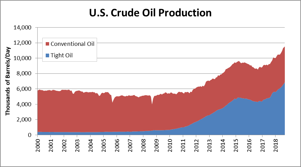
Figure 3 presents conventional and tight oil average daily production levels since 2000. This chart shows that all of the U.S. oil production growth over this period is attributable to tight oil. From January 2000 to October 2018 conventional oil production decreased from 5.4 to 4.6 million barrels per day, while tight oil production increased from 0.4 to 6.9 million barrels per day.
Parity between tight and convention oil production occurred during December 2014. That month both conventional oil wells and tight oil wells produced 4.7 million barrels per day. During October 2018 tight oil wells accounted for 59.8% of total domestic oil production.
U.S. Oil Imports
The United States began importing oil near the end of World War I in order to meet both domestic needs and to provide exports to Britain and France. The source of these early imports was Mexico. At the beginning of 1920 oil imports equaled 203 thousand barrels per day. In comparison, domestic production equaled 1.1 million barrels per day.
Figure 4 shows changes in the share of the United States’ oil supply derived from imports since 1920. From equaling about one-quarter of the U.S. oil supply during the early 1920s, the import share declined to almost nothing during 1942. After World War II the import share increased again and from the mid-1950s to 1970 averaged a 12.5% share. From the beginning of 1971 to the middle of 1977 the import share jumped from 10.4% to 46.6%. Then, through the late 1970s and early 1980s the import share declined bottoming out at 18.9% during February 1985. From that point in time imports experienced strong growth reaching a peak share of 68.5% during September 2005. The actual volume of oil imports peaked at a rate of 10.8 million barrels per day during June 2005.
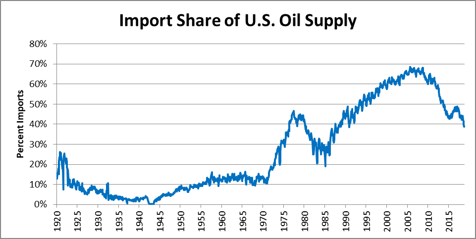
By the start of the domestic tight oil boom, imports averaged 9.2 million barrels per day and accounted for 62.6% of the U.S. oil supply. But as tight oil production grew imports dropped. As of October 2018 oil imported averaged only 7.3 million barrels per day and they accounted for only 38.8% of the U.S. oil supply.
Figure 5 shows the shares of the U.S. oil supply accounted for by imports and domestic tight oil and conventional oil production from January 2000 through October 2018.

U.S. Refinery Oil Usage
During October 2018, U.S. oil refineries input on average 16.4 million barrels of crude oil per day. During 2018 there were 135 operable and operating oil refineries in the United States. These refineries had the capacity to process 18.6 million barrels of oil per day.
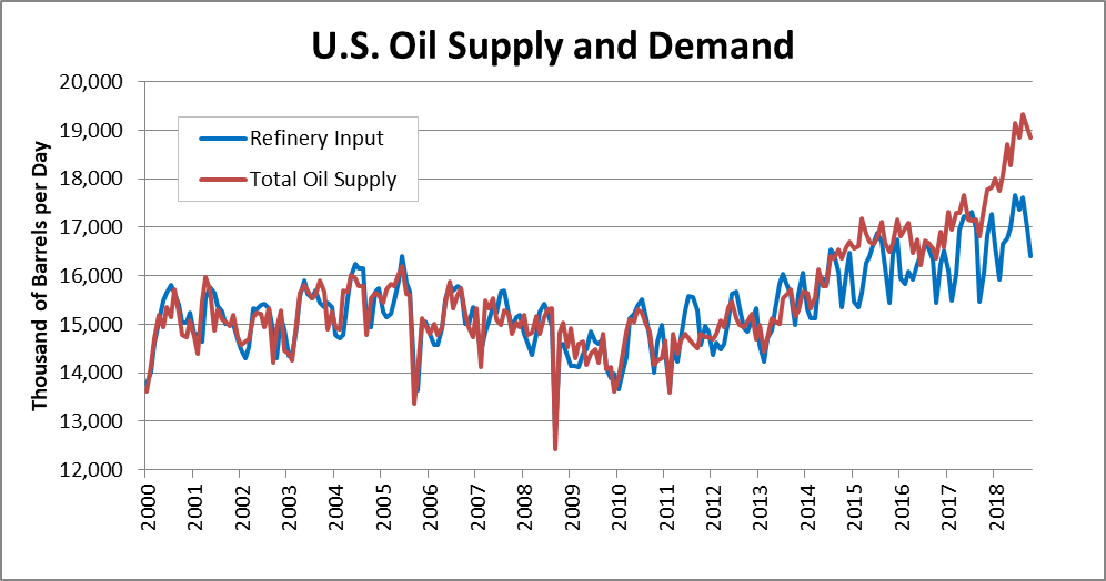
The previous two sections presented information on the sources of supply for U.S. oil refineries. Figure 6 combines the monthly oil supply amounts with refinery input demands from the beginning of 2000 through October 2018. This chart shows a fairly close correspondence between oil supply and demand from 2000 through the middle of 2014. In fact, over that period there were exactly the same number of months of oil surplus and deficit. One should recall that during June 2014 the WTI price of oil peaked at $105.79 per barrel.
Since July 2014 there have been 45 months during which the U.S. supply of oil has exceeded domestic refinery input levels, while there have been only seven months of oil deficit. Also, the spread between supply and demand has been growing. During 2015 the average spread equaled 608 thousand barrels per day, while during the first ten months of 2018 the average surplus has increased to over 1.7 million barrels per day.
U.S. Oil Exports
From 1977 through 2015 the export of domestically produced crude oil was largely banned. However, there were certain exceptions, such as for exports to Canada, oil from Cook Inlet, oil flowing through the Trans-Alaska Pipeline System, heavy oil from California, certain trade with Mexico, and the re-exporting of foreign oil.
The ban was implemented by the Energy Policy and Conservation Act of 1975. This followed the 1973 OPEC oil embargo. But with the growth of tight oil production and the dramatic drop in domestic oil prices beginning in the middle of 2014, political pressure to eliminate the ban grew. The export ban was ended as part of the Consolidated Appropriations Act of 2016 (HR 2029), which was signed by President Obama on December 18, 2015.
As shown in Figure 7, U.S. oil exports averaged only 33 thousand barrels per day from 2000 through 2012. From 2013 through 2015, U.S. oil exports increased to an average of 317 thousand barrels per day. Since the lifting of the ban oil exports grew to an average of 591 barrels per day during 2016, to 1.2 million barrels per day during 2017, and to 1.9 million barrels per day during the first ten months of 2018. During October 2018 exports actually averaged over 2.3 million barrels per day.
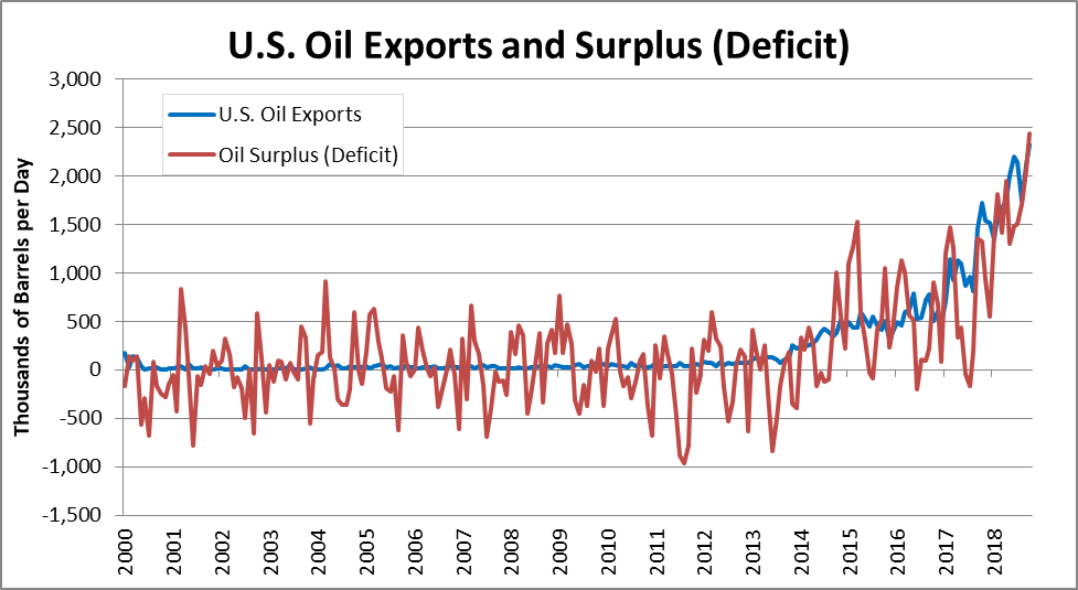
Figure 7 also shows the surplus (deficit) of crude oil in the United States by month. As shown in this chart, the oil surplus or deficit equals domestic production plus imports minus refinery input. As stated previously, although the surplus (deficit) line shows considerable variability over the entire time period, from 2000 through the middle of 2014 the number of months of surplus exactly equaled the number of months of deficit. Over these fourteen and half years refinery input of crude oil exceeded domestic production and imports by only 94.8 million barrels. On the other hand, from July 2014 through October 2018 the aggregate U.S. oil surplus equaled 1,249.2 million barrels.
With the rise of exports the relationship between the supply of and demand for crude oil in the United States is now nearly balanced. A final factor that is essential to the maintenance of this balance is the oil reserves held in storage facilities around the country.
U.S. Oil Storage Capacity and Reserves
The U.S. Energy Information Administration (EIA) publishes statistics on the capacity of crude oil storage facilities twice a year in March and September. These reports identify two primary types of storage facilities: refinery storage and tank farms (including underground storage facilities). Additional stocks include crude oil in-transit by pipeline, railroad, barge and ship. As of September 2018, the total amount of refinery and tank farm working storage capacity in the United States equaled 632.9 million barrels. These facilities held 296.5 million barrels of oil at that time. In addition, there were 119.6 million barrels of oil in-transit.
The storage facility capacity statistics are only available back to March 2011. Since that time the working storage capacity at refineries has decreased by 4.2 million barrels, but at tank farms and underground storage facilities working capacity has increased by 181.5 million barrels. The amount of oil in-transit has also increased by 40.4 million barrels. The storage facilities are particularly important as insurance so that refineries have adequate access to crude oil in order to operate efficiently and to satisfy the demand for refined products.
Figure 8 shows monthly commercial crude oil stocks and exports from 2005 through October 2018. From the beginning of 2005 through the end of 2014 the amount of crude oil in storage experienced a modest increase of 90.6 million barrels from 270.3 million barrels to 360.9 million barrels. Then over the next 27 months the amount of oil in storage rose to a peak of 538.6 million barrels. But then the amount of oil in storage began a significant decline to a low of 406.9 million barrel during August 2018 before moving back up to 432.5 million barrels during October 2018.
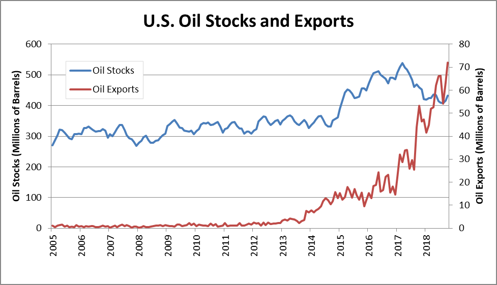
The line representing crude oil exports in Figure 8 shows a noticeable rise after 2014. From 2014 through 2016 oil exports increased from 128.2 million barrels to 216.3 million barrels, or by 88.1 million barrels (68.7%). Then during 2017 oil exports began to explode reaching 422.5 million barrel for the year, which is a 206.2 million barrel (95.3%) increase over 2016. During the first ten months of 2018 exports jumped to 575.3 million barrels.
Looking at the crude oil storage and the export curves together, initially exports did not seem to have much impact on the domestic oil supply. However, beginning early in 2017 the large drop in the amount of oil in storage implies that exports were having an impact on the domestic oil market. This appears to be reflected in the change in the WTI price of crude oil, which rose from $51.97 per barrel in December 2016 to $57.88 per barrel by December 2017 and then to $70.75 per barrel during October 2018.
Summing Up
Given that crude oil exports have been increasing at an exponential rate and that there is similar rapid growth in domestic oil production, predicting domestic crude oil surpluses or deficits is difficult. As has been seen in both domestic and foreign oil markets it does not require much of an imbalance between oil supply and demand to cause large price shocks. Therefore, to better understand what may happen to oil prices an orderly and incremental analysis of the different factors that influence the supply and demand sides of the oil market is required.
On the supply side of the market there are three components, which are conventional oil production, tight oil production, and imports. The demand side of the market consists of refinery input and exports. The rise and fall of oil stocks acts as sort of a shock absorber. Figure 9 shows how the year-to-year percent change in each of these components compares to the year-to-year change in the inflation adjusted WTI price of oil.
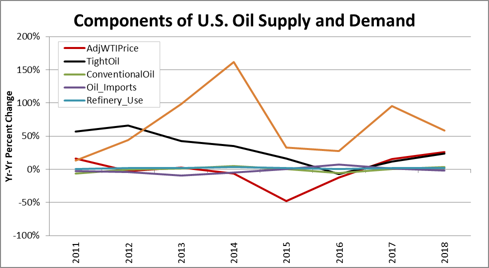
Figure 9 only addresses the years from 2011 through 2018. This is because 2011 marks the start of the U.S. tight oil boom. Also, it was shortly after this that the ban on oil exports began to be relaxed and eventually removed. At first glance this chart may just appear to be a bunch of random strands of spaghetti, but on closer inspection some interesting relationships appear.
The component that exhibits the least variation is refinery input. Over the eight years its average annual rate of change equals 1.8% and it only varies over the range of from 0.3% to 3.5%. There results provides little surprise as the domestic demand for refinery products grows at a fairly steady rate except during recessions and even then it does not decline as much as does overall economic growth.
The production of oil from conventional wells exhibits the second least variable component with an average annual rate of change equal to -0.2% and a range of from -6.3% to 5.2%. Similarly, the annual rates of change for oil imports averaged a modest -1.9% and varied in the range of from -9.6% to 6.9%. More importantly, the growth for this source of oil has been trending downward.
As previously discussed, the birth and growth of tight oil extraction technology has driven most of the growth of the domestic oil industry. Over the eight years beginning in 2011 tight oil production has increased at an average annual rate of 30.5%. But there has been one year of contraction over this period, -7.3% in 2016. The highest rate of growth occurred during 2012 equaling 66.1%.
Looking at changes in the inflation adjusted WTI price reveals an interesting relationship with changes in tight oil production. Rather than tight oil production driving WTI price changes the relationship appears to be reversed at least through 2016. During 2017 and the first ten months of 2018 the growth rates for tight oil production and the WTI price have moved in unison.
Finally, the exports component has exhibited the largest variation among the domestic oil market components with an annual average change of 66.2% and a range of from 12.9% to 161.9%. But this growth range is somewhat deceiving due to early year growth being compared to very small base amounts prior to the elimination of the export ban. The most interesting thing about the annual rates of change for exports is how these fluctuations appear to impact the WTI price. When the growth declined between 2014 and 2015 so did the WTI price, then when the growth of exports jumped again during 2017 the WTI price followed with its own rise.
Not surprisingly, exports seem to be the main disruptor within the U.S. crude oil marketplace. The major destinations for U.S. oil exports are Canada and China. The amount of oil exports to Canada has been stable since 2014, but the amount of oil shipped to China has experienced a dramatic rise over the past year. If oil exports become a vehicle for reducing the U.S. – China trade imbalance, this can have significant implications for the domestic price of oil.
Looking into the future, the U.S. Energy Information Administration (EIA) projects that the WTI price will average $54.19 per barrel during 2019 and it will increase to $60.76 per barrel during 2020. In addition, the EIA projects that domestic oil production will increase from a rate of 10.9 million barrels per day during 2018 to 12.1 million barrels per day during 2019 and to 12.9 million barrels per day during 2020. U.S. oil exports are increasing at a much faster rate than forecast only a year ago. If this growth continues there will likely be considerable upward pressure on the WTI price.