In his comments concerning the disparity between the sentiment of Democrats and Republicans in early 2017, the University of Michigan’s Richard Curtin wrote that “The surge in consumer confidence was based on political promises, and not, as yet, on economic outcomes.” He also pointed out that in 50 years, the surveys “never recorded as dominant” an effect of partisanship on economic expectations. Although at that time Democrats had become much more pessimistic over the last six months, and Republicans much more optimistic, Dr. Curtin himself expected the divergence to converge. Why? He believes consumers themselves find their own expectations useful guides, and in order to regain that tool, both parties would have to “temper their extreme views.”
That has not happened. While Independents tend to track all households, the outlook among Democrats and Republicans has instead widened slightly since Trump took office, as the outlook has risen 4 points among Democrats, and close to 7 among Republicans. Small beer, perhaps, but against Dr. Curtin’s expectations.
UMich collects data by political party only sporadically, so we don’t have a full history, but look at the spike in the gap between the assessments of Republicans and Democrats. It went straight up, by close to 100 points, in February of 2017:
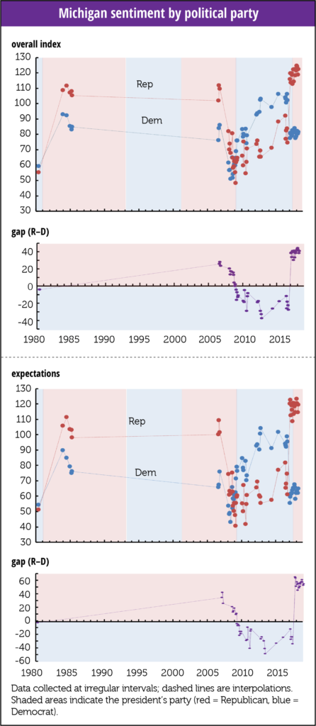
In 2008–2009, all agreed that the outlook was grim, with sentiment among Democrats and Republicans hitting lows, and series lows, of 31 in June 2008 among Democrats, and 48 in March of 2009 among Republicans. Both parties also had low levels in June 1980, and both parties ended 2008 at 59.
The raw average for the entire intermittent series is 80 for the Democrats, and 89 for the Republicans. The raw range for Democrats is the 55 points between 51 and 106, and for Republicans the 77 points between 48 and 124 (rounding). Taking out the lows of the Great Recession narrows that to 32 points for the Democrats, but just to 70 for the Republicans. o Republicans are clearly more excitable and optimistic when their party is in office than the more dour Democrats
And it’s all on the exuberant side of the scale. Both parties have a floor around fifty, but the Republicans top out at 124, almost 20 points higher than the Democrat’s 106.
In the surveys taken during the Reagan and GW Bush years, Republican sentiment averaged 20 points above that of Democrats, if you exclude the 3.9 and 0 for November and December 2008 after Obama’s election, that is. During the Reagan years Republican sentiment averaged 108, Democratic, 88, and during the HW Bush years Republican sentiment ran at 80, and Democratic at 64.
In those polls taken while Obama was President the Republicans averaged 19 points below the Democrats, but averaged just 9 points below during the recession years of greater agreement. (So as the expansion took hold, the split widened.) Whoever thought we’d remember anything comforting about those two years?
During the years Obama was president, Democratic sentiment averaged 87, and 93 if you take out the recession years. During those same years Republican sentiment averaged 69, and 72 if you take out the recession years.
During the years Trump has been President, Republican sentiment has averaged 117.6; while that of Democrats averaged 80, meaning Republican sentiment is running 46 points above the Obama years, while sentiment among Democrats is running just 13 points below (both calculations exclude the recession years). Democratic sentiment is running near where it has in prior Republican administrations, while Republican sentiment is off the chart.
It’s no surprise that consumers feel more confident when the White House is occupied by people whose policies they tend to support. But currently, the Republican outlook, which peaks above the Democratic outlook, is in the cat bird’s seat, while the Democrats are more restrained on the downside. (Dr. Curtin noted that all of April’s gains were driven by Democrats and Independents.) It’s not illogical to wonder if the survey is becoming biased to the upside during this Republican administration, given these differences in character.
The gap is even greater for the expectations component of the index. Dr. Curtin points out in September 2017 comments that over the then-last seven months, Republican expectations exceeded the series peaks for all households, while Democratic sentiment was about level with the start of the recessions of the last half-century. In October 2016, the Republican outlook was 61 while the Democratic outlook was 95. As you can see where blue fades to light red on the right of the lower chart, by February 2017 the Republican outlook had doubled, to 120, while the Democratic outlook fell to 56, rocketing the gap between the two by close to 100 points, from -34 to +65. That unprecedented disparity narrowed only to 48 in September, and has since widened to 55, considerably larger than the gap for current conditions. During the final months of the Obama administration, a gap also widened, but it averaged 22 points for the 5 months, and only extended to 34 points.
A striking point Curtin makes: the demographics really changed in 2017. Through 2016, generally, assessments of economic possibilities rose with income and education, and fell with age. That changed in 2017. Overall expectations for those with less than a high school degree had risen from 68 in October 2016 to 82 by August 2017, but fell for those with a college degree from 87 to 80. For those 65+ they rose from 2016’s 69 to 83 in 2017, while slipping a bit, to 86, for those 18 to 34 years old.
Sentiment for all three education terciles tracked each other closely throughout the series, all peaking around 2000, high school at 100 and the two college groups at 120, before falling raggedly to about 60 in the recession. The current divergence is led by an increase in the outlooks of the two lower attainment levels while those with a college degree are basically flat.
Since 1978, the gap between those with a college degree and those with some college has averaged 4.8. It has widened over time, and varies a lot. It’s averaged -0.4 since January 2017, and is currently -1.4. The gap between those with a college degree and those with high school or less has averaged 12, and had never been below the water line through 2016. It did slip to 1% in February 2009, maybe there’s something about the aftermath of an inauguration, but recovered to the average and even spiked into the 20s in early 2013, a record high, although it hit 20 in early 1985. In October 2016 the gap was 14 points, slipped to 6 in January, and then ran slightly negative for 3 months. It has now recovered to 4.2, and has averaged 3 since January 2017.
This is a tricky issue. We want people to get the education they need to have job and economic security, and we doubt that less than high school fills the ticket, but people with low educational attainment shouldn’t be punished, and we want them to do well. Still, such a shift is unsettling.
It really is a drag that we don’t have a full series. Maybe one of the subgroups, perhaps those with some college in the north central region? always gets it right. We’ll never know.


“Never as Dominant” a Partisan Effect
In his comments concerning the disparity between the sentiment of Democrats and Republicans in early 2017, the University of Michigan’s Richard Curtin wrote that “The surge in consumer confidence was based on political promises, and not, as yet, on economic outcomes.” He also pointed out that in 50 years, the surveys “never recorded as dominant” an effect of partisanship on economic expectations. Although at that time Democrats had become much more pessimistic over the last six months, and Republicans much more optimistic, Dr. Curtin himself expected the divergence to converge. Why? He believes consumers themselves find their own expectations useful guides, and in order to regain that tool, both parties would have to “temper their extreme views.”
That has not happened. While Independents tend to track all households, the outlook among Democrats and Republicans has instead widened slightly since Trump took office, as the outlook has risen 4 points among Democrats, and close to 7 among Republicans. Small beer, perhaps, but against Dr. Curtin’s expectations.
UMich collects data by political party only sporadically, so we don’t have a full history, but look at the spike in the gap between the assessments of Republicans and Democrats. It went straight up, by close to 100 points, in February of 2017:
In 2008–2009, all agreed that the outlook was grim, with sentiment among Democrats and Republicans hitting lows, and series lows, of 31 in June 2008 among Democrats, and 48 in March of 2009 among Republicans. Both parties also had low levels in June 1980, and both parties ended 2008 at 59.
The raw average for the entire intermittent series is 80 for the Democrats, and 89 for the Republicans. The raw range for Democrats is the 55 points between 51 and 106, and for Republicans the 77 points between 48 and 124 (rounding). Taking out the lows of the Great Recession narrows that to 32 points for the Democrats, but just to 70 for the Republicans. o Republicans are clearly more excitable and optimistic when their party is in office than the more dour Democrats
And it’s all on the exuberant side of the scale. Both parties have a floor around fifty, but the Republicans top out at 124, almost 20 points higher than the Democrat’s 106.
In the surveys taken during the Reagan and GW Bush years, Republican sentiment averaged 20 points above that of Democrats, if you exclude the 3.9 and 0 for November and December 2008 after Obama’s election, that is. During the Reagan years Republican sentiment averaged 108, Democratic, 88, and during the HW Bush years Republican sentiment ran at 80, and Democratic at 64.
In those polls taken while Obama was President the Republicans averaged 19 points below the Democrats, but averaged just 9 points below during the recession years of greater agreement. (So as the expansion took hold, the split widened.) Whoever thought we’d remember anything comforting about those two years?
During the years Obama was president, Democratic sentiment averaged 87, and 93 if you take out the recession years. During those same years Republican sentiment averaged 69, and 72 if you take out the recession years.
During the years Trump has been President, Republican sentiment has averaged 117.6; while that of Democrats averaged 80, meaning Republican sentiment is running 46 points above the Obama years, while sentiment among Democrats is running just 13 points below (both calculations exclude the recession years). Democratic sentiment is running near where it has in prior Republican administrations, while Republican sentiment is off the chart.
It’s no surprise that consumers feel more confident when the White House is occupied by people whose policies they tend to support. But currently, the Republican outlook, which peaks above the Democratic outlook, is in the cat bird’s seat, while the Democrats are more restrained on the downside. (Dr. Curtin noted that all of April’s gains were driven by Democrats and Independents.) It’s not illogical to wonder if the survey is becoming biased to the upside during this Republican administration, given these differences in character.
The gap is even greater for the expectations component of the index. Dr. Curtin points out in September 2017 comments that over the then-last seven months, Republican expectations exceeded the series peaks for all households, while Democratic sentiment was about level with the start of the recessions of the last half-century. In October 2016, the Republican outlook was 61 while the Democratic outlook was 95. As you can see where blue fades to light red on the right of the lower chart, by February 2017 the Republican outlook had doubled, to 120, while the Democratic outlook fell to 56, rocketing the gap between the two by close to 100 points, from -34 to +65. That unprecedented disparity narrowed only to 48 in September, and has since widened to 55, considerably larger than the gap for current conditions. During the final months of the Obama administration, a gap also widened, but it averaged 22 points for the 5 months, and only extended to 34 points.
A striking point Curtin makes: the demographics really changed in 2017. Through 2016, generally, assessments of economic possibilities rose with income and education, and fell with age. That changed in 2017. Overall expectations for those with less than a high school degree had risen from 68 in October 2016 to 82 by August 2017, but fell for those with a college degree from 87 to 80. For those 65+ they rose from 2016’s 69 to 83 in 2017, while slipping a bit, to 86, for those 18 to 34 years old.
Sentiment for all three education terciles tracked each other closely throughout the series, all peaking around 2000, high school at 100 and the two college groups at 120, before falling raggedly to about 60 in the recession. The current divergence is led by an increase in the outlooks of the two lower attainment levels while those with a college degree are basically flat.
Since 1978, the gap between those with a college degree and those with some college has averaged 4.8. It has widened over time, and varies a lot. It’s averaged -0.4 since January 2017, and is currently -1.4. The gap between those with a college degree and those with high school or less has averaged 12, and had never been below the water line through 2016. It did slip to 1% in February 2009, maybe there’s something about the aftermath of an inauguration, but recovered to the average and even spiked into the 20s in early 2013, a record high, although it hit 20 in early 1985. In October 2016 the gap was 14 points, slipped to 6 in January, and then ran slightly negative for 3 months. It has now recovered to 4.2, and has averaged 3 since January 2017.
This is a tricky issue. We want people to get the education they need to have job and economic security, and we doubt that less than high school fills the ticket, but people with low educational attainment shouldn’t be punished, and we want them to do well. Still, such a shift is unsettling.
It really is a drag that we don’t have a full series. Maybe one of the subgroups, perhaps those with some college in the north central region? always gets it right. We’ll never know.