Archive for September, 2017
Industrial Production: Up Close & Personal
Note: We are looking at long term trends here so this isn’t a big deal, but the Federal Reserve pointed out that Hurricane Harvey is responsible for approximately three-quarters of the decline in the latest industrial production report. Expect the Harvey and Irma effects to be with us for a long time.
Industrial production is the red-headed step-child of coincident economic statistics. The entire market stops, and then quickly restarts, when the BLS releases the employment report. The Census’s retail sales number receives less fanfare, but it does have a certain amount of headline grabbing power despite its unruly nature. In contrast, the Federal Reserve’s industrial production release receives no attention. This is unfortunate, because it contains a great deal of salient information. And there is no disputing its economic importance: according to BEA industry output data, manufacturing is one of the largest contributors to total industry output.
Before looking at the latest report, let’s consider some context:
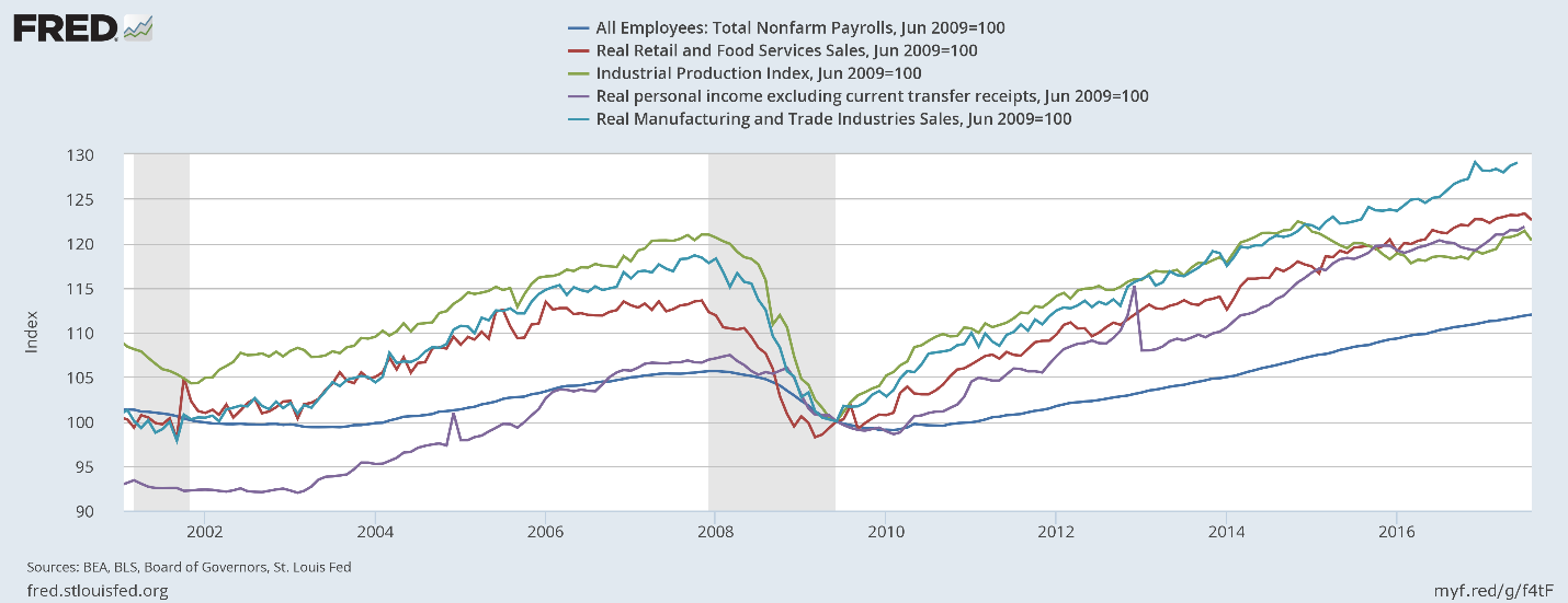
The above chart shows all the primary coincident indicators shifted to base 100. All – except industrial production – have risen above their respective pre-recession highs. It peaked at the end of 2015, dipped for a few years, and only recently increased to higher levels.
Next, consider capacity utilization:
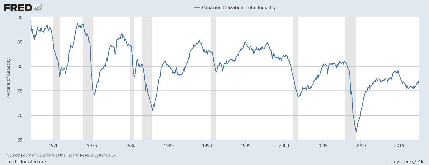
This statistic has hit consistently lower peaks for the last three expansions. This has two important ramifications. First, it weakens investment demand. Why add to your physical plant when you’re employing a lower percentage of it? Second, this may be a fundamental reason for weak price pressures. Why raise prices when instead all you have to do is bring more of your dormant capacity online?
There are two categorization systems used by the Federal Reserve to break down industrial production: major industry groups and major market groups. We will take those in turn.
Major Industry Groups
We’ll break this data down into 4 sub-components, starting with durable and nondurable manufacturing.

Durable manufacturing (in red) first peaked in mid-20124 and again in 2017. But it still hasn’t advanced much beyond its pre-recession level. It’s doubtful it will do so; auto sales are declining and the auto dealer sales/inventory ratio is near a multi-decade high. Non-durable goods dropped about 10% during the recession and only recently started to rise from the pre-recession lows.
Here are the charts of the final two industry groups:
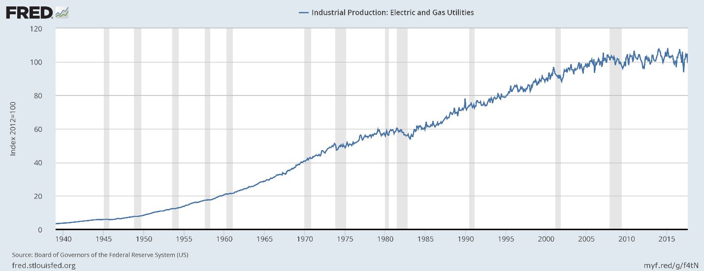
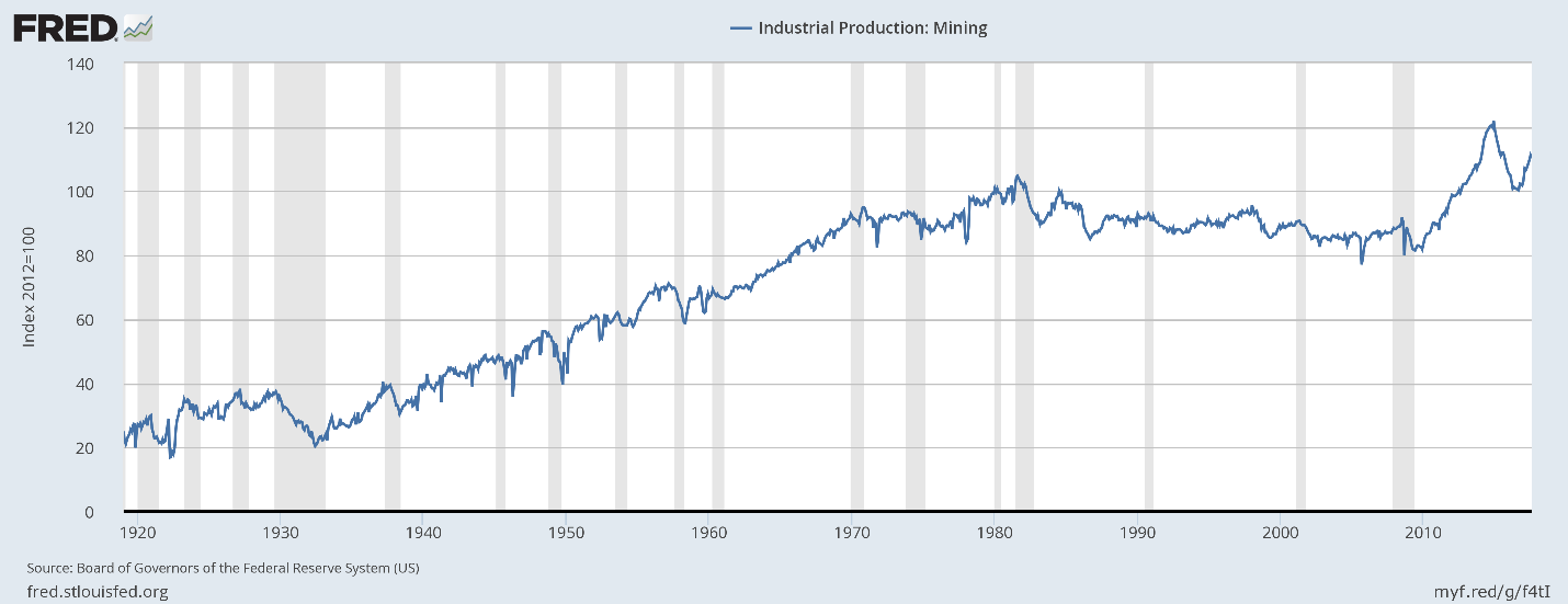
Utilities (top chart) have moved sideways for the duration of this expansion. We suspect increased energy efficiency is having an impact, a good thing. That leaves mining (bottom chart) to provide the sold growth engine. It declined for 30 years (1980-2010) before growing strongly because of the fracking revolution. That has proved to be an unstable thing, but if it weren’t for fracking, there would be no major move in industrial production along industry lines.
Market Groups
Let’s first look at industrial production for consumer goods:
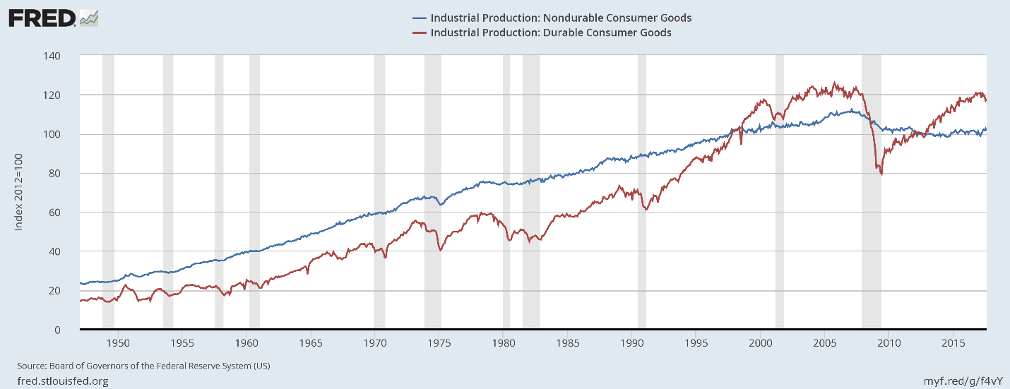
Durable production (in red) has risen to slightly above pre-recession levels, but has yet to move meaningfully beyond that level. Nondurable production (in blue) remains below its prerecession level – so much so that it’s highly doubtful it will advance beyond its previous high.
Next, here is business equipment:
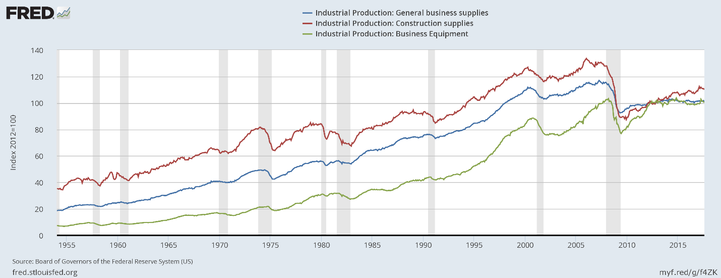
Business equipment (in green) is stuck near its pre-recession level. Construction production (in red) was understandably high during the housing bubble. It dropped sharply during the recession and has been rising consistently since. General business supplies (in blue) is still far below pre-recession levels.
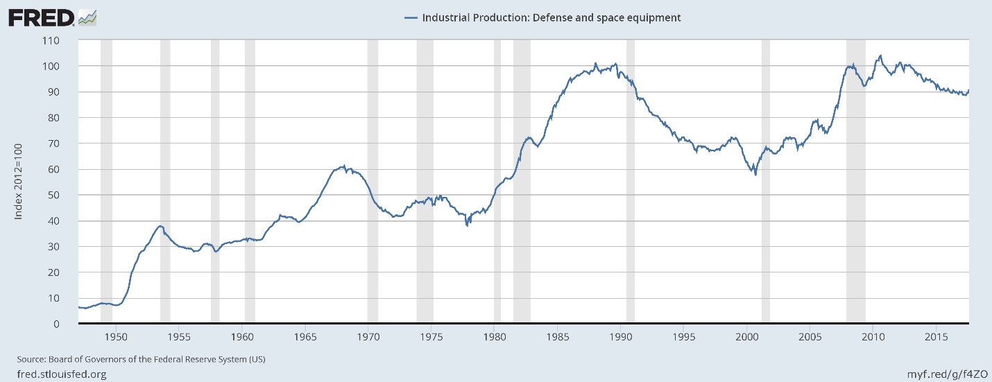
Defense and space production has recently declined:
Next is durables and nondurables materials production:
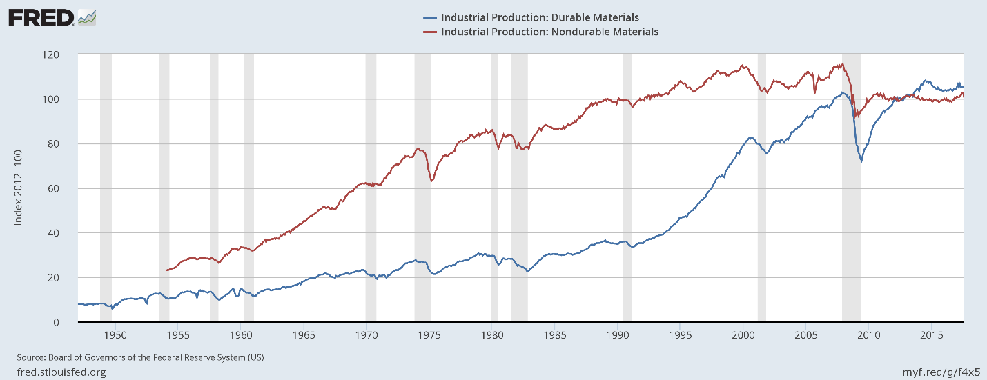
Durables production (in blue) is slightly above it pre-recession level while nondurable goods are sharply lower. There has been no meaningful growth in either measure dor at least several years.
Energy is the last industry classification:

And it is the only one that has meaningfully grown during this expansion.
Regardless of how you slice the data, The United States’ physical production hasn’t grown meaningfully during this expansion. The best performing sector in the consumer areas is durables, and they’re still near pre-recession levels. Overall business supplies levels are also lackluster. If it weren’t for oil, we’d be seeing no growth in industrial production.
Just around the Corner? Maybe Not.
A very smart analyst joked yesterday that the Consumer Price Index is the new Nonfarm Payroll. Since the FOMC has made it clear that they are waiting for 2% inflation—or perhaps Godot—all eyes are searching for signs we might be getting there, so all price indexes are good fodder, especially the PCE, the Fed’s favored index.
The FOMC’s models have continually demonstrated a “just around the corner,” feature where, despite currently weak PCE measures, the expectation is that higher inflation would occur in the near future.
Unfortunately, a historical look at the broad components of this inflation measure belies their optimistic projections:
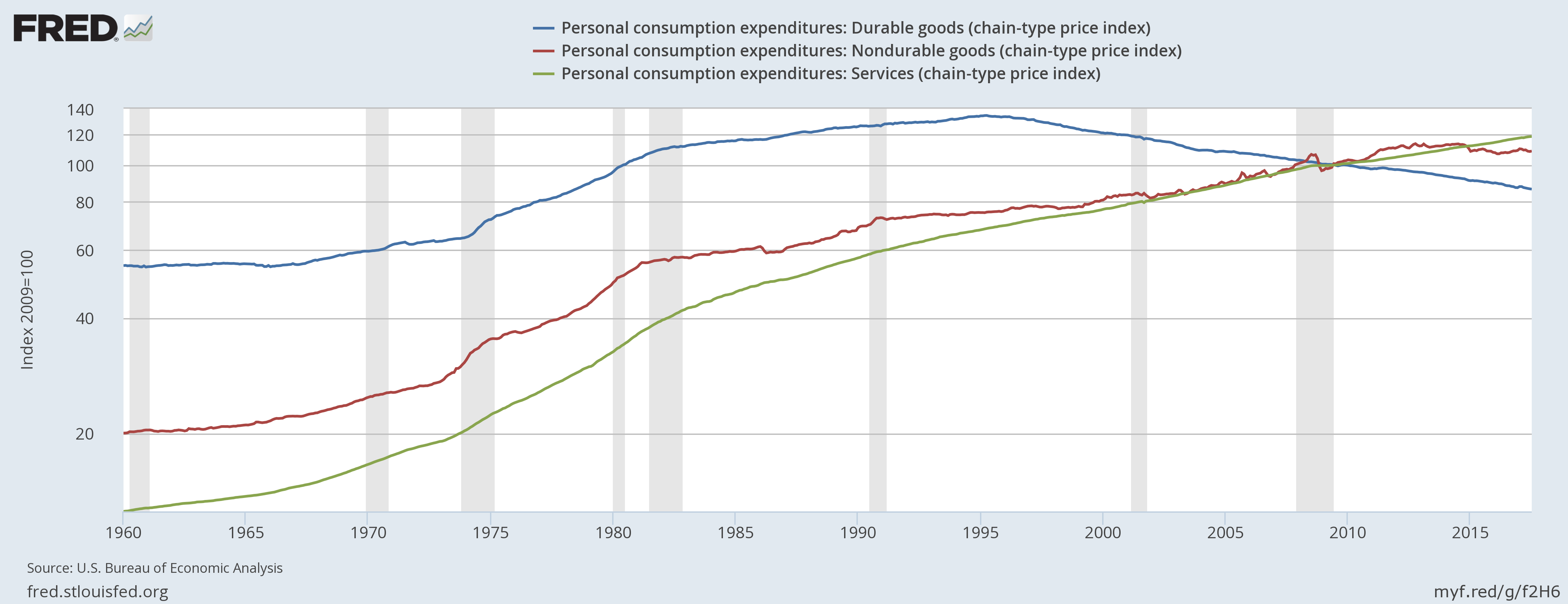
Above is a logarithmic graph of the three components of the PCE price index: durable goods prices (in blue), non-durable goods prices (in red) and service prices (in green). Two key visual elements are apparent: durable goods prices have been consistently declining since the mid-1990s. Non-durable goods prices have been stagnant to slightly lower for the last 5 years. That leaves services as the only PCE price index component that can exert upward pressure.
Let’s look at the same data from a Y/Y percentage change perspective:
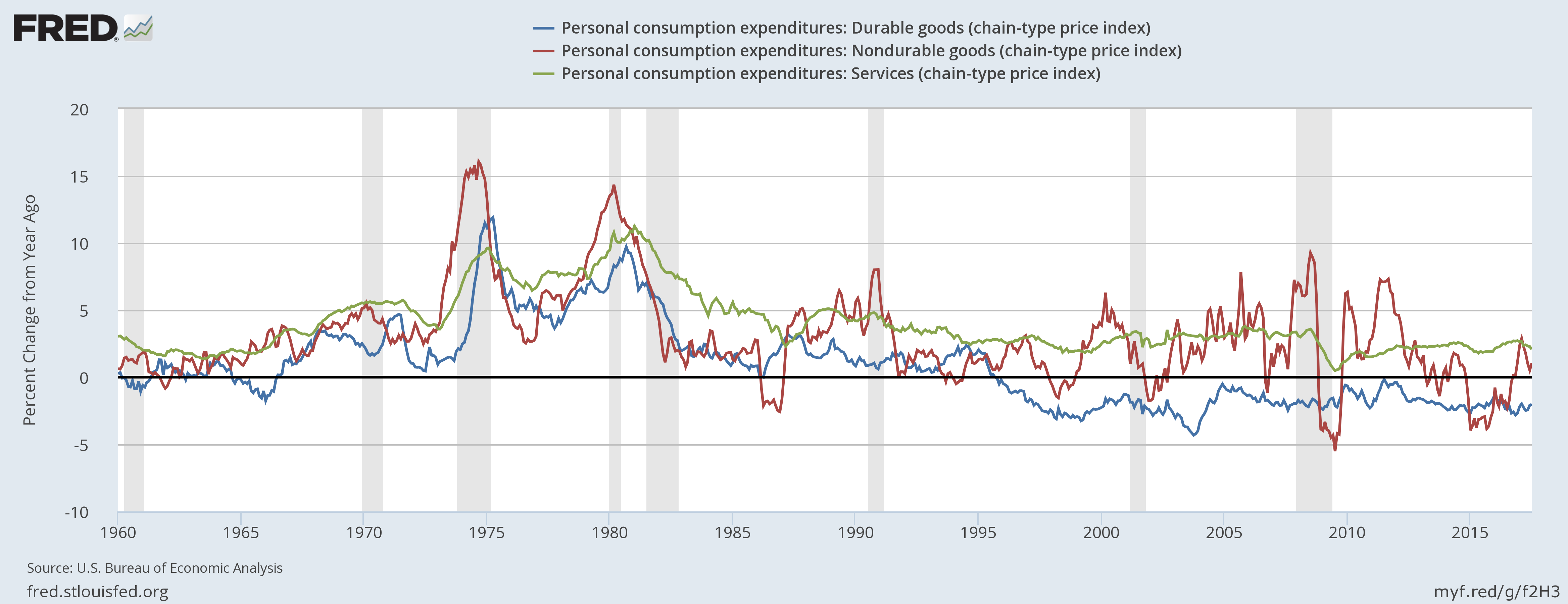
Durable goods prices (in blue) have been subtracting from price growth for the last 20 years. Non-durable goods prices (in read) have been declining since 2011-2012; they subtracted from PCE price growth for most of 2015 and only recently turned positive. Only service prices (in green) have increased PCE price pressures on a consistent basis.
There are several important lessons to draw from this data. First, the PCE price index looks at prices from a business perspective. According to the Cleveland Fed, “the PCE is based on surveys of what businesses are selling.” The above charts indicate that neither durable goods nor non-durable goods companies have any pricing power. Second, the Y/Y percentage change in service prices has been declining. Third, price growth for 31% of PCEs are either negative or very weak. That means the remaining 70% of prices would have to increase at a faster Y/Y rate to hit the Fed’s 2% PCE Y/Y inflation target. This runs counter to the second conclusion regarding service prices, that the y/y rate of change is narrowing.
Those trends mean the Fed cannot hit its 2% y/y target under the current circumstances.
2% target? Inflation Didn’t Get the Memo
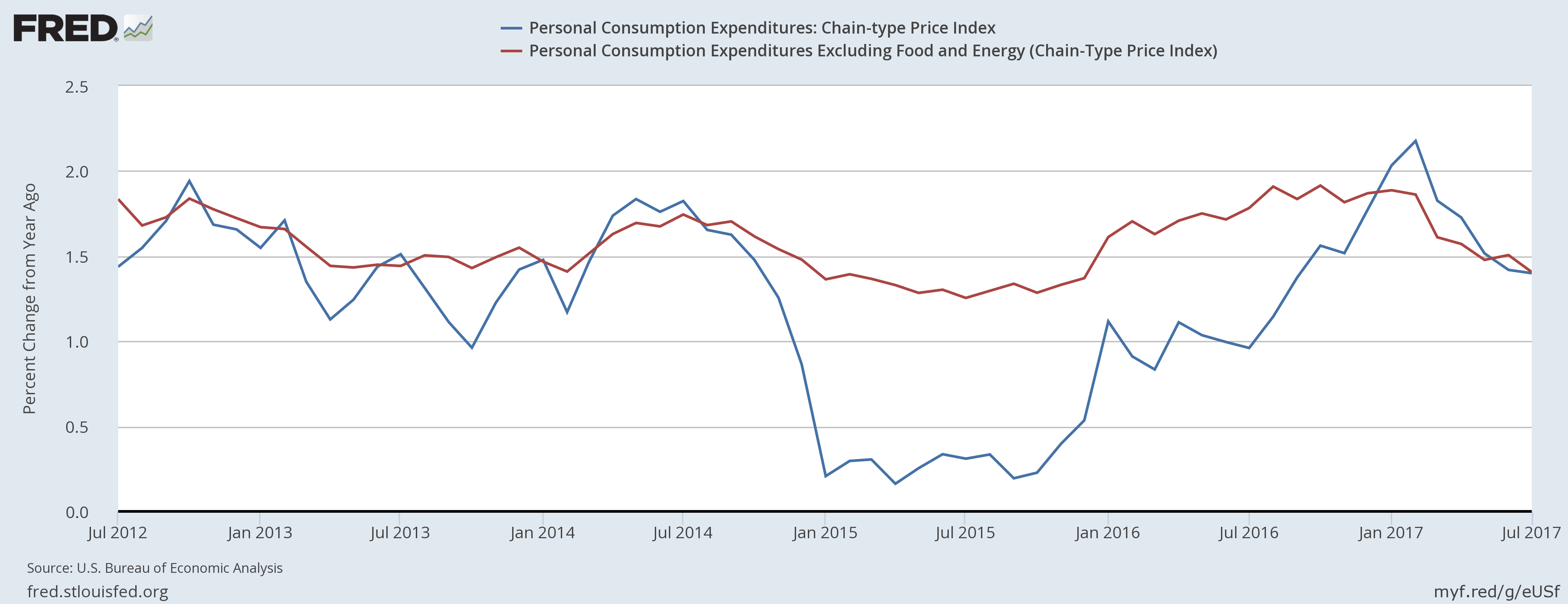
The Fed has publicly stated it has a 2% inflation target, but inflation has been stubbornly uncooperative in reaching that level. The PCE price deflator moved above 2% earlier this year, but has since fallen back, bringing both the overall and core rates back to 1.4%.
The latest Fed minutes show, yet again, that the Fed is concerned about weak price pressures. We’re harping on this subject both because it’s very important, and because it reveals a bit of a dust-up within the Fed. Apparently there has been an ongoing debate within the Fed over showing a united front or encouraging dissent. We, of course, go with dissent, so to us the current inflation debate is encouraging.
Hale Stewart put together the following round-up of recent FOMC speak on that debate.
At their latest meeting, explanations for ongoing low inflation offered by the fed includedoffered by the Fed included:
… a diminished responsiveness of prices to resource pressures, a lower natural rate of unemployment, the possibility that slack may be better measured by labor market indicators other than unemployment, lags in the reaction of nominal wage growth and inflation to labor market tightening, and restraints on pricing power from global developments and from innovations to business models spurred by advances in technology. A couple of participants argued that the response of inflation to resource utilization could become stronger if output and employment appreciably overshot their full employment levels, although other participants pointed out that this hypothesized nonlinear response had little empirical support.
Fed Governors James Bullard and Lael Brainard have been the most vocal on the problem that inflation, in Bullard’s words, “doesn’t seem to be related to the variables that we think it should be related to.”
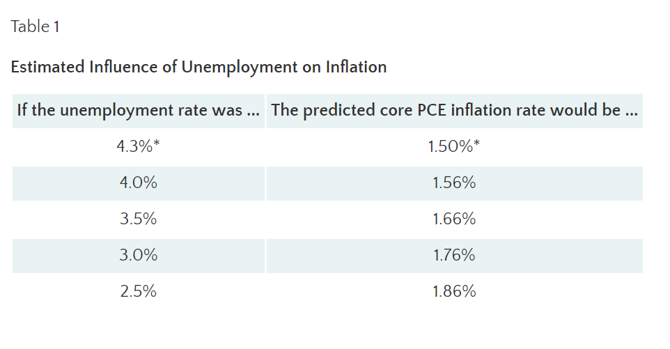
Last week Bullard posted comments on the St. Louis Federal Reserve’s blog focused exclusively on the Phillip’s Curve, which argues that as unemployment decreases, wages increased. This relationship was first observed in the 1950s and became part of central bank policy making soon thereafter. While the 1970s stagflation experience soured the Fed on this theory, it returned to prominence in the 1990s. As many, including the gang here, have argued, the relationship between employment growth and wages is weak at best. The table below shows that even a nearly impossible 2.5% unemployment rate would cause only a minimal increase in PCE inflation (36 basis points). This research indicates that a basic relationship assumed by the Fed is no longer supported by the data, if it ever truly was.
With the Phillips’ Curve either very flat or broken, what should we consider as the causes of current very low inflation? Lael Brainard – one of the Fed’s brightest lights – offers several explanations starting with import prices:
One key factor that may have played a role in the past three years is the decline in import prices, reflecting the dollar’s surge, especially in 2015. By contrast, in the 2004‑07 period, non-oil import prices increased at roughly a 2 percent annual rate and had a more neutral effect on inflation. Nonetheless, while the decline in non-oil import prices likely accounts for some of the weakness in inflation over the past few years, these prices have begun rising again in the past year at a time when inflation remains relatively low.
The following graph illustrates her point:
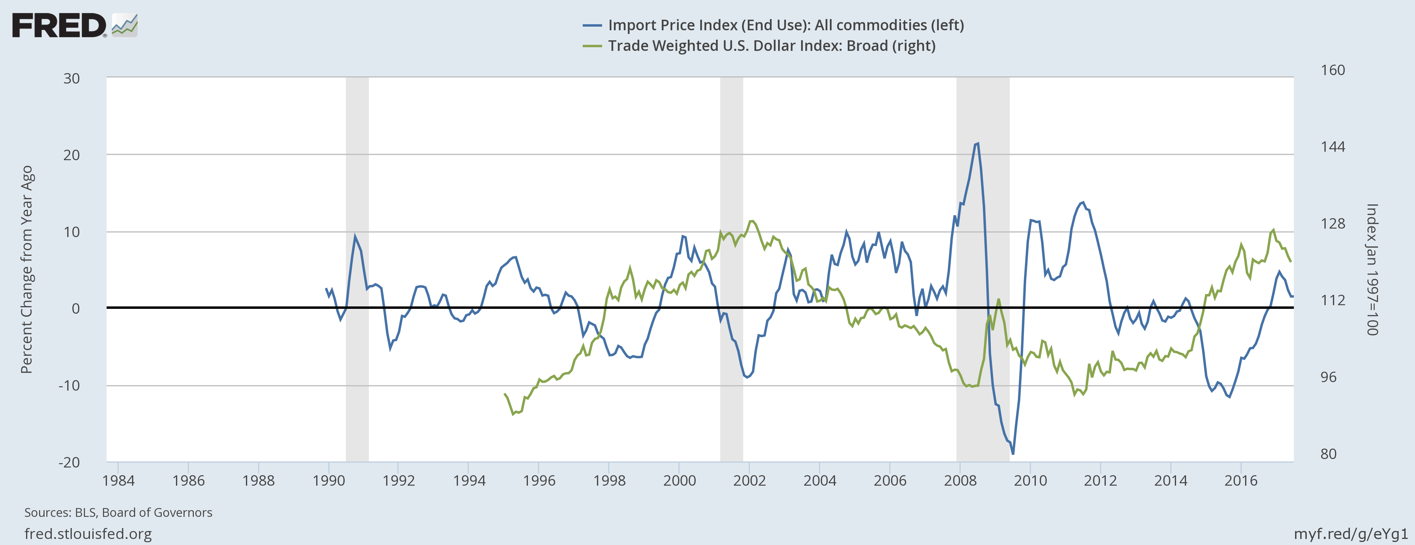
The trade-weighted dollar (in green, of course) decreased 25% between 2002-2008. At the same time, import prices rose at fairly sharp rates. The exact opposite happened during this expansion: the dollar increased a little over 30% causing import prices to contract from 2012 to the beginning of 2017.
She also argues that underlying inflation–as well as inflation expectations–has decreased, which is best illustrated by the breakeven inflation rate, which subtracts the yields of TIPS, Treasury Inflation Protected Securities, from the corresponding treasury.
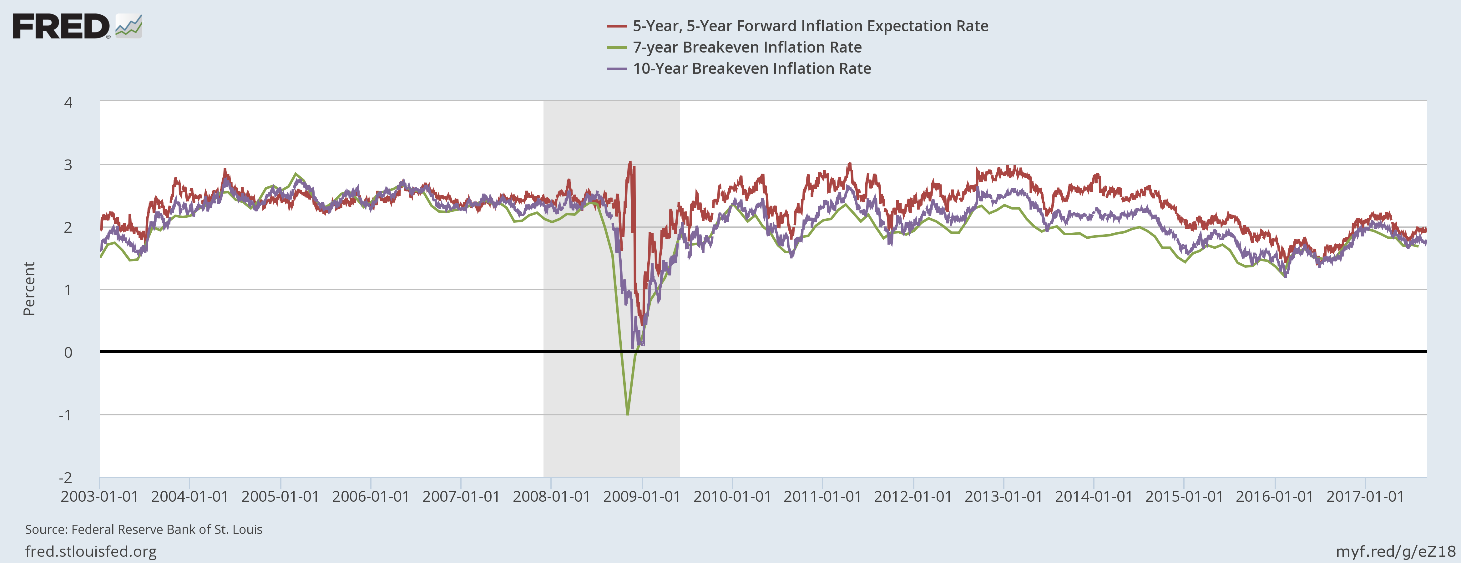
The 5-year (in red) and 10-year (in purple) breakeven rate each fluctuated around 2.5% during the previous expansion. But each has decreased in fairly pronounced ways in the last 4 years. The 5-year has dropped about 100 basis points while the 10-year is down about 75 basis points. This graph indicates that people believe price pressures are declining, so they’re demanding less interest as compensation.
Brainard offers two reasons why inflation expectations are declining:
One simple explanation may be the experience of persistently low inflation: Households and firms have experienced a prolonged period of inflation below our objective, and that may be affecting their perception of underlying inflation. A related explanation may be the greater proximity of the federal funds rate to its effective lower bound due to a lower neutral rate of interest. By constraining the amount of policy space available to offset adverse developments using our more effective conventional tools, the low neutral rate could increase the likely frequency of periods of below-trend inflation. In short, frequent or extended periods of low inflation run the risk of pulling down private-sector inflation expectations. (Note: Bullard has argued that the recent trend is the best indicator of inflation’s direction.)
The first theory has been advanced to explain Japan’s low inflation expectations, but while there is a correlation between the two statistical events, we don’t know if there is causation. The second is related to recent research from the San Francisco Fed, which observed that the natural rate of interest is abnormally low and has been for the duration of this expansion. Low interest rates can’t exist if inflation is high because at some point, the markets will demand sufficient compensation to the natural devaluation of this money.
As we noted last week, the Fed moves at a glacial pace, so don’t expect a sea change in their collective inflation thinking. In fact, several other speeches this week indicate that some governors are continuing to argue low inflation is transitory. However, Bullard and Brainard have at least put the ball in play and offered substantive evidence supporting a rethinking of the Fed’s recent inflation targeting failures. And we believe they won’t drop that ball.
State-level GDP: Down on the Farm with Energy Rising
During first quarter of 2017, economic growth declined in five of the seven Plains states. Within this region, only Missouri and North Dakota saw their economies grow during the quarter. North Dakota’s growth came from a reviving energy sector that contributed 1.7pp and offset almost the entire 1.9pp drop in its agriculture sector. Missouri’s agriculture sector declined by 0.8pp, but this was offset by relatively strong growth in durable goods manufacturing and wholesale trade.
The states that experienced the greatest declines in output were Nebraska (-4.0%), South Dakota (-3.8%), and Iowa (-3.2%). Lower prices for row crops likely explain the decline. During the first quarter of 2017 corn prices averaged 4.4% below the prior year and wheat prices were down 11.7%. Soybean prices were up somewhat compared to 2016 but were trending lower.
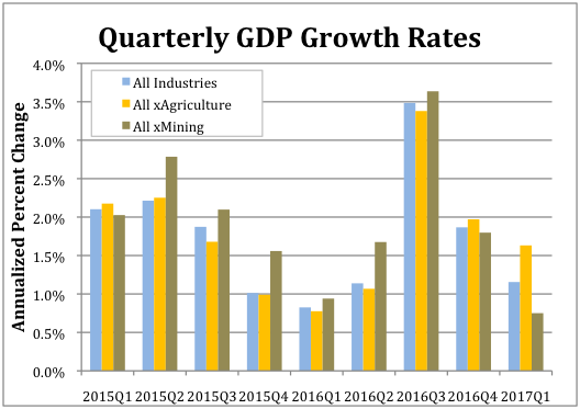
Nationwide the agriculture, forestry, fishing and hunting sector subtracted 0.41pp from the overall annualized growth, which totaled 1.1%. As the accompanying chart shows, absent the agriculture sector national GDP grew by 1.6% during the first quarter.
The fasted growing sector in Q1 was mining, which includes oil extraction. It was up 0.3%. As shown in the accompanying chart, excluding the mining sector national GDP would have only increased by 0.8%.
Texas 3.9% gain was the strongest. Its mining sector increased by 2.1pp. West Virginia experienced the second highest rate of overall growth at 3.0% and its mining sector contributed 3.2pp. New Mexico had the third highest growth rate at 2.8% with its mining sector contributing 1.8pp. Other energy states also experienced increased growth. Oklahoma’s 1.9% growth in output ranked 11th and noisy Alaska’s 1.8% growth ranked 14th. (A revenue estimator from the state told us they basically don’t even try to forecast revenue growth in the state because the economy is so volatile.)
But other energy states did not fare as well. Lousiana’s economy grew by only 1.0% (ranked 28th). Growth in Wyoming clocked at just 0.9% (32nd), and Montana saw a 0.5% decline (45th)
Finally, a couple of standout states for the quarter were Washington and Wisconsin. Washington continued a pattern of strong performance from 2016 when it took the blue ribbon. Its economy grew at an annualized rate of 2.7% during the first quarter and by 3.8% for all of 2016. This growth was driven by its information sector, which accounted for 1.7pp, and durable goods manufacturing, which accounted for 0.7pp, of the overall growth. Wisconsin’s 2.1% annualized growth for the first quarter represents a reversal of fortune from 2016 during, when its economy grew by only 0.9%. The sectors that contributed the most to its first quarter 2017 growth were real estate (0.6pp), durable goods manufacturing (0.4pp) and nondurable goods manufacturing (0.4pp).
Subscriptions
No ideology, no agenda, just a straight take on breaking economic data.
Each week as we scrutinize incoming data, we will send you a graph and a concise note on anything new that’s worth your time, 4 – 5 times a week. Our perspective allows you to make intelligent decisions no matter what political or economic outlook you embrace.
Subscribe for $27 a month > More Info...
Subscribe >
More Info...
Subscribe >
 More Info...
Subscribe >
More Info...
Subscribe >